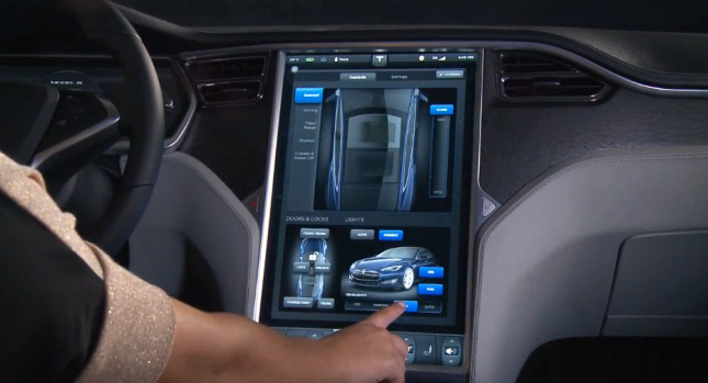
The single most important standout feature of the Tesla Model S‘s interior is the gigantic 17-inch touchscreen display. Some people don’t even have screens that big on their laptops, let alone in their car, so it does attract a fair bit of attention. Imagine ferrying passengers around in your Model S – you’d be flooded with questions from people with wide eyes not believing that there are no real buttons to speak of inside your car.
The screen controls everything about the car. From its ride height, to the lights and amount of regenerative braking, everything is touch-controlled. Those who have used it say it is responsive and quick, and the general style of menus, as well as the overall look is very similar to what you get in the latest iPad.
The massive screen (or lack of storage cubbies) won’t be to everybody’s taste, but if it does prove to work well in time and be durable and reliable, we could see ourselves switching over to using it, instead of regular knobs and buttons. Tesla argues that the problem of “muscle memory” is addressed, because the top and bottom parts of the screen never change, and the buttons you grow accustomed to are always in the same place.
Again, time, sales figures and customer satisfaction ratings will show if this type of massive screen is the way to go, or if some bare-essential physical buttons will remain as they are now. The Model S only features two buttons inside – one for the four-way flashers and one for opening the glove compartment.
By Andrei Nedelea
VIDEO


