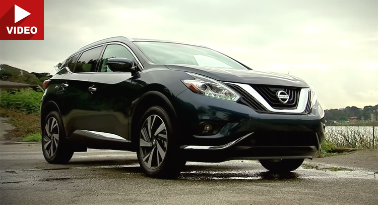
The new Nissan Muano is a departure from the style of its predecessor. It features a new swoopier approach to design, and an interior that looks like it belongs in a premium vehicle – at least in the photos/videos we’ve seen.
Its infotainment screen, however, while powered by new software, still looks like it’s from the early 2000s, and the touch response is also last-decade…
CNET says it’s still pretty good (the car and the infotainment, that is) and it also appreciates the car’s simplicity of operation. Nothing is fiddly to do, and the new Murano doesn’t have as big of an array of buttons and functions as some rivals do.
But still, there are those who will buy it based on looks alone. It’s not necessarily pretty, but it does stand out.
Also, don’t look for fuel saving tech on this car because it and its 3.5-liter V6 engines are still oldschool propositions in many respects.


