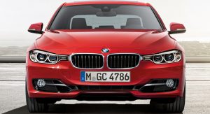
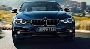
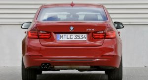
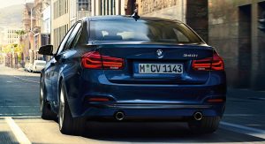
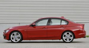
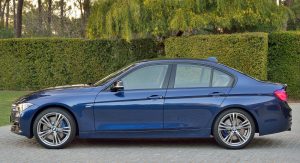
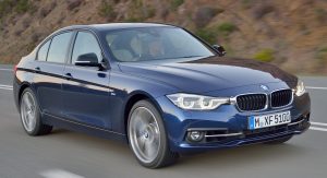
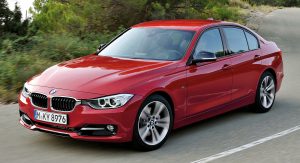
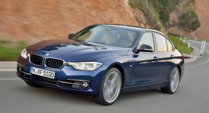
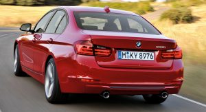
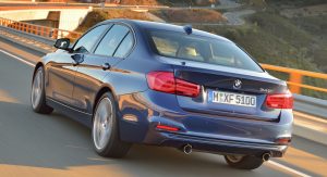
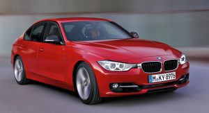
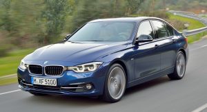
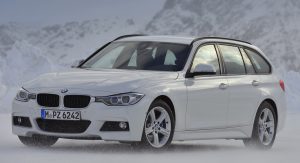
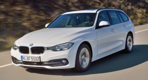
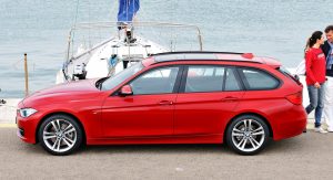
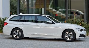
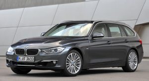
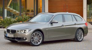
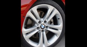
You’ll probably need a big magnifying glass to be able to spot the differences – in design – between the 2016 BMW 3-Series facelift and the outgoing model. Not even eagles can tell the cars apart…
One could think BMW’s designers have pulled a “Porsche” stunt and didn’t change anything on the exterior. At least at a first glance, that is.
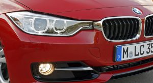
The main theme around the car seems to be “wider” and it can be seen best of all on the slightly tweaked front end. The bumper’s revised side air intakes give the car a more bloated look, which make the headlights feel narrower. It’s like the 3-Series got punched in the face, on both sides.
Speaking of headlights, they do feel a little further apart. That’s because the former ‘angel-eyes’, within the optical block, were moved away from each other and placed near the corners. That apparently strengthens the car’s broad stance on the road, or so the BMW design crew says. Moreover, full-LED headlights can now be specified as an option.
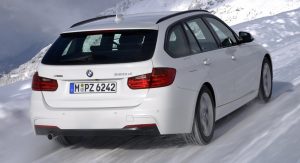
The rear-end remains clean and almost untouched. The most significant changes can be seen on the revised taillights, which now come with LED technology as standard. For those of you who are wondering why they didn’t come with standard LEDs in the first place, maybe it was an option reserved for the facelift model – so there can be proof that BMW actually changed something on the car. Oh, and the light bars within the rear clusters units are now curvier, giving the car a more modern look.
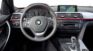
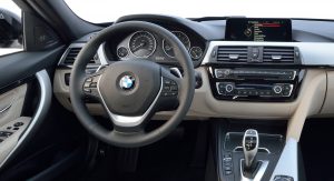
In the interior, it’s business as usual, although some chrome highlights made their way on the majority of the controls. As you can see, the center console now has a standard high-gloss piano black finish, giving the interior a sleeker, cleaner look. And let’s not forget the most important aspect of all; the cup holders now have a sliding cover.
By Bogdan Zoltan
Note: 2015 BMW 3-Series on the left, 2016 BMW 3-Series facelift on the right


