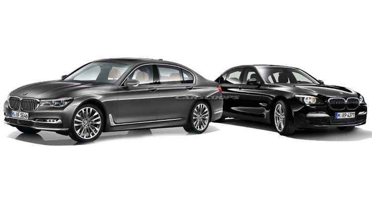
Even though it looks nothing like the previous generation, everybody states that – design wise – the new BMW 7 Series is more an evolution than a revolution.
Granted, it does have a familiar vibe, but just to be sure, I am going to visually compare BMW’s brand new flagship with the outgoing model.
The new 7 Series isn’t really longer, higher or wider than the car it replaces, but the elongated design cues make it seem more slender. For instance, at the front, the broad headlamps offer a simple and continuous horizontal theme, unlike the inflated, bulky look the previous model had.
Because of this effortless design artifice, the wheels look slimmer and pushed towards the outside of the car, offering a bit of a retro feel. In fact, the way the headlights merge with the massive “kidney-grille”, takes us back to the BMWs of old, like the E23 and the E32, where the quad headlamps and the grille were part of the same design element.
Speaking of grilles and kidneys, BMW went to town with the new model’s snout. We thought the ones on the F01 were big, but truth be told, they look like beans compared to the new design. Well, at least the new ones feature a “flap control” which looks awesome when closed – due to the increased vertical bars – and open when there is an increased cooling air requirement. Besides, thanks to a 3D look, they seem independent from the car’s body and hood, sticking out a little.
The new 7 Series sure has a “presence” built into it. A dignified spirit, if you will. The previous generation didn’t lack in chrome, but this one is absolutely garnished in it. Starting from the front bumper all the way to the rear, a chrome stripe elevates the car’s slender attitude. It even has a little air scoop at the base of the fender to dissipate air pressure from the wheel arches. It may not seem much, but actually, this little sleek chrome bar reduces the car’s massiveness, giving the impression of a side skirt. A fake side skirt.
BMW keeps its side proportions in correlation with its heritage. There’s nothing out of the ordinary going on, even though the swollen wheel arches give it a sense of dynamism. But which car doesn’t have swollen fenders nowadays? As always, it’s pleasant to see the hofmeister kink where it belongs.
Oh, and the side mirror brackets are beautifully sculptured pieces of craftsmanship. The mirrors themselves seem to stay on silver supports. Nice touch BMW designers; a very simple, but effective design cue, in contrast with the rest of the car. The F01 didn’t focused so much on details, but more on the whole package.
At the back, BMW’s current design language makes its mark, but the horizontal taillights reduced the car’s bulkiness. One might think they’re just an evolution from the ones found on the previous model, but the “L-shape” design trace its roots all the way to the E32 7 Series. The chrome bar that connects them is an element carried from the previous model. In fact, the whole car is covered in design cues that are meant to reduce its proportions. An interesting thing is that the real tailpipes can be seen through the rear bumper’s big exhaust openings.
Surprisingly, not much has changed on the interior in terms of overall layout. Compared to the previous model, the new 7 Series turned back to its roots with the main panel tilted (more) towards the driver and the light cluster buttons positioned close to the driver’s left knee; of course, the dashboard carries a slimmer design thanks to its thinner infotainment screen, but that should come natural on a brand new car.
BMW believes that the new 7 Series opens the pathway to future high-tech Bavarian automobiles and to demonstrate that it hasn’t got anything in common with older models, the car manufacturer decided to give it the G11 nomenclature, making it the first G series BMW ever.


