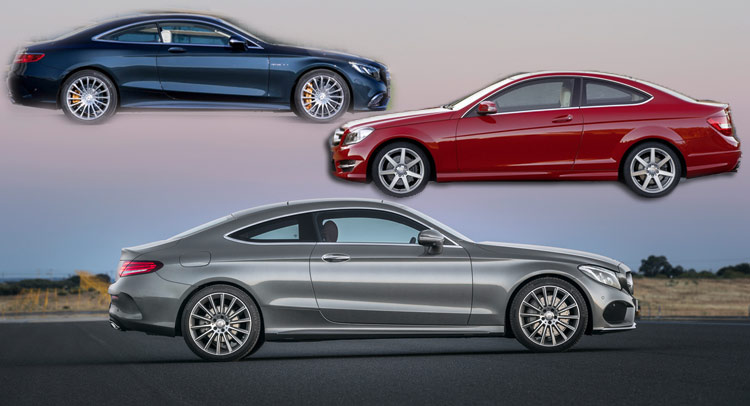
Completely unsurprisingly, Mercedes has styled the all-new C-Class Coupe to look much like the larger S-Class (haven’t you heard that one enough already…). However, the new C-Class does have its own charm, as its rear is much more of a fastback than the more sedan-like rear end of the S Coupe.
We scrambled together this photo comparo to see how it stacks up visually against both its predecessor and the new S-Class two-door.
Against the old car, which in itself is has a handsome well-chiseled look, the new car is completely different. The only similarity between the two is probably the fact they have a three-pointed star badge and two doors…
The new car has a much less aggressively rising side crease, giving it a less wedge-like and more cruiser-like appearance. The previous C-Class, in all body styles, was really a quite traditional-looking, typical Mercedes, both inside and out, whereas its replacement exudes an altogether different vibe.
Personally, I think the new car has the edge on style, and it’s probably mainly due to the more gentle, swoopy side profile.
Alongside the S-Class Coupe, the C looks radically different in its proportions. Yes, the headlights and rear lights mirror those of the S very closely, but with the shorter overhangs, repositioned greenhouse and less tapering rear, it has a more planted stance.
Oh, and on the C-Class, the S-Class-like rear lights lose the chrome strip running along the top, resulting in a less fussy rump.
Scroll through the gallery posted below and have your say in the comments box!


