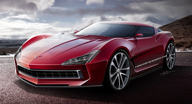
Ladies and Gentlemen, what you see here is in fact NOT the much talked about 2014 Chevrolet Corvette C7. Though don’t worry as there is one coming; Chevrolet is about to unleash its next installment of hyper transport to the world by 2013.
Now, some of you may or may not have seen the many C7 Corvette CGI drawings and videos floating in cyberspace. Supposedly, some of the renderings were based on leaked sources revealing the real thing, although being fair; they all show a nice evolution of the current C6 Vette.
All this has me slightly worried; the current car has been with us since 2005 and deserving of a major design overhaul. Would a simple evolution go far enough?
Personally, when the word Corvette comes to mind, images of the beautiful 60’s and 70’s Stingrays appear. Their design flourishes and excesses were extremely unique back then and still are today, which leads me to the question – why doesn’t Chevrolet recapture some of that unique design glory?
Sure, it is true that many design ideas are kicked into touch by aerodynamics, safety and general engineering constraints, but what if designers were able to have a free reign without being tied to the corporate leash?
Well I would like to illustrate a different perspective with a candy red offering; a halfway meeting point between radical and evolutionary.
To recapture that some of former glory I have succumbed to revisiting the past, looking to the likes of the Stingray and other magical Corvettes. The biggest inspiration here would have to be the 1969 Corvette Manta Ray concept with its expressive surfacing and glorious detailing.
Starting with the extremely pronounced wheel arches and wedge profile, the idea was to move the car away from the current crop of flat surfaced and streamlined coupes.
Attention was then turned towards the business end – with the face being dominated by three main features; the wide and protruding grill, it’s hard-edged and prominent checks and the signature center crease which runs from bumper to bumper.
The grill in particular pays homage to the Manta Ray, whilst the cabin shares similarities with the current car for an evolutionary link. Like the C6, the headlights remain exposed with LED turn signals being incorporated on the outer edges. For a point of difference, the side vents now link into the front wheel arches, helping to enforce a visual statement.
Overall, I believe I have given the car a purposeful, confident and expressive look. So does this find the middle ground without going too far? What do you think?
All I would ask of Chevrolet is to make the next Corvette a complete visual knockout, the kind that you would happily have in your driveway or as an installation art in your living room.
By Josh Byrnes
Design Copyright: Josh Byrnes for CarScoop
PHOTO GALLERY


