Skoda may be a foreign name to many on United States soil, but in Europe, the brand is quite popular. Driving this popularity is their money making press called the Octavia – it’s Skoda’s small car offering that battles with the likes of the Ford Focus, Opel/Vauxhall Astra and the Volkswagen Golf series.
In fact, the latter even has blood ties with Skoda due to Volkswagen buying the Czech subsidiary back in 2000; and that bond will become even closer with the next chapter of Octavia as it joins the Golf and Audi A3 on the diverse MQB platform.
In it’s current form, the Octavia has been soldiering on for eight years with two body-styles; including a sedan/liftback and wagon. Whilst restrained and almost Jetta-like, it has to be said the outgoing car has a handsome appeal akin to a James Bond villain wearing a Tuxedo. However the market doesn’t stay still and older model-cycle vehicles can get lost in obscurity if not updated and refreshed.
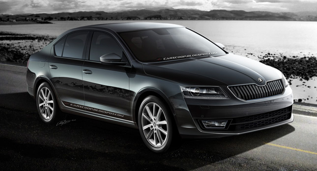
This is where the 2013 Skoda compact offering comes into view; it’s all new with a fresher design language that hopes to set a point of difference in an already crowded segment. In creating this illustration, I’ve noticed some design influences inspired by the VisionD concept car that debuted at last year’s Geneva Motor Show. That concept stood out for having a long wheelbase coupled to a dynamic roofline and short overhangs.
Unfortunately, those influences appear to be weakly translated to the production version. Forget the long wheelbase and short overhangs (specifically the sedan), the car appears to be a warmly re-skinned Jetta. The roofline carries more dynamism of the concept, as do the lower hard creases running the length of the doors. Sadly, the aggressive wheel arch flares didn’t make the transition, however, the C-Shaped rear lights have – and which are now becoming a Skoda signature characteristic.
The chiseled front would have to be the most dominant aspect of the new look. The grille is intersected by an over-biting snout (incorporating Skoda’s new logo) that runs up the center of the hood. Below this is a waterfall arrangement of black teeth to fill the grill’s chrome lined border – it may not be dramatic but it does look unique for the small car segment. As your eye’s glance down, the lower air intake eschews the above theme and makes do with a honeycomb pattern insert. Whilst the headlights with LED running lamps appear non-dramatic, they do look crisp; the projector lamps are encased in black bezels with subtle light reflecting channels that mimic the waterfall bars.
Overall, the new Octavia keeps the restrained appeal that graced its predecessor, something that should keep middle Europe buying them in droves. However, if the brand were to open for business on American soil, fortunes maybe extremely tough against more radical designed offerings from the more established big players.
What do you think; would the Skoda stand a chance in the US market or would it just be a Czech labeled wallflower?
By Josh Byrnes
All Photos Copyright: CarScoop / Josh Byrnes
PHOTO GALLERY


