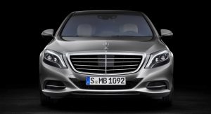
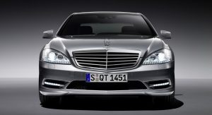
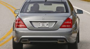
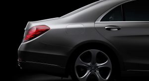
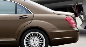
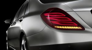
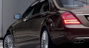
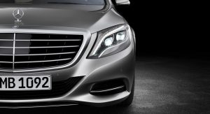
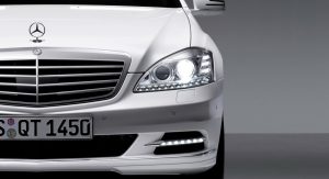
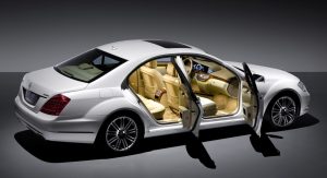
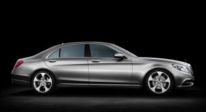
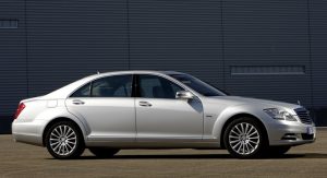
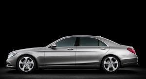
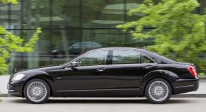
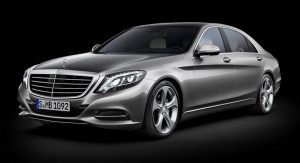
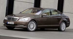
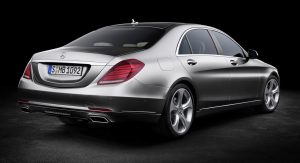
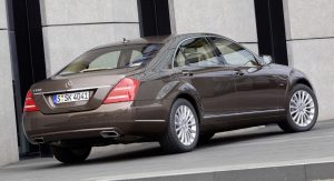
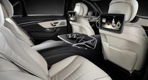
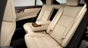
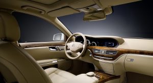
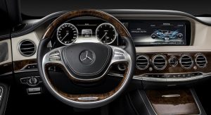
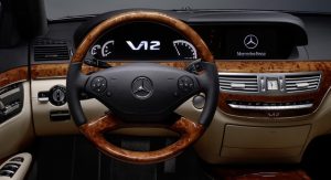
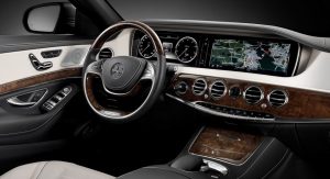
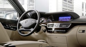
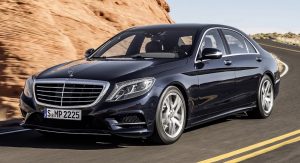
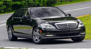
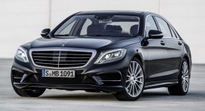
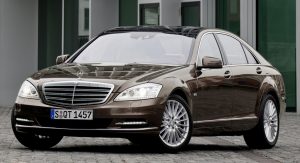
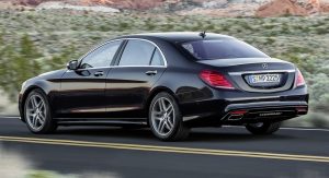
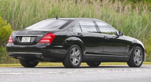
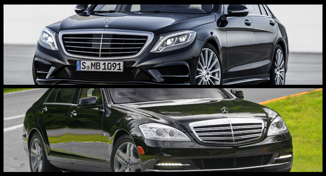
The new Mercedes-Benz S-Class is visually very different to its predecessor, but to help you more easily spot where the biggest changes are, we have put together a selection of photos of both cars, and put them side by side for your convenience. Seeing them like this really brings out the differences in proportions, shape and the details.
The first thing that strikes you is just how flared the wheel arches of the W221 (the old model) are compared to the new W222. It is perhaps less striking to look at because of this, but it is by no means bland or uninspiring. The rear doors are also visibly larger and the roofline is more steeply raked. However, according to Mercedes, this does not hamper headroom in the back, as the new car’s passenger compartment is measurably larger.
The interior is vastly different in the two cars, though there are similarities, like the horizontal row of buttons on the center stack which look near-identical, as well as the storage compartment located underneath it on both models. The wood trim also goes onto the door in the new car, but it seems a bit more nicely integrated into the overall design of the cabin.
The W221 was one of the first cars to feature a full digital screen instead of a conventional speedo, along with a large centrally-mounted unit for the sat-nav and infotainment systems. This is retained in the new car, but it gets a full LED display which replaces all of the conventional dials. Speaking of LEDs, the W222 is full of them, both inside and out (some 300 LEDs were used inside alone) and Mercedes is proud to have renounced conventional light bulbs completely.
By Andrei Nedelea
Mercedes S-Class W222 (Left) vs W221 (Right)
