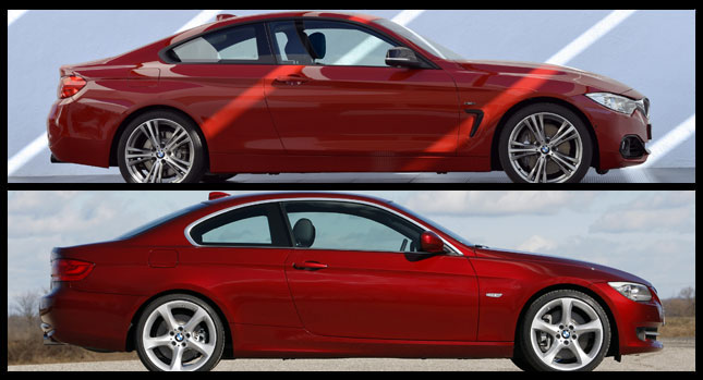
The production version of the BMW 4-Series Coupe may look toned down compared to the concept, but let’s not forget that almost all studies lose some of their shine when translated into series production models.
While this is true, it doesn’t mean the production 4-Series is an ugly car. One can’t make such a statement before seeing it in real life. So, how does the 4-Series Coupe compare to its predecessor, the 3-Series Coupe? We listened to one of our reader’s request (nicknamed “anonymo”) and we put both the two cars side by side in a virtual photo comparison to see which one looks better.
To keep it fresh, the 3-Series Coupe in the photos is a facelifted 2010 model and not the original model launched in 2006. Surprisingly, the two generations don’t look all too different, at least on the outside.
The side profile is where they’re most similar, while the most differences can be found at the front end, largely due to the newer model’s headlights and grille combo and the plunged hood. I’d say the exterior is a tie between the two generations as the 4-Series Coupe somehow lacks the “wow” factor that brand new cars usually have (or at least, they should have).
The interior is another story, with the newer model sporting a more attractive dashboard in my opinion. The interior layout and quality of materials simply look better in the newer model. But I’m sure each of you has his/her own opinion about this so feel free to express yourselves in the commentary section.
By Dan Mihalascu
PHOTO GALLERY


