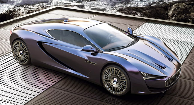
If you ask me, many unofficial model renderings that are intentionally made to look like the work of the manufacturer come out seriously lacking substance and cohesiveness.
This happens when those who create them don’t spend the time to take in the subtleties of a brand’s design, and think that simply borrowing rough familiar styling cues (grilles, lights, chrome accents and wheels), throwing them all into a metaphorical bowl and using a blender to piece them together offers a chance of achieving praise-worthy results – it usually doesn’t.
The Maserati you see here is not like that. It’s the work of designer Alex Imnadze, and has a very aesthetically pleasing shape to behold. Special mention goes to the fact that this particular design exercise, which revives the old Bora name from the brand’s mid-engined past, stays true to Maserati’s current design philosophy – it looks official.
The front and rear lights, along with the position and shape of the grille are very reminiscent of the Ghibli and new Quattroporte. Even the three side slats are present, and it all looks rather cohesive – clearly, it’s benefitted from having a lot of thought put into it. There are also hints of the old Bora in the shape, and Alex told us that his aim was to make this into a real rival for the Ferrari 458, so has he?
Check out the complete gallery below and feel free to share your views in the comments section too.
By Andrei Nedelea
Thanks to Alex for the designs!
PHOTO GALLERY


