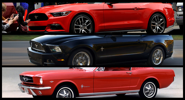
The all-new 2015 Ford Mustang is not retro in its styling in any way, but it is influenced by its predecessors, and particularly the original model before it started gaining weight (from the 1964 to 1968).
It’s a much more svelte looking design job than that of the outgoing fifth-gen Mustang, leaning more towards sports than pure muscle car, though, I think it’s always been kind-of in the middle of those two criteria.
The previous car ended up being not bad at all to look at after a couple of facelifts, particularly in the light green hue it’s been shown in more recently, but it seems brutal, whereas the new car is more pointy-looking and dynamic, if you will.
Thus, we decided that this is as good an occasion as any to place the three models side by side, and see just how they compare visually.
The new 2015 model has been reengineered from the ground up, and while it has the same wheelbase as the outgoing car, it seems differently proportioned, with a changed stance.
For me, the front screams classic Mustang, though, again, it’s not retro, but it would still look good if you swapped out these modern front lights for a pair of classic round ones. I think that from the rear three-quarter view, it really harks back to the old car in a big way too.
Inside, it also looks like a big step up, but it’s not as big as the one the new Corvette took over its predecessor, at least not from the photos we have so far. Here too the design theme is continued from the previous model.
Take a look at the gallery we prepared for yourself and share your thoughts. It may not necessarily be a highly relevant question, but which of the three do you find the most attractive?
By Andrei Nedelea
PHOTO GALLERY


