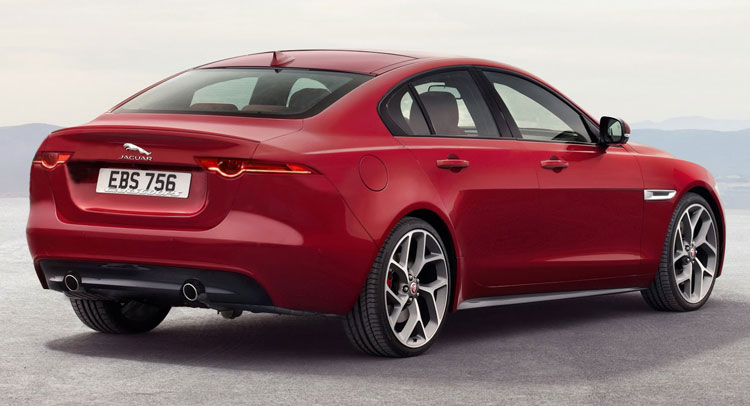
The new Jaguar XE is nice and all, if a bit too similar to the XF, but the biggest gripe I have with it are the rear lights which look like they were inspired by those of the (facelifted) Skoda Superb.
They look fine on the Czech saloon, but not on the sophisticated British one where they detract from an otherwise appealing general esthetic
Would it not look a lot better with the ones from a Jaguar’s own F-Type sports car? With a bit of fettling in PhotoShop, I was able to answer this question that nobody asked by grafting them onto the pert rear of the new XE. It’s not a perfect graft, more of a quick chop and paste, but it gets the job done and the idea across.
There’s just something a bit sloppy about how the XE presents itself. Sure it’s all modern looking and sharper than the larger XF, but it’s as if Jaguar deliberately made the design details so-so, in order to correct them with an early facelift; that or they’re planning a very different next-gen XF…
What say you, dear readers, yay or nay?
Rendering credits go to Andrei Nedelea


