The first thing that comes to mind when saying “Japanese cars” is reliability and an inherent simplicity of engineering that’s complimented by clever (usually electronic) gadgets. What didn’t come to mind before, but certainly does now, is excellent design and style, or at least attempts at flamboyance and avant-garde where there were none (or very few) before.
It’s funny how pretty much all the major Japanese automotive powers are now going through a brand revival based mostly on stylish European-inspired design, with an obvious Japanese twist.
Lexus is really daring with the way it’s styling its cars (think IS, NX); it may turn out to be the exact opposite of timeless, but maybe future generations will look back with appreciation for the boldness of trying. The latest concept it unveiled in Geneva, the LF-SA, is really extreme-looking, and what’s most surprising is that it shows off a vision of a futuristic city car, not some ridiculous unattainable supercar.
It’s not pretty, heck no, but it looks like it’s from a Hollywood movie set in the future, and a movie with really high production values too… If that’s how Lexus wants to start styling its cars, then they should go ahead by all means; we want more, even if we’ll view the products with prudence and often try to pick faults.
Good design rarely gets appreciated by its contemporaries – these new Lexus cars have a really sculptural quality about them. There’s no doubt that machines stamped out their metal panels, and the mishmash of lines they create could be called busy, but the result is a really unique and distinctive look. Remember how boring Lexus’ first car, the LS400, looked? It was just as staid as the Mercedes it ripped off back in the day…
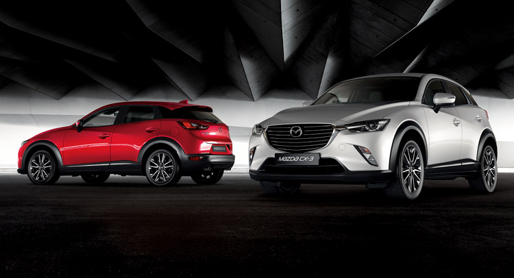
Lexus is the more extreme example out of all the Japanese brands, but I think the best one so far is Mazda. It now makes truly beautiful and also very sculptural-looking cars. They’re complimented by clever (conventional) engineering through an approach that’s as unique as the styling.
Granted, a new Mazda is not as striking as a new Lexus, but many would undoubtedly argue they prefer the slightly more understated look of the former. Pick any car in the Mazda range, from the 2 to the 6 or any of the two smaller CX- models and you’ll be treated to really high quality Italian-esque design. Mazda has really attracted a lot of attention since it started designing its cars so that people would notice them for a change.
Toyota is on board with this too. Just look at all the sporty, aggressive faces it’s putting on its bread and butter cars. The Camry and Avalon, for instance, look like they want to physically eat the road ahead, but at least their design expresses some emotion and passion where before there was absolutely nothing in that respect.
Honda is at it too, of course, although of all the manufacturers, it’s by far the most restrained with the styling of its vehicles. There are still examples like the super-sharp NSX, or the funky and practical new HR-V crossover; Acura, as a brand, needs to be reevaluated and changed, as in its current form it doesn’t seem attractive to the usual German-loving premium buyer.
Obviously Nissan and Infiniti are doing their bid to not be left behind the co-national pack, and even half-dead Suzuki is trying things out as well. The only automaker that’s still struggling to have its own design revival is Mitsubishi, although its most recent concepts do hint at a promisingly aggressive and sharp-looking future.
The trend is actually a global one, although not all manufacturers are onboard. The more traditionalist Europeans are keeping things mostly understated and not so in-your-face. This approach is obviously just as valid, and VW has been successfully applying it for decades and it’s seen many more flamboyant manufacturers struggle and even die around it.
Perhaps VW’s is the way of stability and a purely evolutionary approach. Evolutionary gets old, but you can’t say the same about the revolutionary. I`m not saying the Japanese are revolutionizing the industry, but they have taken important steps to change their image from dusty old clichés like the one this article was started with and they’re all the better for it.


