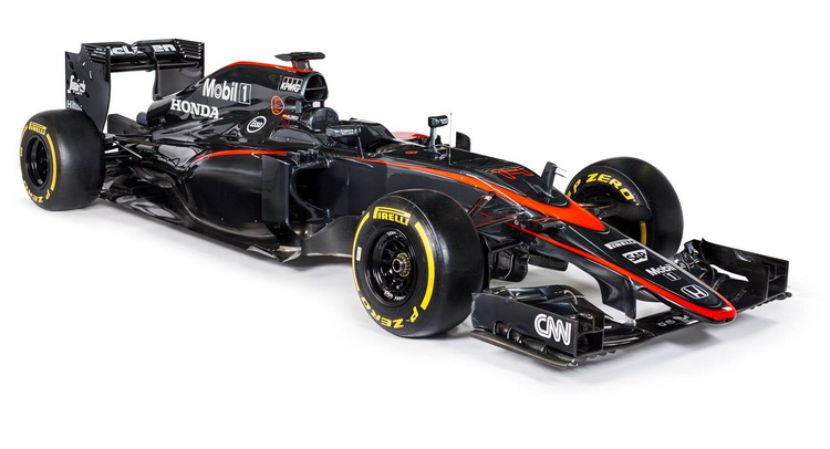
When it comes to Formula 1 racing, you could say that McLaren desperately needs a change. Starting with this weekend’s event in Barcelona, they’ll look to surprise their fans in more than just one way.
Last month, McLaren-Honda Racing Chief Eric Boullier said that they were expecting some major upgrades in time for Barcelona, and we’re only a few days away from being able to tell if those upgrades are going to help them score their first points in 2015, or not.
However, the team decided that it was time to change something else entirely – the way in which the car looks.
While it’s true that many fans were disappointed when the first official livery came out back in January, they just brushed it off and turned their focus on the cars performance (or lack thereof). In a strange twist, McLaren decided to change the livery yet again (it’s quite rare for this to happen during the season), and go with a more dynamic graphite gray look.
The new livery does look better in our opinion, and it should also work better in bright sunshine as well as during night racing (like Bahrain and Singapore) because it won’t reflect light as much as the old chromed livery did.
As for the contrast, it’s typical “McLaren Automotive” – no traces of Honda except for the writing on the back and the logo on the nose.
We’ll pass more judgment once we see the car on the track, until then our main “concern” is that the extra stripe that comes together as a McLaren logo in front, kind of makes the car look as if it has two noses.
Oh and they really need to get a main sponsor already. The car looks practically naked without a logo or writing on the side pods.


