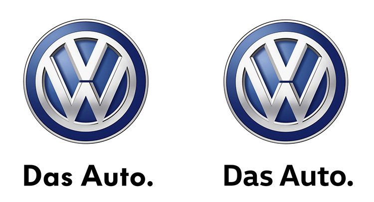
You know when girls go to the hairdresser, get a very minutely haircut and then spend 14 hours trying to get people to notice them? Well, Volkswagen did something like that by changing their official company Font.
Yes, Font – the symbols, or glyphs that compose words and sentences. The big-wigs at Volkswagen decided it’s time to replace that old-fashioned writing style with a more modern, contemporary variant. You can see the changes in the picture.
In a report from Caranddriver, Volkswagen states, the new font is “more contemporary, less geometric and features dynamic contrast, inspired by VW’s distinctive vehicle design.”
The font is simply called Volkswagen Text and replaces the old Volkswagen Utopia. It will be available not only on the company’s stationary brochures, but also on every Volkswagen-badged interior; dashboard, infotainment system. It will also be found on the exterior labeling.
Of course, typefont connoisseurs will either appreciate this move, or loathe it. But will the rest of the world really notice the difference? Maybe the move symbolizes Piech’s withdrawal and a new era for Volkswagen. #illuminati.
Either way, Volkswagen just paid someone to come up with this.


