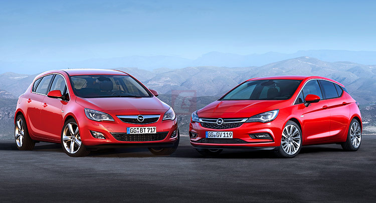
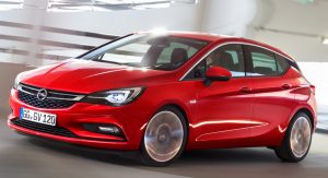
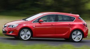
Coming after the Opel Astra H, the Astra J dropped the angular sharp design in favor of a more tuneful, polished look.
That being said, the new Astra, entitled the K generation, resumes the angular scheme the H had going on. In some ways, you can say the new Astra is the H’s ancestral successor. Truth be told, the H generation was the car that drastically changed the visual appearance of the dull and boring Astras that Opel created until 2004.
With elements carried from the past at its side, it is time to put the new Astra K against the outgoing model, the Astra J.
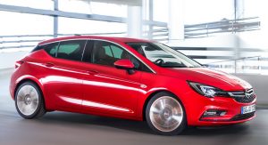
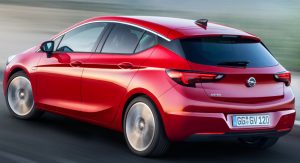
Starting with a general overview of the automobile, you can’t tell from the pictures that the new Astra is shorter in length, has a shorter wheelbase and sits lower to the ground; instead, you can tell it has a “floating roof”, giving it a nice and modern design cue. Yes, the top half of the C-pillar is now blackened, adding a little “lightness” to the car. In fact, depending on the engine type, the car is up to 200 kilograms lighter than the previous generation, but not thanks to the “floating roof”.
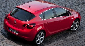
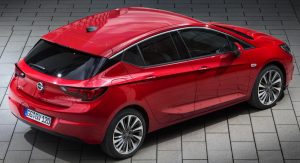
Continuing at the back-end, we clearly spot a shorter, but wider rear window. But don’t let it fool you; the “blackened-out” C-Pillars makes it look that way. A nice touch is the descending roof-line, but the horizontal crossbar linking the rear lights – which continues all the way to the blinkers on the front fenders – is the real “piece de resistance”. It does give a dynamic and wider feel to the car and it’s an homage to the chrome bar positioned on the trunk of the Astra H.
The rear lights are merely an evolution of the ones on the Astra J and do look very familiar. Speaking of familiarities, the high and triangular C-Pillar look very similar to the ones seen on the Nissan Sway concept.
The chrome details at the bottom of the side-windows are gone, to better accentuate the floating-roof motif, while the carved lines on the doors and hood shouts “dynamic-design”.
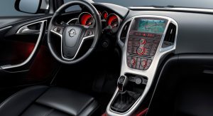
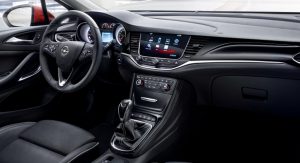
At the interior, things just got simpler. I was never a fan of the Astra J’s cluttered center console and seeing an uncomplicated dash board unfrowns my face. The steering wheel now has a more anatomic 3-spoke design, giving the car sporting credentials. While on the J platform the interior seemed to focus on a vertical theme, the new car adopts a more horizontal look. Long gone is the rotating controller for the infotainment screen, featured on the old model, since then new one comes with a touch interface.
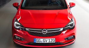
Notice at the front how the new Astra has the headlights connected with the grille – a design cue missing since the Astra H. And unlike the previous model, the chrome bar carrying the Opel Blitz logo is longer and slimmer with a honeycomb mesh beneath it.
The headlights sport the same basic philosophy as the outgoing model, but with a stretched design and updated, modern look. Their angularity takes us back to the H model, but there’s no denying the shape was inspired by the J generation.
With a nosedived look and lower roof-line, the new Astra surely looks sportier and better than the previous generation. Is it just me, or both cars have the same side blinkers?


