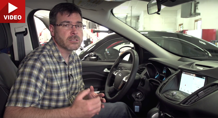
The issues with MyFord Touch and MyLincoln Touch infotainment systems are well-known by users: they’re slow, complicated and frustrating to use due to reliability bugs.
Fortunately, Ford is rolling out an all-new SYNC 3 infotainment system across the entire 2016 lineup and promises most of the glitches will be fixed. The folks from Consumer Reports wanted to see how MyFord Touch compares with SYNC 3 and they released a video which highlights the differences in design and usability between the two systems.
One can never go wrong with a simple design, and SYNC 3 is exactly that. It may not look sophisticated, but it’s more user-friendly thanks to the much simpler basic screen layout. It also has a new processor which makes it operate much quicker than MyFord Touch. Another feature that will be appreciated is the larger font size and bigger buttons. Scroll down to see what else SYNC 3 brings.


