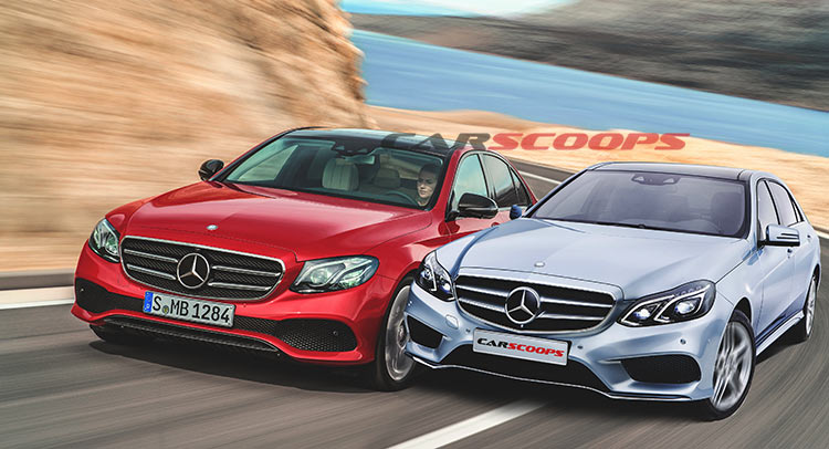
After a long campaign filled with teasers and sneak peaks, Mercedes unveiled the new E-Class at this week’s NAIAS only to showcase a car that to some, looks like a shrunken version of its flagship S-Class, and to others, an overgrown C-Class.
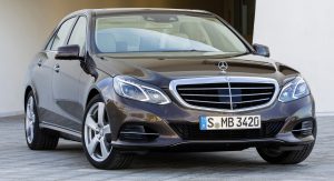
However, you could also support that the W213-codenamed 2017 E-Class is an evolution of the facelifted version of the outgoing W212 model, as the two vehicles share several design traits.
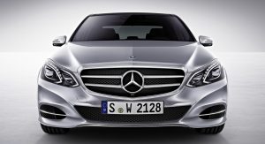
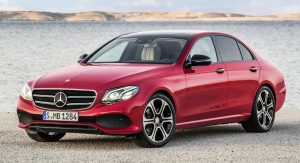
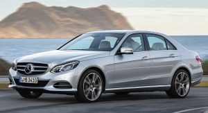
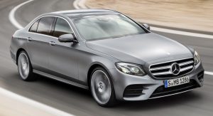
Take the new vehicle’s front fascia, for instance. Its front bumper (whether we’re talking about the Avantgarde Line or the Exclusive Line) is reminiscent of the facelifted W212’s optional sport kit (dubbed the AMG Sports Package), as its governed by two fake air intakes united by a mesh grille that could double as an intake for the intercooler. Compared to the standard front bumper of the old Merc, the new E-Class’ proposal is more aggressive, composed and simple.
The same goes for its iconic grille, which has simpler, flowing lines, with a more imposing presence nonetheless – at least the classic one, as the sport variant (with the big logo in the middle) isn’t that different from the old one. Of course, the S-Class inspired, sweptback and rather compact headlights are the definitive styling feature of the new model.
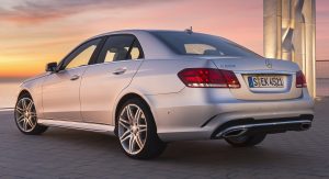
Mind you, proportional-wise, the old model seems a little more elongated, highlighting the car’s luxurious approach, while the roofline is a tad different too, carrying a more curved look.
On both cars the doors sit pretty high, squeezing the windows, but the older model masks this “trait” with a subtle slope towards the headlights. In fact, on the profile you can see the facelifted W212’s age, as it still retains the edgy lines that came out in 2009.
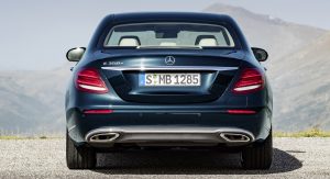
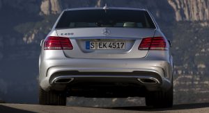
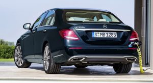
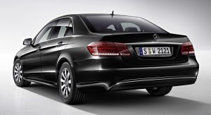
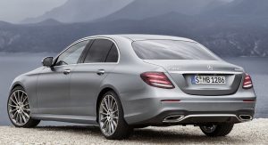
At the back, things are as you’d expect from the new model, as it adopted a fresh design for the lights similar to the S-Class. Oddly enough, the tailpipes finishers are similar to the ones found on the old model, with the rear bumper keeping its overall shape.
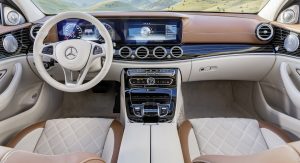
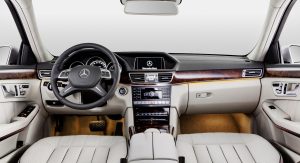
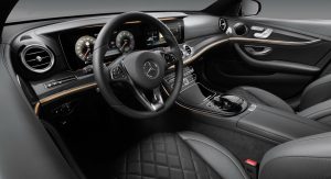
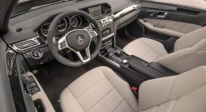
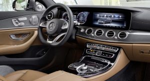
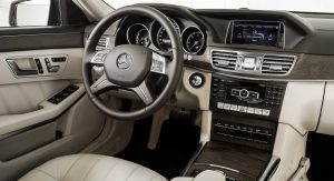
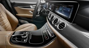
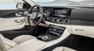
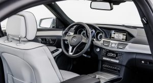
The interior, however, is what really sets the new model apart, as it looks like it’s years ahead of the previous gen’s cabin. No more edgy, sharp lines for the E-Class, as the new model – adopting the organic, flowing lines of the flagship – seems more welcoming and cozy. Instead of a small navigation screen, now there are two big 12.3-inches 1920×720 resolution screens, that take the role of the normal instrument cluster. That said, the future of analogue gauges at Mercedes looks kind of grim.
The seating adjustment controls and all the buttons are where you expect them to be in a Mercedes-designed cabin, although the attention to detail of the new model’s interior is amazingly complex. Don’t worry, the analog clock is still there, though, even if pretty much everything else went haywire, probably confusing the heck out of old-school E-Class customers.
Still there’s no shadow of doubt that Merc’s updated – and finally modern – interpretation of its mid-size luxury sedan is one of the best out there.


