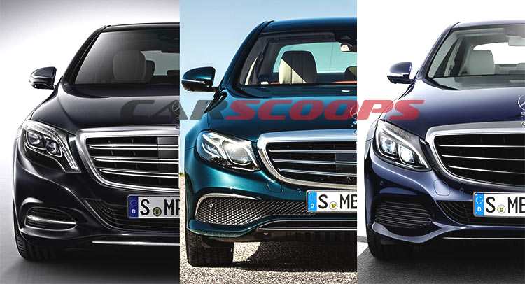
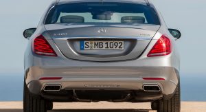
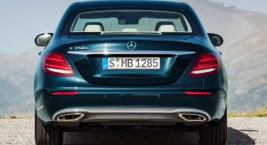
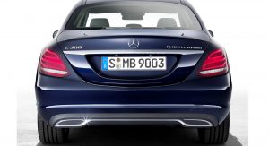
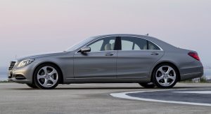
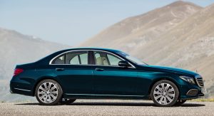
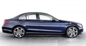
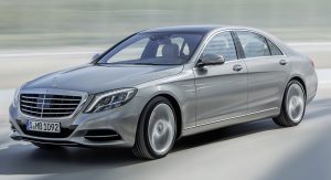
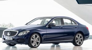
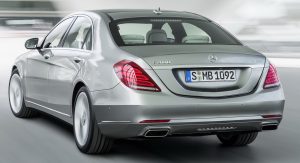
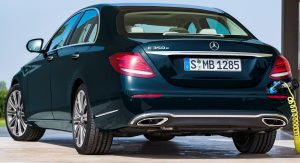
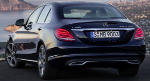
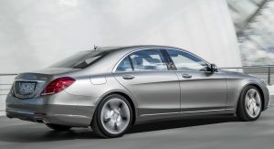
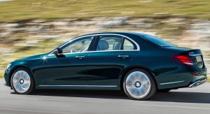
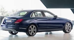
There’s been plenty of talk about how Mercedes has made the latest S-Class, C-Class and the newly premiered E-Class look almost the same, so how about we compare them?
Now, don’t get us wrong, as there are a number of subtle differences between them; but, an automobile newbie could easily mix them up (even in a side-by-side comparison).
The new S-Class was the fresh design approach Mercedes needed, making the brand even more luxurious and stylish than before. In fact, the model’s proportions, elegant lines and luxury appeal were so well received by the public that Mercedes decided to implement the same visual philosophy on the S-Class’ smaller siblings.
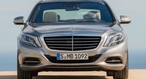
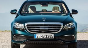
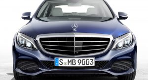
In other words, the German car maker reckoned everybody wants an S-Class and began offering the same recipe watered down in smaller packages. Take for instance the three cars’ front end; they basically sport the same design, with roughly the same headlights and the same oversized grille (although the C and the E-Class offer the sport variant as well), but each one has its own subtle style cues, with the lower portion of the front bumper different to suit its segment.
Sure, the center air intake (below the grille) is the only one functional and it’s a core design piece on all models, but whereas the one on the C-Class mimics the original S design, flanked by two “nostrils”, following the line that embeds the headlights, the one on the E-Class unites the aforementioned style cues to create the illusion of a continuous opening – running the whole width of the front fascia. The headlights are different as well, not necessarily in shape, but in the LED patterns that compose them.
Proportional-wise, although all three cars follow the same design philosophy, the C-Class appears to carry a sportier profile – a trait highlighted by the shorter boot, which makes the model appear more poised, somehow reducing its business pizzazz. Still, staying true to the S-Class’ design, it proudly sports two dynamic lines on the doors, unlike the E-Class; which instead has a small boot lip and a chrome strip (available only for the Exclusive model) at the bottom of the doors, running all the way to the rear bumper, hiding its overall proportions and making it appear more elegant. Other than that, the cars are like…three differently-sized drops of water.
At the back, the differences between the models become even less obvious, mainly because the only notable changes are made by the taillights. Granted, there are many other subtle modifications between the S, E, and C-Class, including the thin chrome-plated strip on the latter, but you’ll need more than a glance to notice them. Nevertheless, the E-Class is the only model which might stand out from the trio, mainly thanks to its more compact rear light clusters.
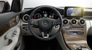
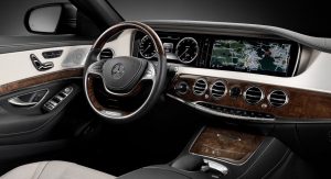
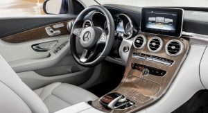
In the interior, things are as you’d expect them to be, with both the C and E-Class adhering to the S-Class’ style. Still, here’s where the C-Class loses ground and shows its lower market positioning, as the car’s cabin seems like a cruder interpretation of the one found on Merc’s flagship.
Furthermore, whereas the S and E-Class uses two big screen monitors as instrument clusters and infotainment display, the C-Class has a conventional dashboard with a single tablet-like display governing over a single-piece, uninterrupted center console that flows from the top of the dash all the way to the scrolling knob. The E-Class, on the other hand, adopts a style similar to the big daddy S, with the center console split in two by the dash’s four central air vents. Mind you, The S’ quirky, two-spoke steering wheel remains exclusive for the flagship, as the other two appear to sport similar three-spoke design.
In conclusion, Mercedes managed to cramp its flagship’s style into two lower market automobiles, raising the automotive bar in the process.


