A site’s main focus should be its readers; not just for increasing its traffic but because that is, or rather should be, the core of journalism.
In fact, your feedback is more valuable than most realize, for it is a great help in constantly improving our job.
One would be justified to consider this sweet-talking. It’s not. Case at point: Ross Anderson visited the Geneva Motor Show and wanted to share his experience.
A different perspective to that of a hack? Deal! Here’s what he has to say and show, through his own images, about the Geneva premieres.
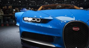
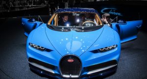
Aside from possibly a naked Beyoncé, it is hard to find something that will grab more camera attention than a Bugatti. Despite this, as I walked around the wide blue beast, most cameras had swiveled to the man sitting inside it – a man with a dark ‘EB’ Bugatti logo not insignificantly tattooed on his neck. If I thought I was a big car fan, I was sorely mistaken.
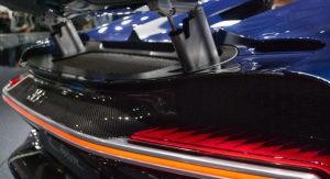
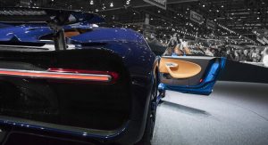
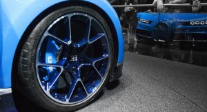
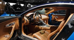
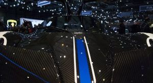
Once I had enough with this future regretful pensioner, I took in what the VW Group’s most savage company had cooked up. The first thing about the Chiron that should be said is that it is huge. Incredibly wide and long, with muscular curves and bulky proportions bolstered by how ridiculously low it is. The caricature proportions of supercars never really come across in pictures, however I have never seen this quite so profoundly as with the Chiron.
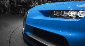
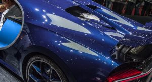
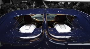
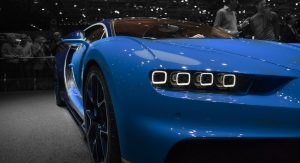
The other difference is, unlike in the photos where it seems to be nothing more than a slightly more modernised Veyron, in the flesh it looks actively brilliant. The aesthetic is fair less bulbous than its forbear and it’s a finer piece of automotive craftsmanship, with the new engine cover and floating strip rear light’s highlights of this. The only real sore point are the brutish headlights, which appear seemingly simplistic and generally don’t match the curvature of the rest of the car;
Actually, I do have another beef with it. When compared with the industry-shattering impact of the Veyron and the technology at play in competitors such as the Koenigsegg Regera, this mechanical deja vu seems slightly underwhelming. It’s a 1,500 hp monster alright, but in the end it is an evolution of the original concept. Technology has move on considerably and the Chiron is a bit stuck in the past.
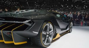
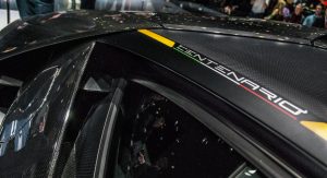
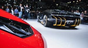
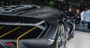
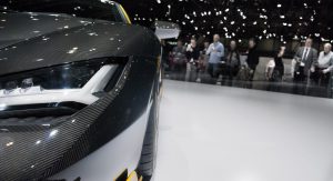
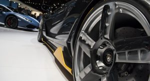
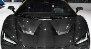
The Centenario is another debut which the pictures presented differently than the actual car. The patent pictures made it look like an Aventador that had been sat on and the official ones like an eight-year old sketch of what the world’s most tacky car would look like.
In the metal… well it would be a lie to say it is good looking, even remotely classy or comparable with other hypercars. But really, it doesn’t look too bad either, with some details (the multipiece rims being a notable example of this) having some rather fantastic detailing and the open rear wheels seeming like an idea that could have worked. As a celebration of Ferrucio Lamborghini’s centenary, though, I would have been much happier with a tractor.
Aston Martin DB11
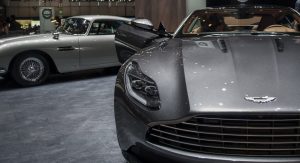
When the first pictures of the DB11 were unveiled, the response was one of instant and immense adulation. Many praised Aston Martin for modernizing the classic DB9 shape with sophisticated modern design details while keeping the spirit of the old car. I don’t entirely agree and, after seeing the car in the metal, my reservations persist. In the face of Aston Martin’s previous models, the DB11 does not reach the astonishing heights of its predecessors.
I will start with the good points. The rear lights look exceptional, taking cues from both the DB9 and the Vulcan, the interior is an astonishingly beautiful blend of that in the One-77 and the classic ‘mass production’ Aston interior and the front stance a perfect combination of sophistication and muscularity. This added aggression almost reminds me of one of favourite Astons, the 1970’s V8 Vantage. However in this comparison, the issues with the DB11 are exposed. The beauty in Bond’s favorite car manufacturer originates from a classical simplicity; uninterrupted long body lines and curves, simple and elegant detailing, and a unified design. This is best seen in the DB9, the 1990’s V8 Vantage, the DB7, the Vanquish, the V12 Vantage Zagato.
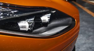
In my opinion, the same cannot be said about the DB11. In the attempt to both distinguish itself from previous models and compete with its competitors, it has incorporated design features which simply break this up, most notably the slightly too boxy and complex headlight design, the awkward and incongruous rear diffuser and the overly large and unsubtle side and bonnet air inlets and outlets. Some of these work, such as the slightly flying buttresses (closer to hovering than flying but still) and the lighter A/C pillar colouration, but others just don’t.
This is a good looking car. For me, it just does not meet the high standards that the brand has set over its long history. A pity.
Rimac Concept One
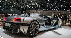
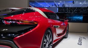
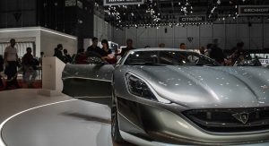
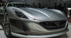
One of the most surprising and pleasing debuts in Geneva. Not only is the technology astounding, the overall look is incredibly similar to that of the concept. When I expressed this opinion to one of the designers, his said there are 36 changes from the concept. The most notable are the headlights, which are more vertical than the pre-production car’s and the more compact proportions. This a point of slight confusion though: from the size of it is hard not to forget that this is not a competitor for the 488 and 560S, but rather a 20 model run limited edition hypercar with the performance to back it up. An exquisite piece of engineering and an exciting preview of the full scale production models the Croatian car company has in store for the future.
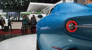
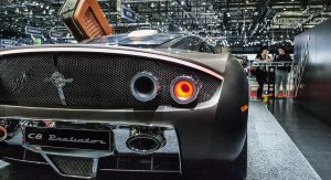
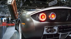
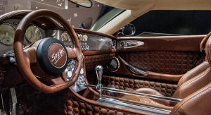
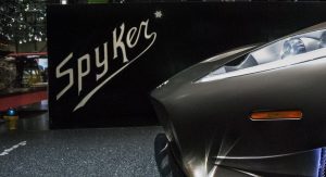
An example of what is best about the small sports car industry, Spyker’s new model may lack the advanced electric propulsion it would reportedly feature, but is nonetheless an astonishing, beautiful and wholly unique sports car. A replacement to the larger super car C8 Airelon, the C8 Preliator may sound like a fridge brand but has the artistry of a Patek Phillippe watch and is a bronze monument of automotive artistry.
The Spyker’s proportions are unconventional with some aspects seemingly misplaced, such as the rear lights sticking out beyond the body of the car and generally the way the rear of the car flows in contrast with the more muscular front, however in saying this it is not bad looking but just rather quite distinct from other sports cars on the market. Much of this is down the airplane inspired detailing, most prominently the afterburner rear lights and the immensely cool gearstick and whilst the turbine inspired detailing are missed, it is not lacking for quirky little features. This is an exquisite highly original car and it deserves to be recognized as one.
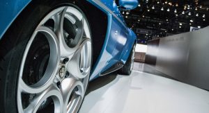
Touring Superleggera Disco Volante Spider
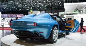
I will start with the one noticeable negative point of this car, which is the interior. Considering that this car not only costs numerous millions but also means there will be another rare and beautiful car, the Alfa Romeo 8C, on the road, as it’s built around it, the interior seems a tad disappointing. Compared with that of the significantly less expensive Spyker, it seems underwhelming that such a magnificent machine is festooned with such an indistinct and slightly old fashioned interior.
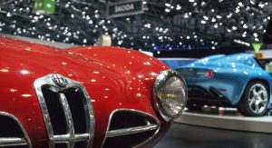
Thankfully, the bodywork is a classic design, a modern interpetation of classic coach-built roadsters with muscular features hidden beneath deep curves and the removal of the roof only adds to its theatricality. I still do prefer the coupe, as the design seems purer and with better proportions, however when sitting next to its red ancestor it is hard to argue that this blue cruiser is anything other than fantastic.
When the trademark sketches of the Porsche 911 Targa came out, I thought they were utterly horrific: an automotive hunchback of Notre Dame with an excessively large rear fixture forced in to recall the classic Targa. One tries not to judge too harshly until a car is unveiled however in the face of sketches like these, I struggled.
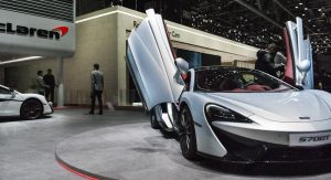
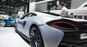
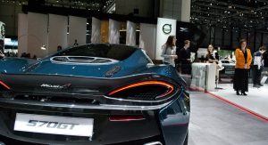
When it was unveiled I was utterly shocked. Frankly, I had never been so wrong, with the Targa 4S being one of the best looking cars in the Porsche range. McLaren has done a similar thing with the 570GT: take an idea which should look considerably worse than the standard vehicle yet make it look even better. The idea of McLaren converting the 570S into a 2+2 sports GT by extending the rear and adding a large rear window seemed destined for an unwieldy and mediocre design at best.
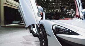
Somehow, not only is the 570GT not worse looking than the 570S but with its smoother back, more relaxed focus and the rather beautiful side hinged rear window it is altogether classier and slightly better looking. Without the race inspired rear, the design has a more cohesive aesthetic, its curves melding together, unified by the long black glass which stretches across the car. Congratulations McLaren, you continur to beat the odds. Keep up the good work
.
The modern Boxster and its Cayman twin are cars so good that magazine articles have regularly posed the question as to whether a base 911 is really a better option than a fully equipped version of either. The answer that consistently comes back is that you should get the 911 if you want a bigger car. When luggage capacity and rear seat space are the distinguishing factors between your trophy car and it’s less expensive sibling, it is testament to both how good Porsche’s smallest models are and how little they care about the struggles of their sales representatives.
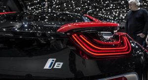
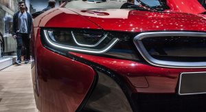
So when the 718 was unveiled it seemed that Porsche had put priority on the latter point over the former, putting more space between it and the 911. After seeing it in person, I can say that this isn’t wholly true. It still does look premium: the detailing is of exceptional quality and overall, the car looks expensive. Naysayers of the downsized turbocharged flat-four can look at the Jaguar C-X75 and BMW i8 that prove cars with small engines can still drive great and be fun, so I do not fear that it will be any less fun to drive than its predecessor.
The overall lighter look and more beaked light design removes some of the muscularity of the car and makes the car more appealing to female customers. I find it less sporty than its predecessor and at the same time quite pleasant.
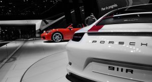
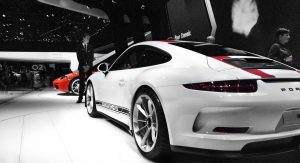
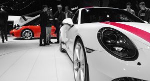
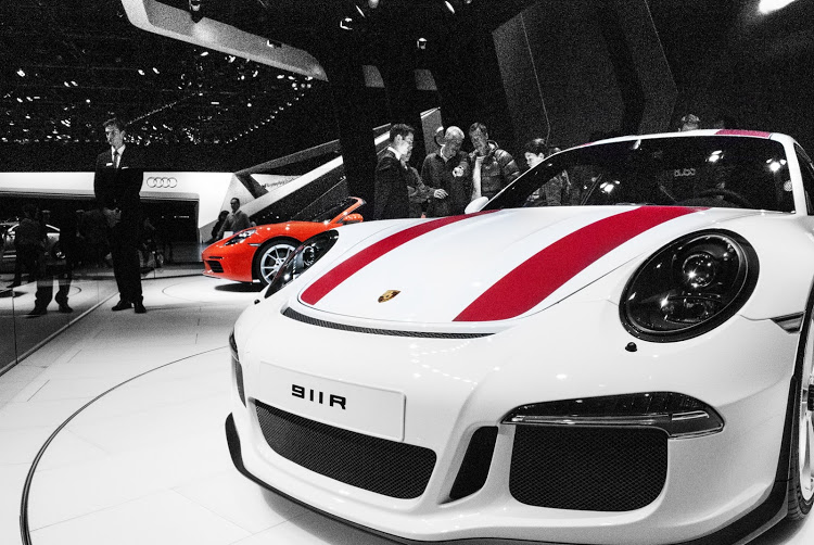
However on the Porsche stand, it was clear which one the car fans were most attracted to. The 911R is both a thank you letter to Porsche fans and a greatest hits album of the 911 range, taking the features that their more traditional fans miss the most, such as the manual gearbox and naturally aspirated engine,a and incorporating them into a stripped down but fantastically designed car.
The 911R is what Singer would be making if it tackled modern 911s, exaggerating the wide curves and classic angles of its best models so as to form a montage of the best of 911 range, whilst lacking the garishness which oft exists in limited edition models. Well, aside from the (optional) red stripes which probably would have been better slightly thinner in black but still. This is possibly the best limited series 911 ever made, and that’s saying something.
Asymmetry in automotive design is a rather detestable way to make a product seem more exciting and exotic without taking any real design risks. This is most notable in the original Mini Countryman, where the meaning the word ‘Mini’ really was quite literally starting to get stretched, and the Hyundai Veloster, where the Korean brand proved if you want to build a sports car and a hot hatch, build two separate models.
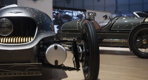
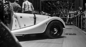
So when the staple of charming British motoring that is Morgan unveiled the electric, 3 wheeled, Airstream caravan/coffin cross breed with a single headlight placed to one side I was not particularly pleased. However upon seeing the eclectic little pod, I must concede, its incredible charm overcame my usual symmetry OCD. One may imagine that next to its side exhaust and motorbike engine festooned twin, the electric 3 wheeler seem a tad boring. On the contrary, it is has a completely different flavor and distinctive quirkiness to such a degree I can’t truly tell which one I like best.
The petrol three wheeler is call back to the original and a cartoon of WW2 aeroplanes, whilst the EV3 seems like what people in the 1960’s would have imagined motorbikes in the future would look like, and in this comparison, the asymmetrical lights are contextualised. To put it frankly, if the 911R is a thank you note to Porsche fans, these two little cars are Yates love poems to car fans in general. Is it practical? No. Is it even slightly usable on any daily basis? Of course not. But oh is it fantastic, with a passion and charm which is so sorely lacking in so many cars today. I am infatuated.
Other debuts:
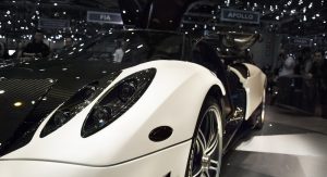
The Apollo N looks exactly as ugly as the old Gumpert Apollo and the Apollo Arrow looks somewhat like a full size Hot Wheels car. the Arash AF8 and AF10 Hybrid don’t look bad but as though they have been released 10 or 15 years too late and the Zenvo TS1 and TSR are slightly more garish versions of the fiery original.
Chevrolet’s Corvette Grand Sport doesn’t look bad in itself; amongst European supercars it does look slightly brash and cheap – but then again, it is a muscle car so in its home environment its own distinctly American flavor undoubtedly would be more appealing than in Europe.
Don’t have much to say about the Ferrari GTC4Lusso or Maserati Levante. The Prancing Horse is a predictable and messy replacement to a not great looking car and comes with one of the most absurd name I have seen on a car. The Levante is a rather bullish shame of an offroader that doesn’t look as bad as the Bentayga but is even more conflicting with the rest of their brands models and history. At least with the Bentley it sits not too uncomfortably with the Mulsanne and spray tanned clientele. Also the Ferrari and Maserati stands were packed like football stadiums and I really couldn’t be bothered with the wait.
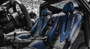
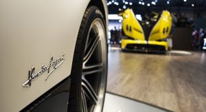
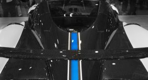
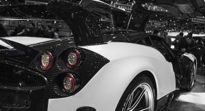
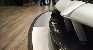
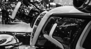
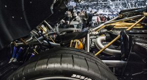
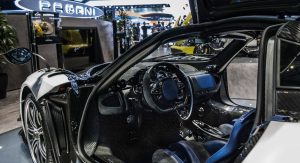
The new Pagani Huayra BC is a car worth talking about though: as light as a small hatchback, as powerful as a race car and with an artistry and attention to detail that boggles the mind. Is it as striking as the standard Huayra? Not quite – the plain black interior and aerodynamic necessities mean that the purity of the original design had to be slightly sacrificed in the name of performance. However being ‘not quite’ as stunning as the standard Huayra – like not being “quite as rich” as Bill Gates, or “as big a jerk” as Kanye – is still pretty damned stunning, and in its pure aim of speed, the BC has its own stark beauty.
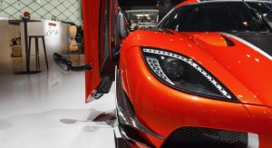
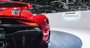
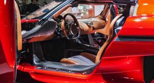
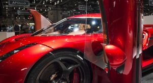
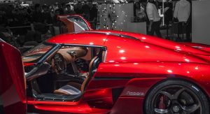
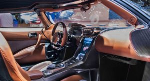
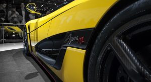
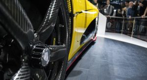
I imagine Jaguar’s F-Type SVR drives fantastically but when compared with the standard convertible and coupe, it does seem rather ostentatious; an accusation which could also be labelled upon the yellow Agera on the Koenigsegg stand which was adorned with red pin striping. This could not however be placed upon the Regera. Tthe latest model from Sweden’s most mental car company (admittedly not a tough title to acquire), this megacar is a work of engineering brilliance and design beauty. The rear is the high point where the wide lights highlight the immensely low and wide proportions of the car, however in contrast with what the official press photos would make you believe the headlights look great too. I could say more but frankly all that need to be said is this: the Regera is possibly the most seismic shift forward in performance cars since the invention of the V8, simultaneously an artistic masterpiece and engineering marvel and my favorite car in the entire 2016 Geneva Motor Show.
Text and photos by Ross Anderson


![The 2016 Geneva Motor Show Through The Lens Of A Carscoops Reader [112 Images]](https://www.carscoops.com/wp-content/uploads/2016/03/Carscoops-RA-Geneva16-31555.jpg)
