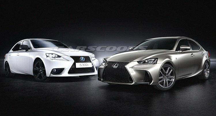
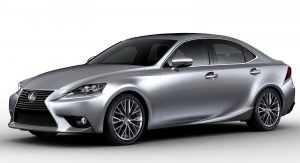
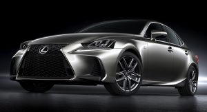
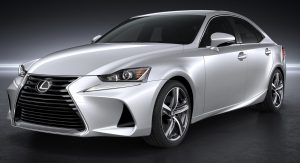
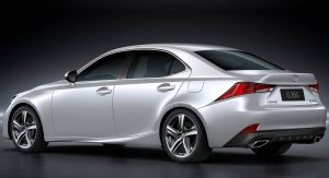
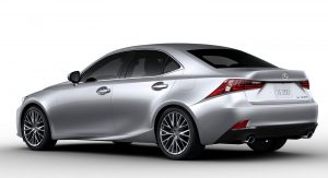
The IS’ original design didn’t last more than three years, as Lexus reckoned a dash of aggressiveness was in order to keep its compact executive model afloat.
As striking as the outgoing design was, Lexus still felt the need to emphasize some styling cues, especially the front end with its huge grille flanked by two gaping air intakes. The front fascia’s redesign included the headlights as well, which now have a cleaner appearance and L-shaped daytime running lights, bringing the IS’s “face” in line with the rest of the range.
This redesign is a perfect example of “small changes, big results”, as Lexus didn’t go out of its way to improve the vehicle’s form, but rather focused on the little things that make a big difference. That’s why you won’t notice other major exterior revisions, except maybe the new LED clusters within the taillights, the rectangular chrome exhaust tips, and the lower plastic portion of the rear bumper.
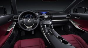
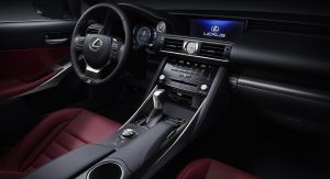
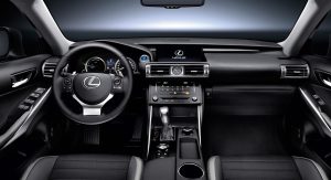
The same story goes for the interior; open the door and you’ll hardly notice any difference, apart from the multimedia display screen being enlarged from a 7-inch unit to a 10.3 one. Eagle-eyed readers might spot the ever so slightly restyled air vents, different lower center console, and somewhat tilted push-start ignition button as well.
One thing is certain: Lexus’ futuristic, intricate and unique design language is in class of its own, but whether that’s a good or bad thing depends on the viewer. So, which side of the fence are you on?


