With its fresh design, the Bugatti Chiron is certainly a fitting replacement for the Veyron and the fabled Bugatti badge.
But the car we know as the Chiron didn’t always look like it currently does.
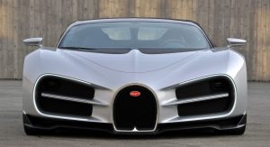
During the design process, company executives were mulling over a design far more unconventional and aggressive than the finished product. Pictured above, the design came courtesy of Volkswagen Group designer Sasha Sellpanov and included a front-end to scare off any competitors.
In the early stages of the Chiron’s development, Cnet reports that numerous designers from VW were asked to submit designs for the Veyron’s successor. Sellpanov’s was selected and given a full-time design position at Bugatti to help bring the Chiron to life. With a small team, he produced a scale model of his finished design and presented it to the company’s executives.
The front of the model was characterized by the traditional Bugatti horseshoe grille as well as two further gaping-wide grilles split in half by a central LED daytime running light. Embedded within the upper two section of the intakes are two round headlights.
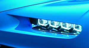
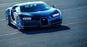
Ultimately, Bugatti opted for a slightly more conservative design incorporating the now instantly recognizable “eight eyes” design.
Between Sellpanov’s design and the finished product, which do you prefer?


