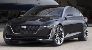
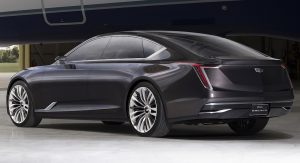
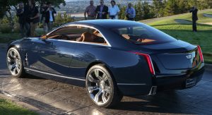
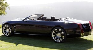
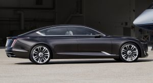
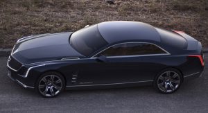
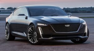
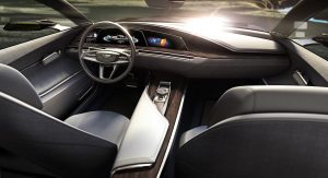
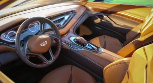
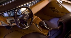
The recently unveiled Cadillac Escala is a map of things to come. Cadillac took the wraps off its latest concept at the Pebble Beach Concours d’Elegance, previewing what its designers have installed for the future.
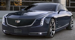
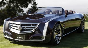
Although Cadillac’s gracefully drawn concepts have made headlines before, they only previewed certain production elements and design cues. If you squint really hard at the current CTS model, for example, you’ll be able to find a few Elmiraj-borrowed lines, while the Ciel remains confined in the American car maker’s design archives.
Not the Escala, though, it will help the brand compete head-to-head with the German aristocrats, and take its well-earned place among the luxury giants, as reported by the Detroit Free Press.
According to Johan de Nysschen, head of Cadillac, the new concept is better proportioned and adopts horizontal light clusters in order to balance out the vertical design lines. As you may have noticed, Cadillac’s design language (over the past decade) was governed by an upward-oriented, edgy motif, beginning with the head and tail lights and ending with the grille.
The Escala’s design was created to balance out the familiar pattern used by the carmaker, and concentrate more on the width of the car. As a matter of fact, the Elmiraj and Escala share similar styles, as the latter builds upon the old philosophy by adding subtle horizontal elements.
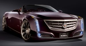
Compared to the Elmiraj and the Ciel, the new concept also smooths out the sharp design in favor of a chiseled look – similar to that of Cadillac’s competitors.
However, some strong, clear-cut segments remain, proving that the GM-owned luxury brand hasn’t lost its distinctive appeal.
“It was time for the design to move on. We need to think where the brand is going”, says de Nysschen.
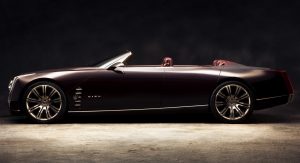
Like the Escala, the Ciel and the Elmiraj were unveiled at Pebble Beach Concours d’Elegance, each one of the three challenging a different niche: cabriolet, coupe, and sedan. The only question remains, which one do you think looks the part?


![Is The New Escala An Improvement Over Cadillac’s Previous Concepts? [w/Poll]](https://www.carscoops.com/wp-content/uploads/2016/08/cadillacs.jpg)
