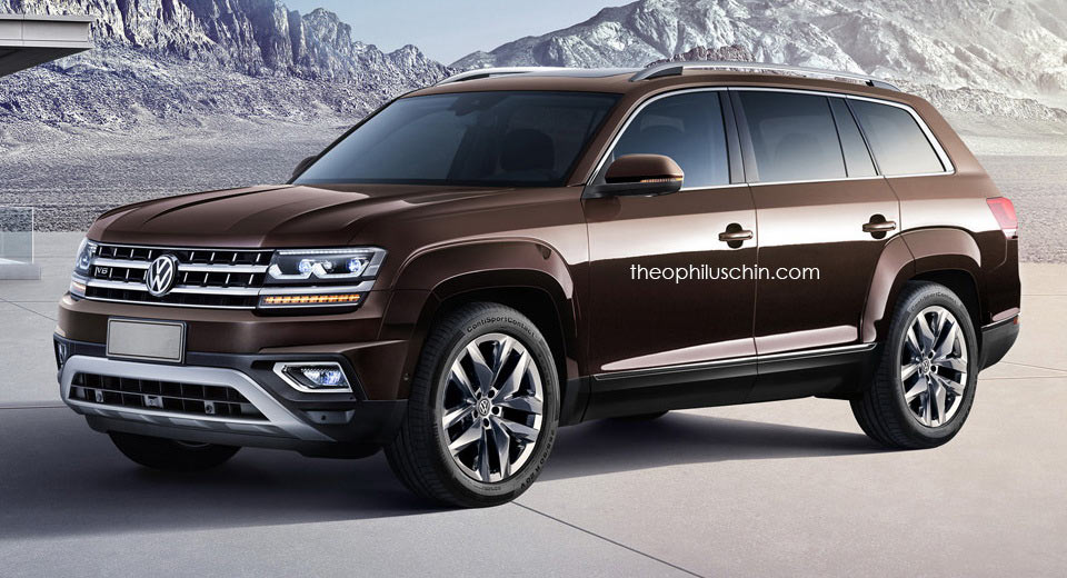
According to its designer, the whole idea behind the Atlas’s chunky wheel arches and profile line was to give the car a wider look.
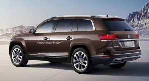
That being said, if you happen to be one of those people who think the Amarok pickup actually looks cleaner from a design perspective, this render by Theophilus Chin represents a sort of mix between the two VW products.
It was head of VW Design Klaus Bischoff himself who said that the Atlas was meant to “look substantial without looking too aggressive” and that the look of the Atlas is meant to age well and not go out of fashion in two or three years’ time.
Yet, if you recall the VW CrossBlue concept, even that one seemed to offer a cleaner profile than the Atlas, which for some people actually makes for a classier appearance.


