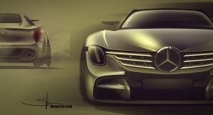
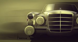
In the current world of automotive design, automakers are all about curved edges and flowing lines but if you wind the clock back a few decades, it wasn’t always like that.
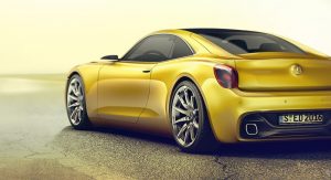
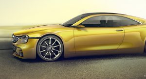
In fact, many cars of yesteryear were dominated by flat surfaces, sharp edges and horizontal body lines. So, what happens when you combine these two drastically different design philosophies into one? You get the Mercedes 350 SE pictured.
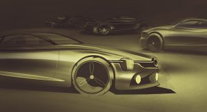
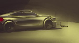
Designed by Daniel Handler and Eugen Schlee on Behance, the study has taken design inspiration from the Mercedes W108 and mixed it with design elements featured across the marque’s current range of models.
The car therefore goes down a similar route to Nissan’s retro IDx concepts and includes almost vertical front and rear ends as well as squared headlights and bulging rear wheel arches. On a more modern front, the futuristic 350 SE incorporates a low-slung roof with wide side windows, streamlined wing mirrors and a curvy pair of doors.
It is difficult to imagine any Mercedes looking like this down the road but even still, its intriguing to see how impressive such a car could look.


