Audi’s all-new A8 is without a doubt one of the most important debuts of the year, packed full of tech features, some meant to keep you safe, others comfortable and entertained.
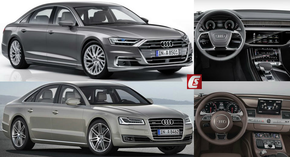
However, this here is a visual comparison, which means that regardless of how smart the new car is, we’ll be focusing mostly on its design, both inside and out, and how well it stacks up against the previous-generation model, which some say has aged rather nicely.
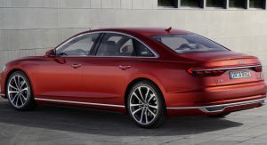
You don’t need to stare at the new A8 for too long in order to see that its design is heavily inspired by the Prologue Concept. It’s got sleeker lines, thinner headlights and a much wider grille out front.
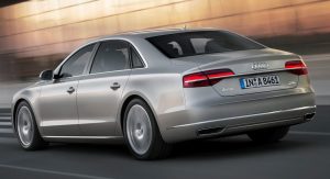
At the rear, everything has been completely overhauled, with twin LED taillights united by a light strip stretching from one side of the car to the other. The sleek roof line is also quite evident from this angle, as it flows down more elegantly than on the older model.
Speaking of which, the last time we got excited over the third-generation A8 was back in 2013 when the facelift came out. Aesthetically, this mostly meant redesigned bumpers, new glare-free adaptive Matrix LED headlights and flatter rear LED taillights, joined together by a continuous chrome strip.
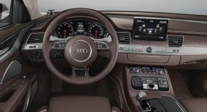
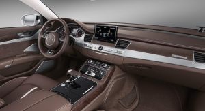
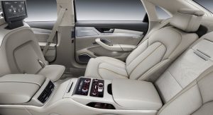
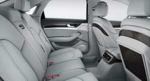
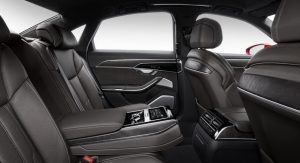
Bigger changes were made to the interior, especially tech-wise where the old A8 got an updated MMI system with a more capable Night Vision Assistant, head-up display, standard electromechanical power steering, Active Lane Assist, Park Assist with 360-degree display, plus Active noise cancellation with some additional noise damping. As for the dashboard, changes included new seat coverings, inlays and colors, plus a wide array of optional extras such as ventilated front seats with massage function, leather-covered center console for the long wheelbase model and a relaxation seat with power footrest.
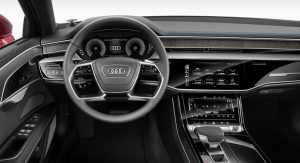
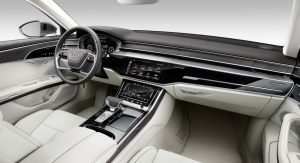
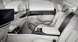
Of course, if you want to relax, the all-new A8 has the older car beat by a mile thanks to innovative features like the foot massage function, fully active suspension, heated central armrest and naturally, the level 3 autonomous driving capabilities, which put the A8 at the forefront of its segment in terms of technology. As for the dashboard design on the new model, Audi got rid of the MMI rotary control and pretty much all physical buttons, especially from the center console area. Overall, the design isn’t as simplistic as it was in the Prologue Concept, but it’s still quite similar to what we saw inside the E-Tron, marking a huge step forward, especially with haptic and audio feedback for the touchscreen commands.
So there you have it. Out with the old and in with the new – and given the segment as well as the rate at which new technology is implemented in the automotive industry, we can expect bigger and better things from the new product. However, if you set aside all the differences in on-board tech or performance, you’re left with two very comparable designs, so we’re quite curious to know which way you’re leaning when it comes to their styling.


