In what is now a probable future where people won’t be owning cars, but rather sharing them with others, the need for complex interior solutions and designs might be all but over.
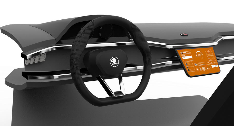
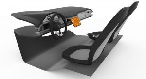
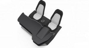
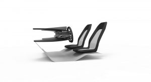
This render from designer Kristyna Karpalova, who came up with a simple yet ultra-modern take on a Skoda dashboard, meant for car-sharing.
As you can see, there are a lot of sharp design elements, with a single touchscreen display in the center, connected to the user’s mobile device. The designer says that she put a lot of work into the user interface and that it holds all the necessary controls for the car.
It’s certainly an interesting take on what is slowly becoming a big topic within the automotive industry. However, if you look at all the concepts coming out today, most of them feature multiple large displays, so perhaps a single screen is actually a bit unrealistic – unless it’s huge, like on a Tesla.
Even Skoda went the other way with their Vision E Concept from Shanghai earlier this year, which had not one, not two, but three massive screens embedded in, and behind the dashboard.
Still, we can definitely appreciate the simplicity of this particular design too, which has just one physical button on the dash, for putting on your hazard lights.


