There’s a new trend in the automotive industry that’s taking off like one of SpaceX’s intelligent rockets – touchscreens that are tacked onto the center console.
Nearly every automaker in the industry is moving towards the new layout. From luxury brands like Mercedes-Benz to more affordable ones like Kia, it’s become a large part of nearly every new vehicle. But is that a good thing?
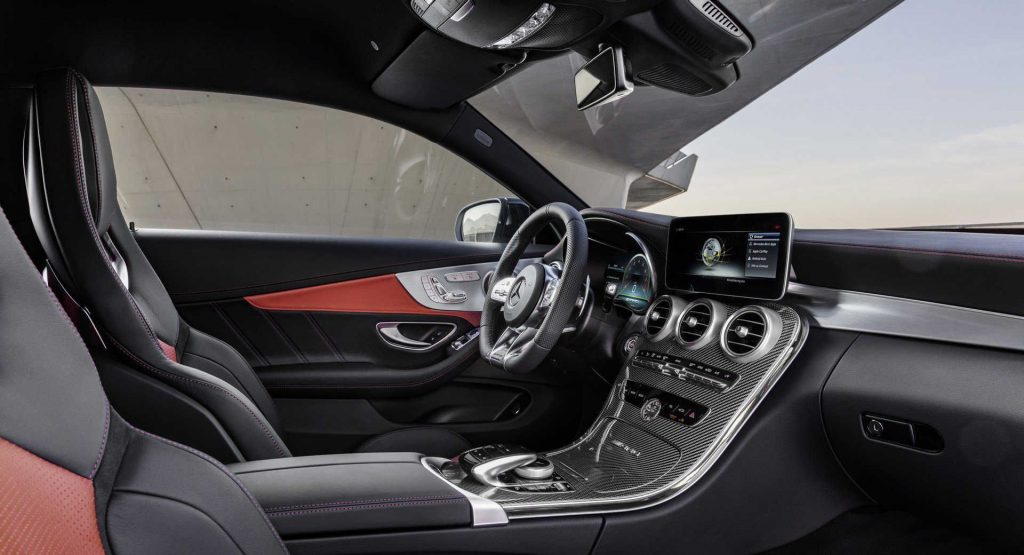
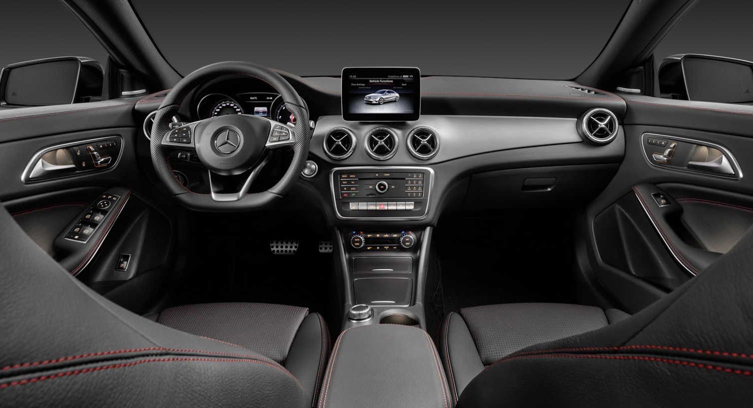
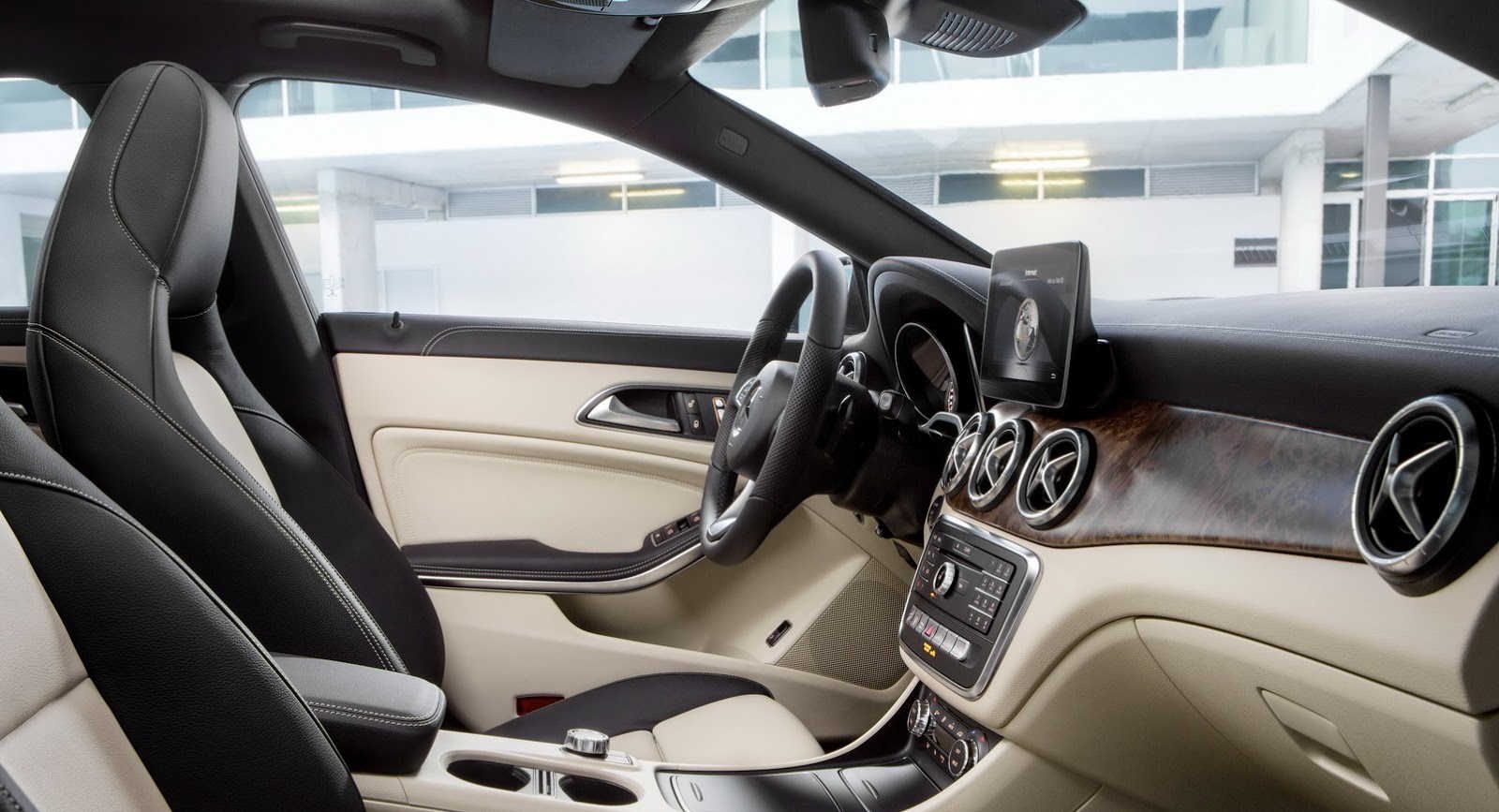
To get a good idea of the placement of a modern touchscreen, take a look at Mercedes-Benz’s current lineup. The lower-end models, like the CLA, C-Class, GLA, and GLC have a 7.0-inch or 8.0-inch touchscreen that the brand calls “freestanding.” On these vehicles, it kind of looks like the screen’s floating above the rest of the center console.
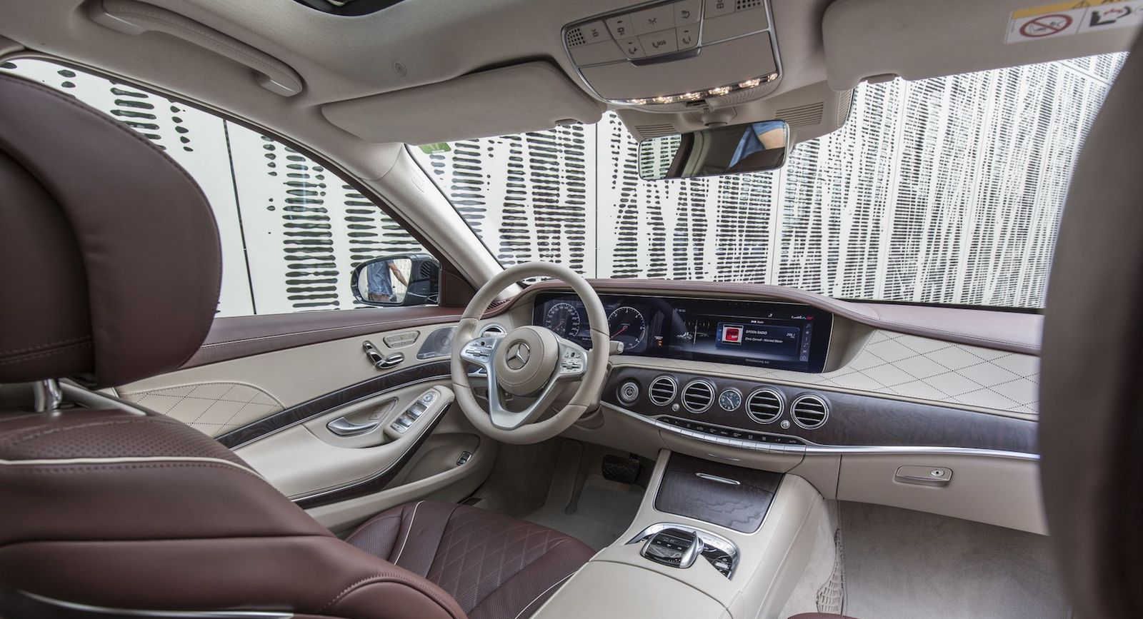
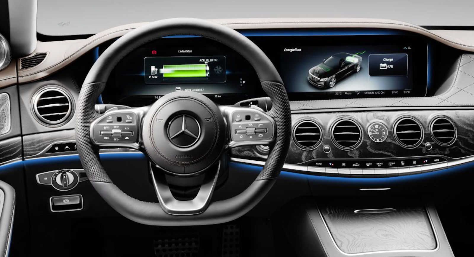
The design is a stark contrast to what Mercedes offers in its more expensive and luxurious machines. A higher price tag isn’t the only thing that separates the E-Class and S-Class from other offerings in the lineup, as the automaker offers those vehicles with a different screen layout. Forgetting for a moment that those vehicles have two massive screens, the S-Class’s 12.3-inch touchscreen is physically built into the dashboard.
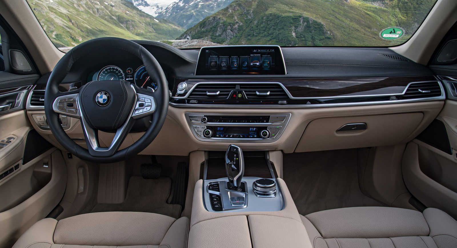
Mercedes isn’t the only luxury automaker to be integrating “freestanding” touchscreens into its vehicles. Nearly all of BMW’s cars have a similar touchscreen layout. The German automaker even offers its range-topping 7-Series sedan with a screen that looks like it’s been placed on the dashboard instead of in it.
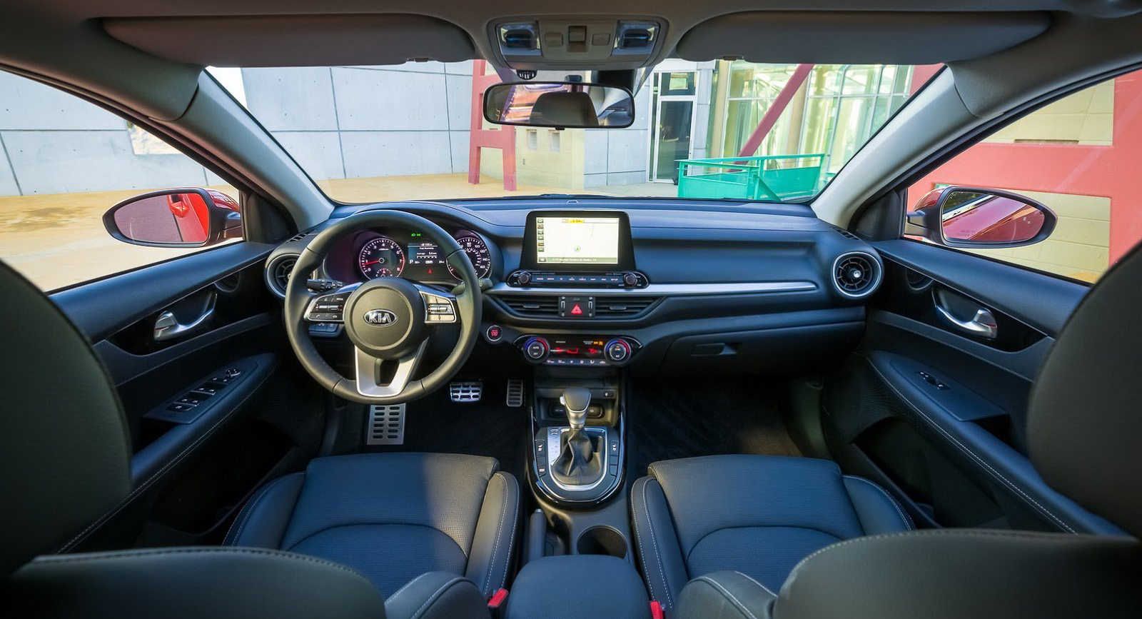
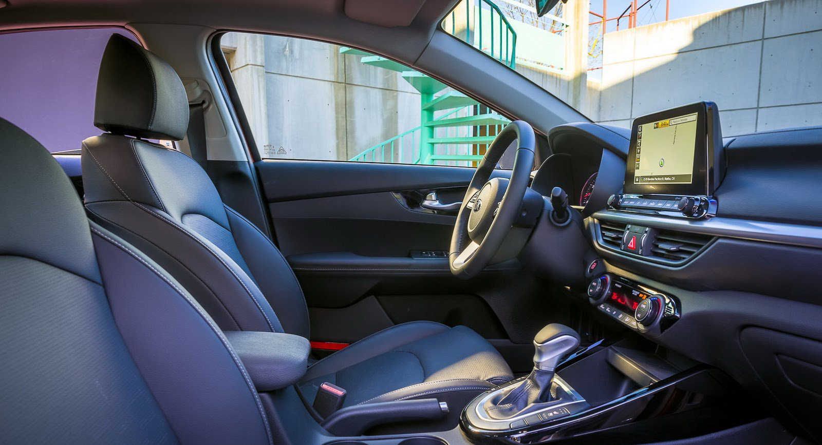
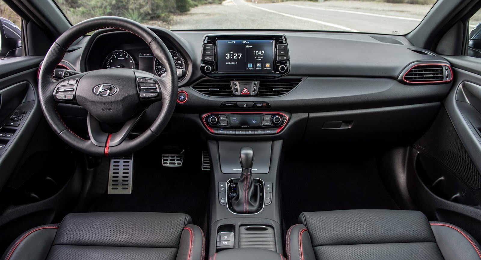
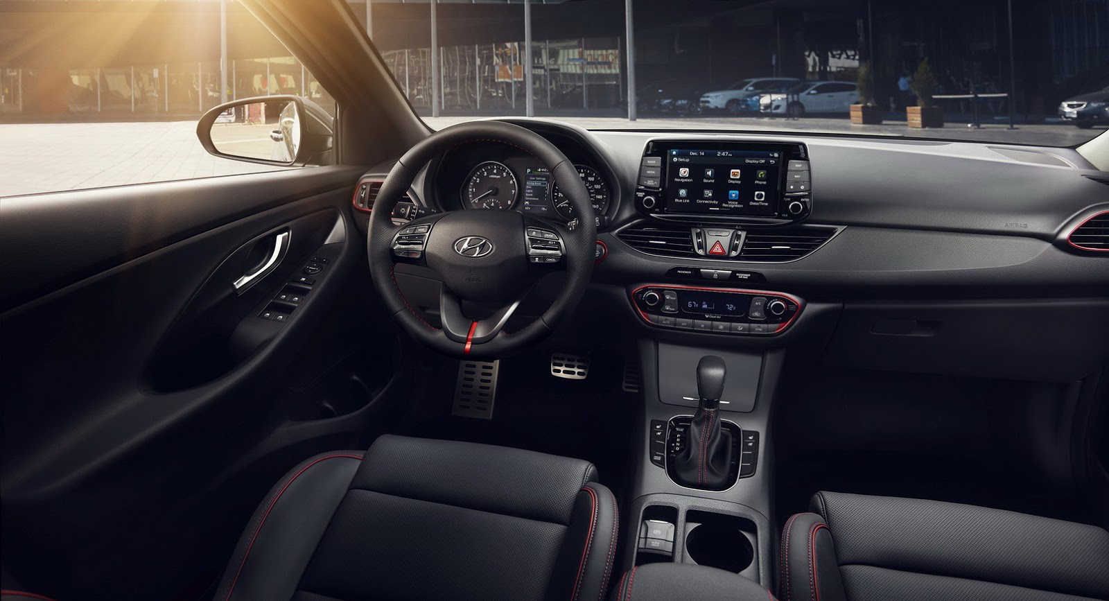
The layout goes beyond German automakers, as well. Kia and Hyundai both offers their vehicles with a touchscreen that’s similarly styled. Both the Kia Forte and Hyundai Elantra GT have floating center screens. I think Kia’s done a better job with its screen, though, as Hyundai’s comes off as an afterthought.
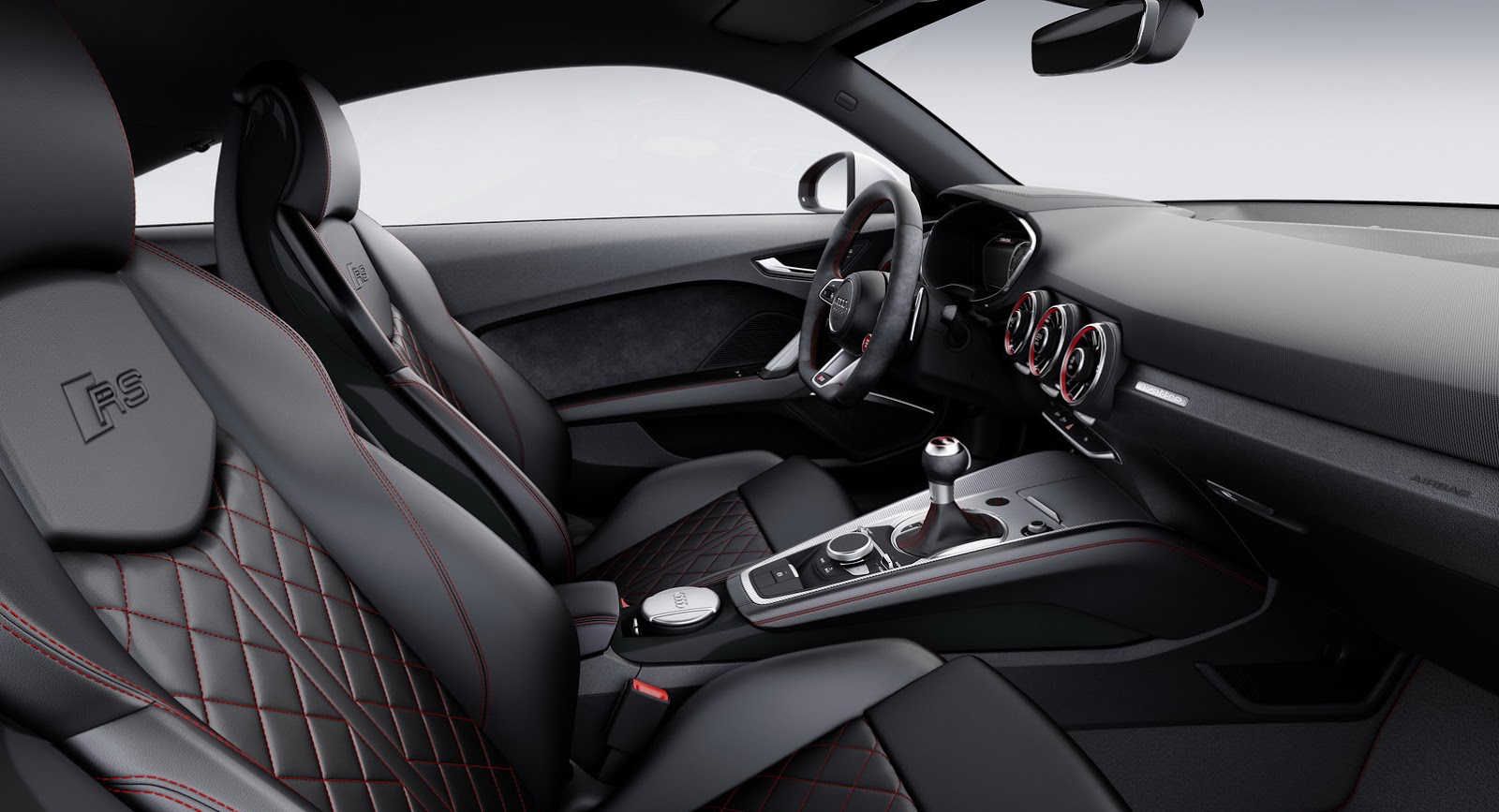
That’s why we’re bringing this question to you guys. Personally, I think “freestanding” screens look cheap. When I was growing up, cars were much simpler and had bare center consoles. The new Audi TT family is a great example of what center consoles used to look like, as it lacks a center screen and has a tidy, uncluttered look.
Back in the day, when you had enough money to opt for the optional navigation package, you got a center screen that was nuzzled into the dashboard. It was a way of remembering that you had made it. It also meant that didn’t need to use one of those pesky Garmins anymore.
I’m a fan of screens that are built directly into the dashboard. To me, it makes it look like the designers actually took the time to find a creative way to integrate the center screen into the cabin. “Freestanding” screens look cheap and almost like a last-minute effort.
What do you think? Are you a fan of floating touchscreens or do you think automakers should ditch the idea?


