Say what you will about technology taking the joy out of driving, but there’s one major upside to putting cutting-edge features in a vehicle – we’re getting some pretty cool stuff.
While the majority of drivers are concerned with getting a massive touchscreen somewhere on the center console, enthusiasts are all about those instrument panels.
A good set of gauges can change the entire feel of a vehicle. Clear, easy-to-read gauges can making driving a good car that much better. But on the flip side of that, a poor set of gauges can throw everything off. In recent times, more automakers have moved towards digital instrument clusters and that’s a trend we can get behind.
While complex digital instruments are relatively new, especially when it comes to affordable, mainstream vehicles, a lot of new supercars are sporting them. The new Ford GT is the perfect example, as the supercar’s 10-inch digital instrument display alters the way information is displayed based on what mode the car is in.
When it comes to our favorite setting for the GT, the car’s V-Max mode is the best, as it displays coolant temperature, oil pressure, oil temperature, and turbo boost to the right, while a centrally-placed speedometer readout is the main focal point.
While Ford’s instrument cluster is one of the better one’s we’ve seen on a supercar, we’d be remiss if we didn’t at least give credit to McLaren and Ferrari. The new 720S is part Transformer, as it boasts an instrument cluster that actually flips and changes the information that’s displayed depending on what mode the car is in. And, when all you want is the crucial stuff, there’s a Slim Display Mode that only shows you what gear the car’s in, its revs, and its speed.
Ferrari went with something a little less complex with the LaFerrari. Regularly, the digital cluster looks like a normal gauge that prioritizes revs over speed. But when it track mode, it switches screens to something that looks like a hockey puck, providing a clearer image of how many revolutions the engine is making and how fast the car’s going. Sometimes, simple is better.
Those cars, though, are for the one percent. But the technology is trickling down to cheaper options.
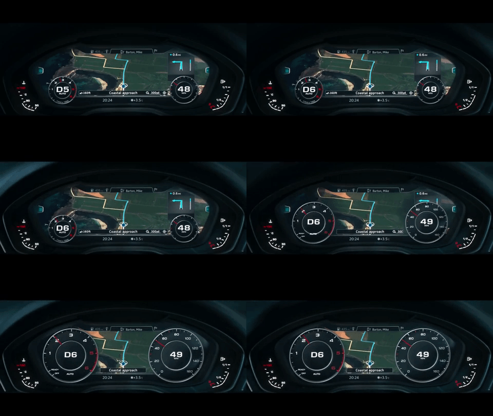
Audi’s Virtual Cockpit system takes the idea of a high-end instrument panel to another level – Volkswagen has a similar system, but on its vehicles, it’s called Digital Cockpit. The system isn’t cheap, but it’s definitely worth the extra money. Instead of traditional gauges, the Virtual Cockpit features a 12-inch screen that allows you to prioritize not only the speedo and tach, but also navigation. It can also display playlists, phone calls, and other handy items.
Lastly, the 2018 Ford Mustang is another car with an insanely cool instrument cluster. I have some experience using this one firsthand and while I didn’t get loads of time using it, I was immediately blown away at just how customizable it was. Just like others on this list, the 12-inch display alters the information that’s shown based on what driving mode the car is in.
But drivers can also choose what gauges they want to be displayed in the specific mode, the background colors, and more. The system’s so customizable, that you can even create your own color if you don’t like the ones that Ford offers. The best thing about the Mustang’s cluster, though, is that if you’re not interested in all of this fancy stuff, you don’t have to use it – which isn’t the case with others on the market. And it’s pretty easy to get a grasp on.
If it were up to me for the best-looking instrument panel, it would have to be for the Mustang’s cluster. It looks fantastic, is customizable, easy to learn, and isn’t a mandatory part of the driving experience. Sure, it can make it more enjoyable, but you’re not going to have frustrating moments like you might with Audi’s or VW’s systems.
What’s your favorite? Is there an instrument cluster I overlooked or would you cast your vote for one of the ones above? Let us know below.


