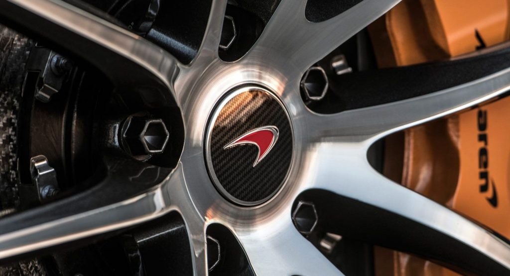
Automaker logos often have histories as interesting as the cars they adorn. Like BMW‘s roundel, or the Ferrari’s Prancing Horse and Porsche’s crest. But what about McLaren?
That’s the question that Carfection seeks to answer in its latest video short. And the answer is anything but straightforward.
To hear Drew Stearne tell it, there are three explanations. One is the “official” story, that it represents the vortices stemming from their cars’ aerodynamics, those swirling gusts of air coming off the tail that you can see in the wind tunnel. And there may be something to that, but it’s not the whole story.
The shape evolved from two icons of McLaren’s past: the Marlboro logo and the kiwi bird. The tobacco company was largely responsible for bringing Ron Dennis‘ and Bruce McLaren’s firms together to form the F1 racing team we know today, and remained one of its principal sponsors for years. That swoosh logo looks like an evolution of Marlboro’s signature chevron emblem, though no one in Woking would admit that much. Especially not since Marlboro left for Ferrari.
The other is the kiwi bird that Bruce McLaren put on all his cars. The rotund, flightless little birds are something of a national emblem in Bruce’s native New Zealand, and they were consistently represented in an increasingly streamlined form on each of his mechanical marvels throughout his career.
The truth, as in most cases, probably takes elements from each. Listen to each in the three-minute clip below and see which rings truer in your ears.


