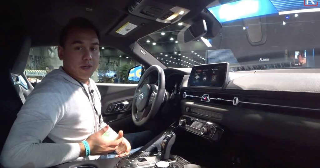
The interior of the all-new Toyota GR Supra is the part of the car most visibly related to the BMW Z4 but is that really a bad thing?
Designers clearly made efforts to distinguish the Supra’s dashboard from the BMW Z4’s and it would be unfair to say the cars look identical inside. They do look similar but saying they’re alike would be a stretch. Still, the BMW switchgear, infotainment system, gearshift lever, steering wheel buttons and stalks are all there, constantly reminding owners of the car’s Bavarian genes.
While everyone would have preferred a cockpit inspired by that of the Toyota FT-1 Concept, the real thing isn’t bad at all. On the contrary, Redline Reviews’ Sofian Bey believes it’s definitely a premium cabin after taking a close look at it at the Detroit Auto Show.
That’s not surprising since there’s a lot of BMW in there. The materials are nice and soft, the metal inlays look classy, the sports seats are upholstered in high-quality leather, and the iDrive-powered infotainment system is top-notch both in terms of operating speed and graphics.
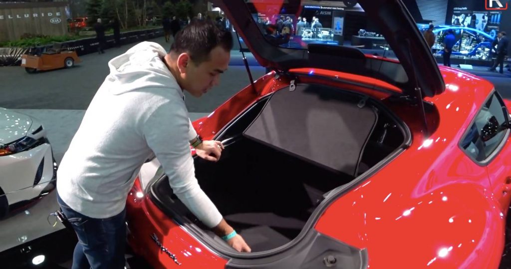
As for practicality, headroom is adequate thanks to the double-bubble roof, and access to the trunk is made easy by the Supra’s rear hatch. Obviously, cargo volume seems pretty small but whatever space is in there does look usable.
Overall, the Supra’s interior looks very well tied together and more practical than the BMW Z4’s — minus the latter’s unlimited headroom, of course. While some people may complain that it looks too much like a BMW, most buyers will probably take it for what it is: a better-quality cabin than most “real” Toyotas have to offer.


