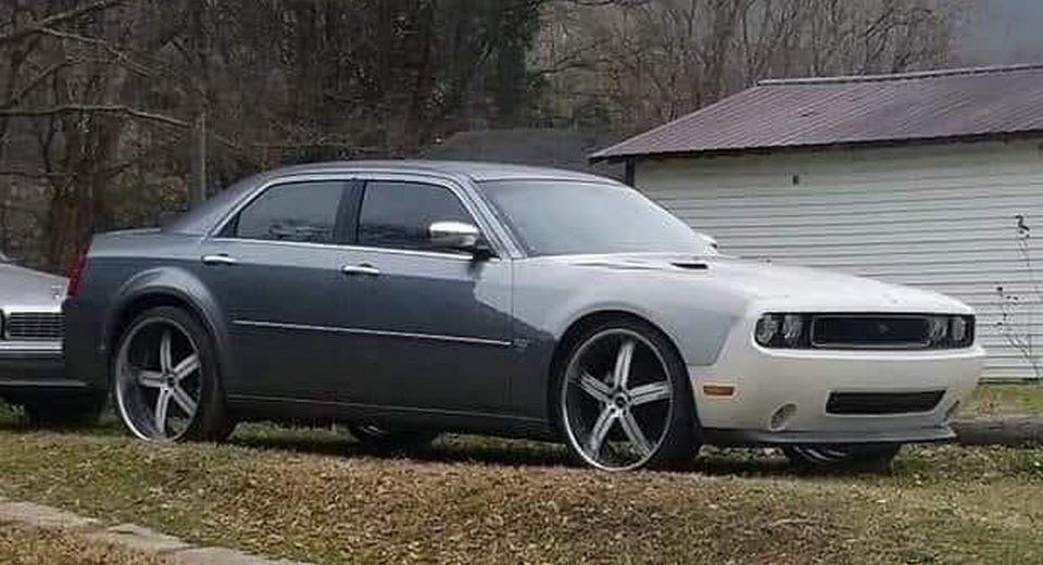
Even though the Dodge Challenger’s timeless design would probably still work well with two extra doors, the truth is that its front fascia doesn’t really match the bulky proportions and rough edges of the old Chrysler 300.
When the modern-day 300 was designed back in the early 2000s, project engineers looked at past 300-Series Chryslers for inspiration. This is why, for example, the rear end of the 300C might remind you of the 300B from the mid-50s, which led to the new model having such an iconic and instantly recognizable aesthetic.
Looking back, there are plenty of bad things one could say about the first-generation 300. It drove like a barge, its interior was poorly built, and overall reliability hasn’t exactly been great. Still, it looked unlike anything else on the road – which is actually as true now as it was in 2004, when it entered production.
Fast-forward to 2008 and out came the third-gen Dodge Challenger, which really took after the original model from 1970 (introduced in fall of 1969). Right now, the Challenger is probably the only new car on sale in the U.S. that looks genuinely retro, so you can probably see why interfering with its design would be problematic – and may explain why Dodge hasn’t replaced it yet.
The creation pictured here is a Frankencar that tries to blend the front end of the Challenger to the body of the 300. Unsurprisingly, the image, taken by Dustin Hale, ended up on Reddit, as it ruins the characteristic front end of the 300 and isn’t that convincing as a four-door Challenger either.
But, beauty is in the eye of the beholder and we can’t exactly fault the execution, at least not from a distance; however, we’d rather it sported the stock front fascia instead.


