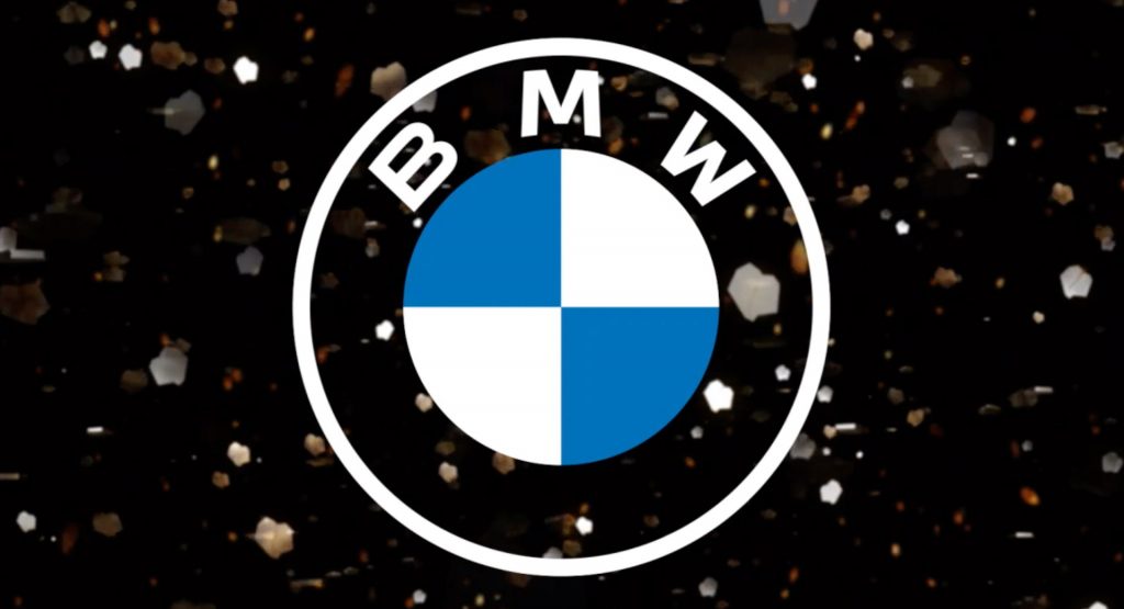
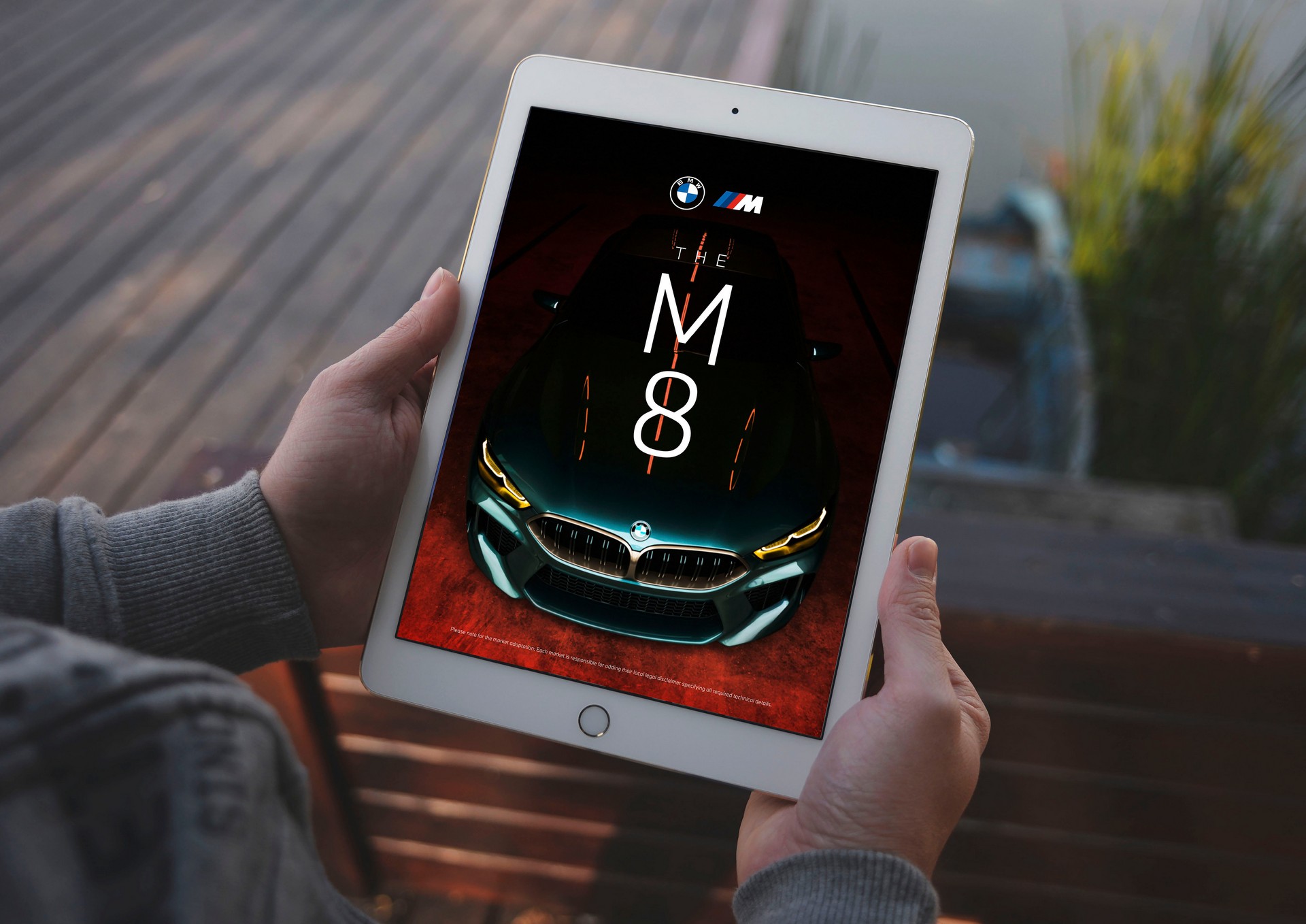
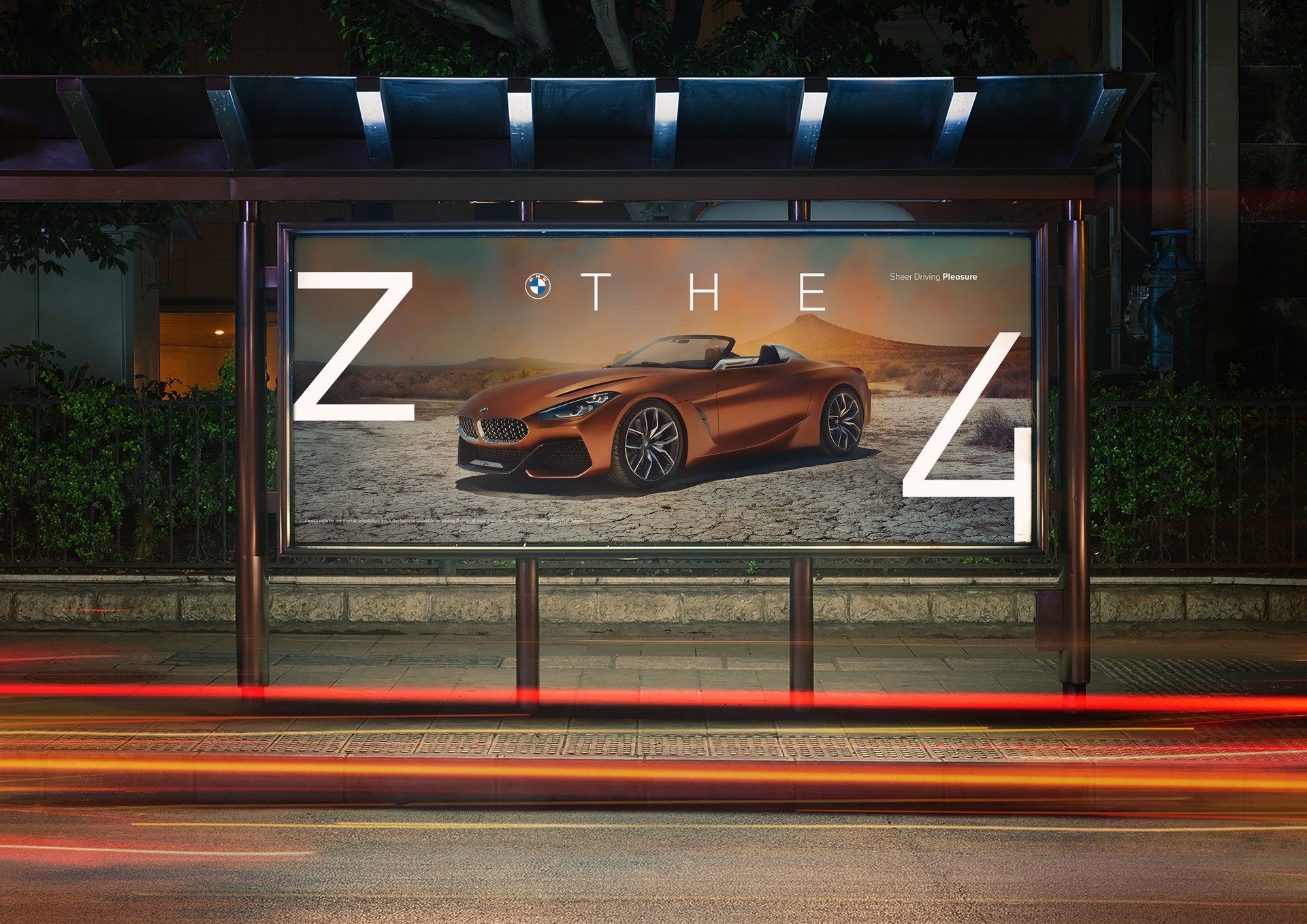
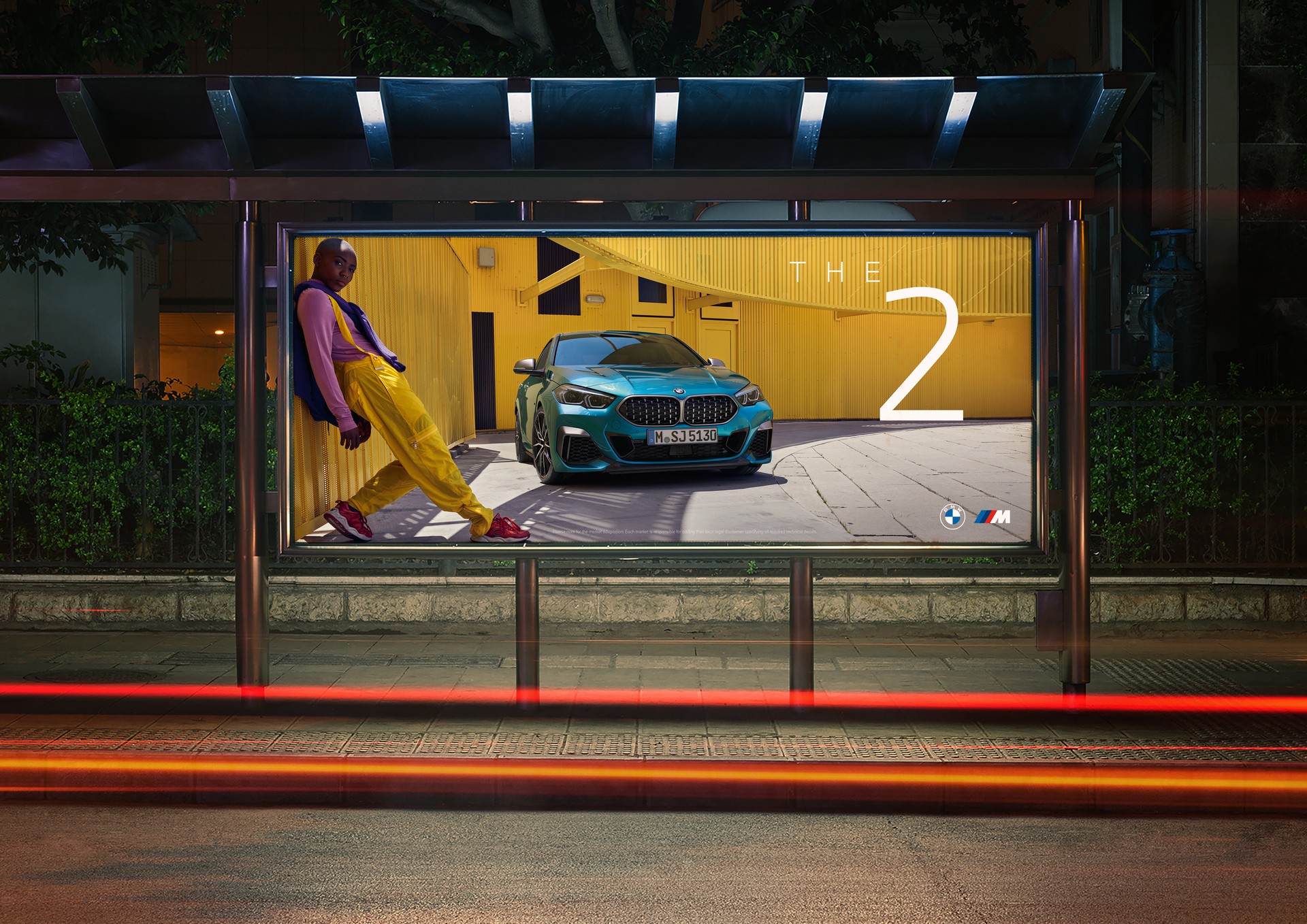
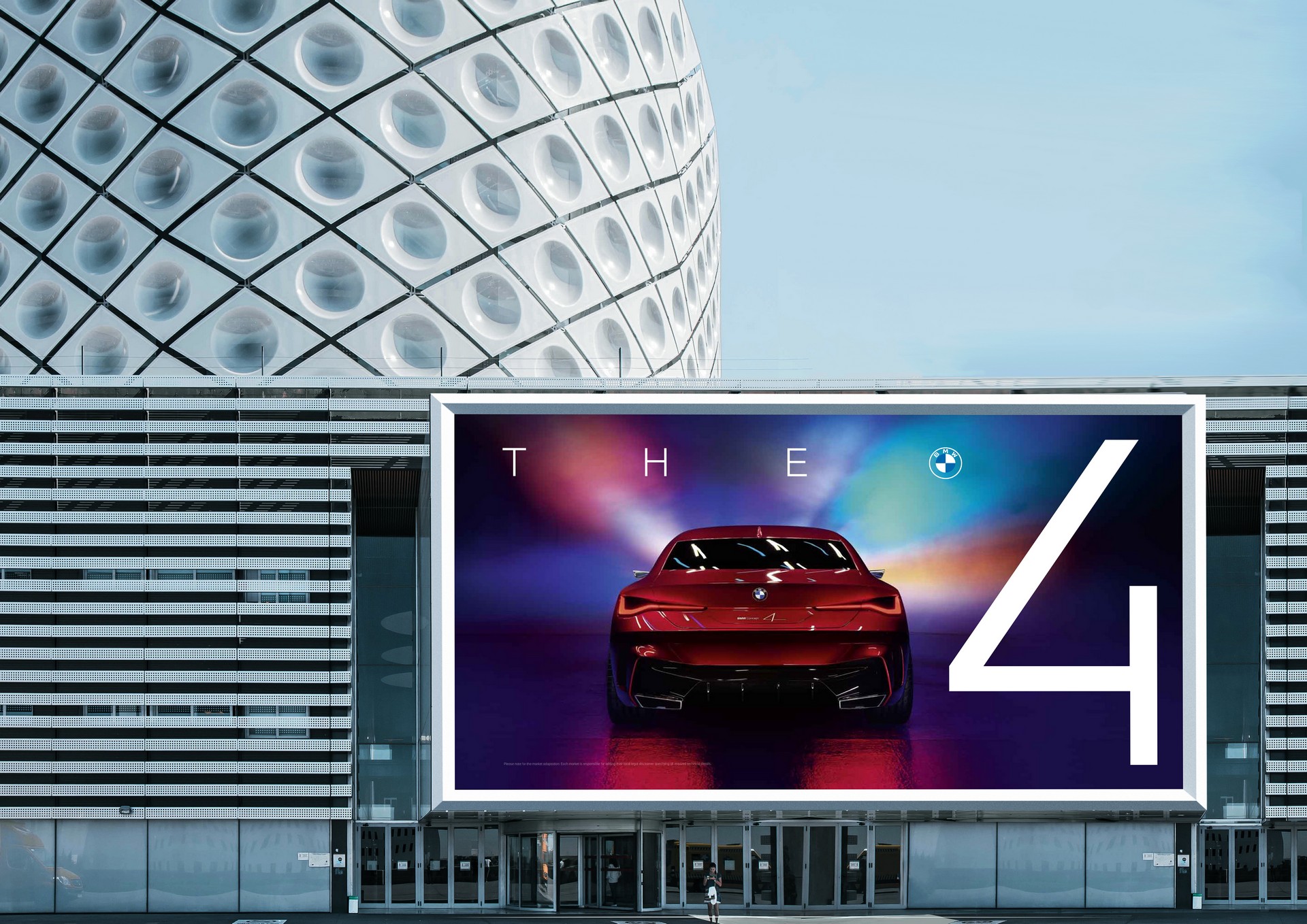
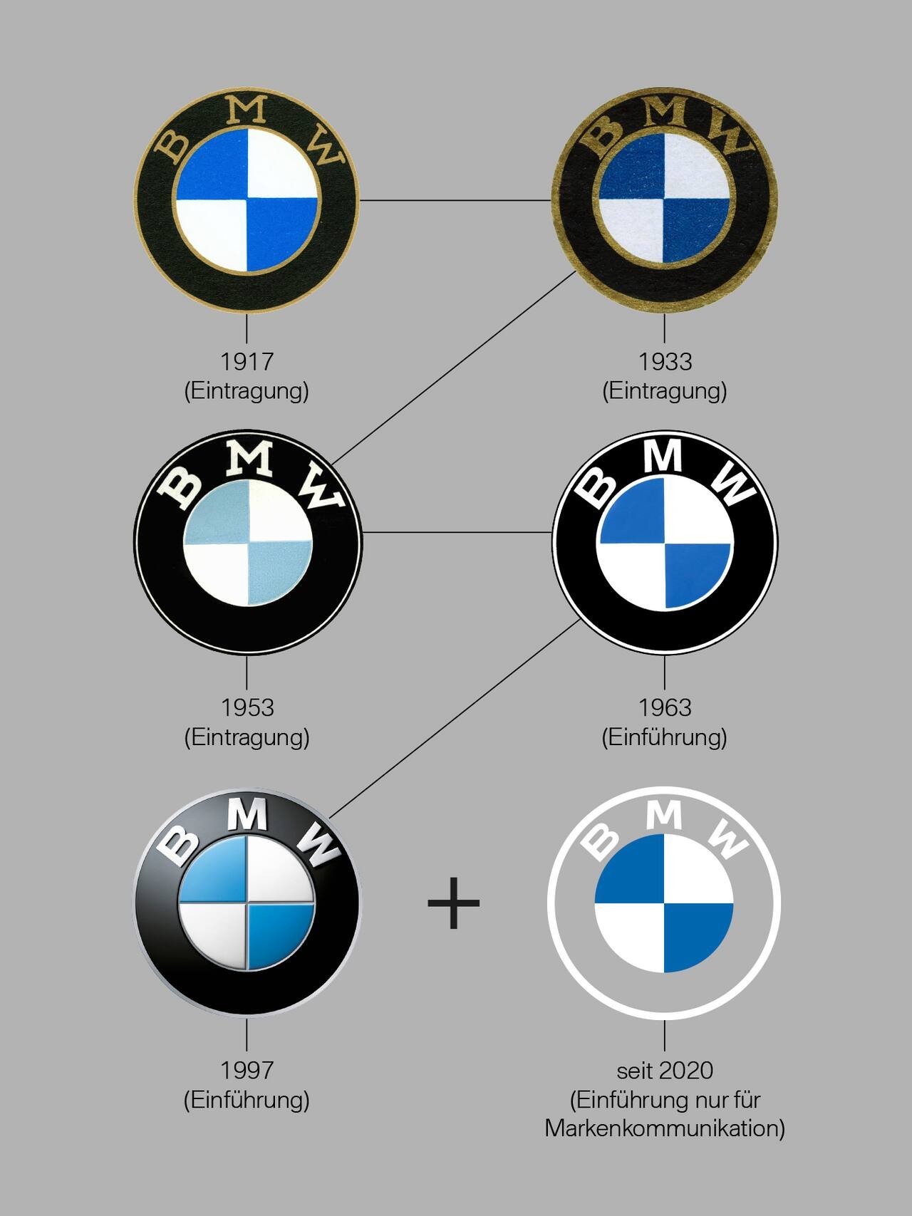
We got a first look at BMW‘s new flatter and partially transparent logo on the i4 concept earlier this week. At the time it wasn’t clear if it would be adopted by the brand, but today, the Germans revealed that along with the reworked BMW i and BMW M logos, it will be used as a “new corporate identity for online and offline communication purposes”.
According to the automaker’s marketing hyperbole, “the new design is an expression of the revised brand identity, which places the customer at the center of all activities”. In essence, getting rid of the black surround means BMW is customer-centric … or something like that.
If that wasn’t enough of a stretch, the company says the new “pared-down and two-dimensional” look “conveys openness and clarity.” Of course, clarity is going to be an issue on white backgrounds.
Also Read: BMW Debuts New Flat Transparent Logo On The Concept i4
Continuing down the marketing rabbit hole, the automaker says the transparent ring is a “more open invitation than ever for customers to join the world of BMW. The change reflects BMW’s transition from centering purely on the automotive world to being about technology and connections.”
The company added the new logo is “geared towards the challenges and opportunities of digitalization” and “expresses openness and strength of character to ensure a contemporary, future-proof presence both on- and offline.” BMW went on to say the logo better reflects the “expectations and visual style of today,” and that’s hard to argue with as the faux 3D effect is very 90’s.
Despite all the marketing fluff, BMW confirmed the new logo won’t be used at dealerships or on vehicles. That’s probably a good call as it would look terrible on white cars and dealership billboards.
Mockup of new BMW logo on a white background
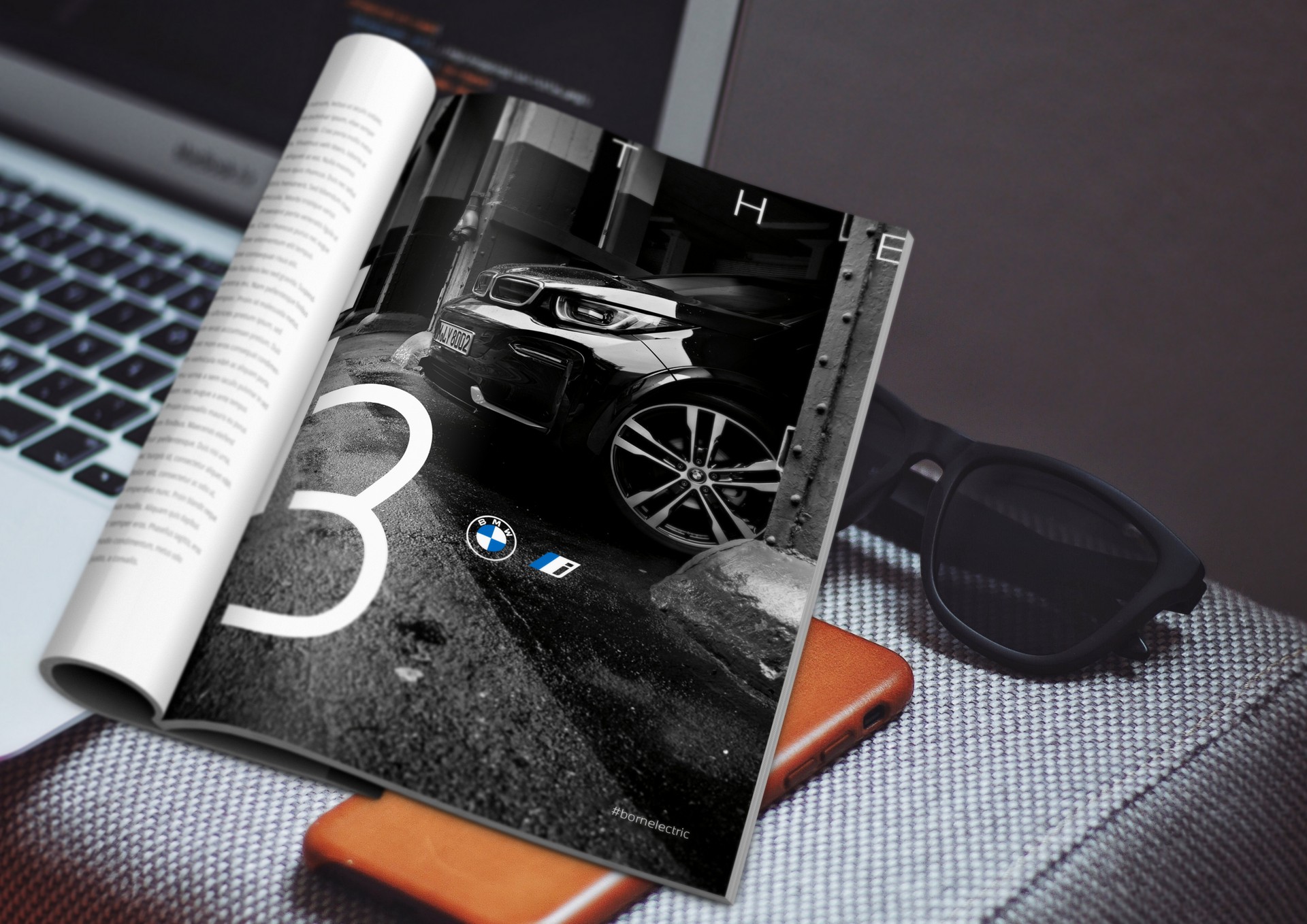
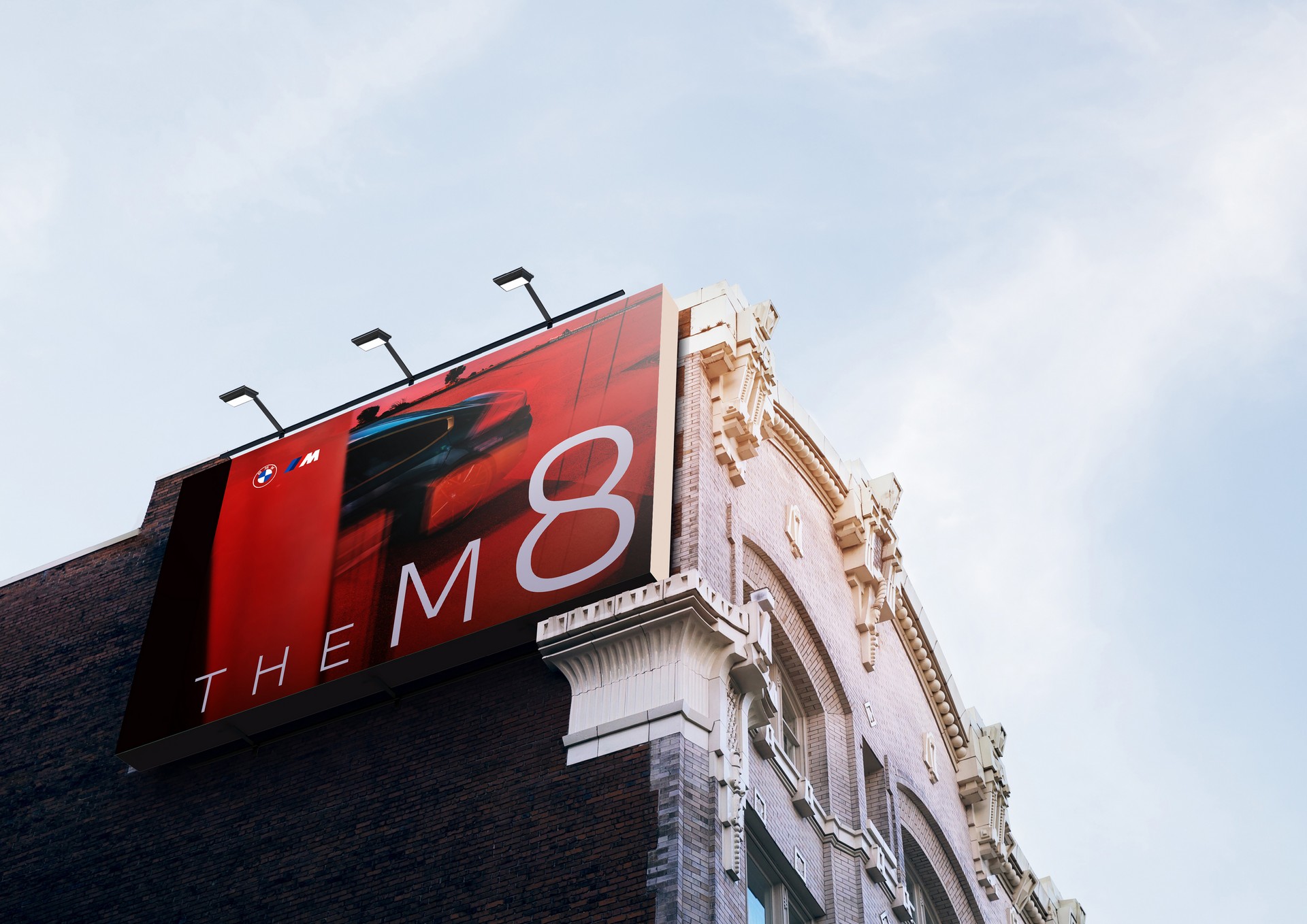
Instead, the new design will be used on all of the company’s communications as well as for trade fairs and events. The transition to the new logo will be complete by May 31st, 2021 and the company reiterated the old logo isn’t going away. Of course, that kind of defeats the point of creating a new logo in the first.
Regardless, the company also introduced new versions of the BMW i and BMW M logos. They feature a flatter design that trades chrome-like accents for plain white details.


