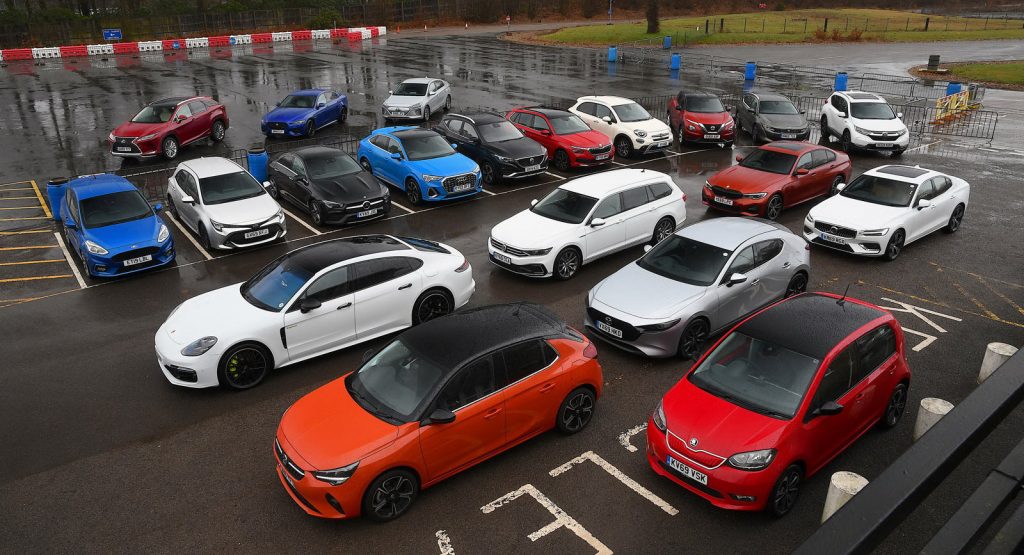
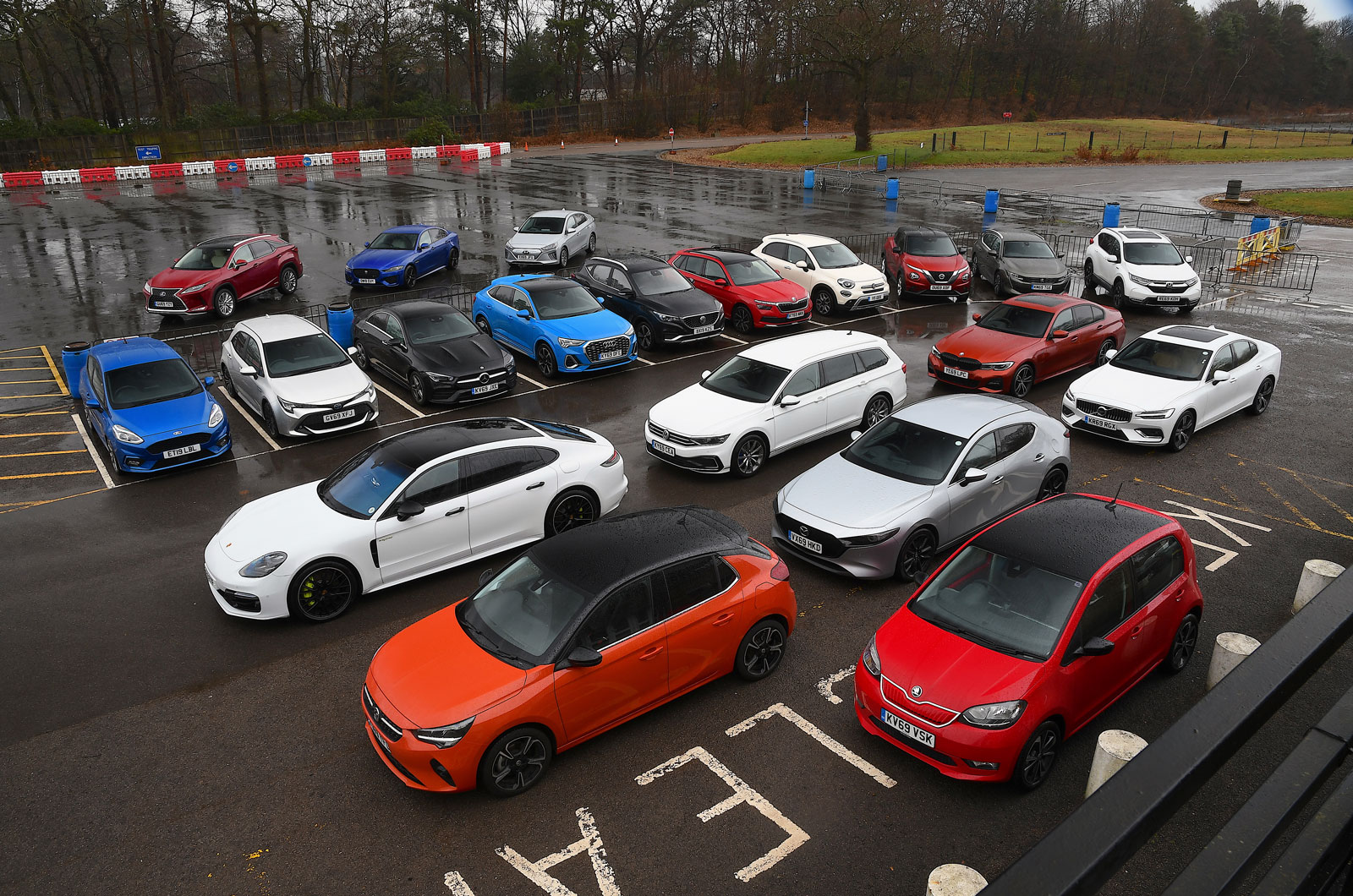
An in-depth study regarding infotainment systems was recently carried out in the UK, with 20 vehicles’ infotainment and air-con controls being put to the test in order to see how distracting (or not) they were while being operated on the move.
It’s already been established that fiddling with a touchscreen can really impact your reaction time, but that’s a completely different study.
Still, most carmakers are now using fully digital displays, having ditched console-based rotary dials.
In order to see which modern-day Infotainment system is best/worst in terms of how distracting it can be, WhatCar began by filming two people driving 20 different cars, featuring different types of systems and dashboard layouts.
One result showed that even though the drivers had time to get familiar with each system, it took more than twice as long to perform a task such as adjusting the heater fan via touchscreen than with a dial or physical switch. It also took more than four times as long to zoom out on a sat-nav map and eight times as long to scroll down a list of radio stations.
Read Also: Honda Goes Back To Dials And Buttons As Customers Grow Weary Of Touchscreens
To make matters worse, using voice control to find the nearest fuel station (which in theory shouldn’t be too distracting) made drivers take their eyes off the road for more than 10 seconds if the system was slow to respond, prompting them to go through multiple other stages in order to complete the command.
“When you consider that a car covers 13.5 metres per second at 30mph, in our worst case scenario of spending more than 42 seconds not looking at the road, the vehicle will have travelled the length of almost six football pitches in that time.”
All in all, the following six tests were performed:
1. Turn up the temperature by 2 degrees
2. Increase the fan speed by two settings
3. With a 20-mile route programmed into the sat-nav and the infotainment screen on the home page, go to the map screen and zoom out to see the entire route
4. Cancel route guidance
5. With the radio tuned to Virgin Radio DAB and the infotainment screen on the home page, go to the main list of DAB stations and switch to BBC Radio 4
6. Using the voice control button on the steering wheel (where fitted), ask the car to find the nearest service station
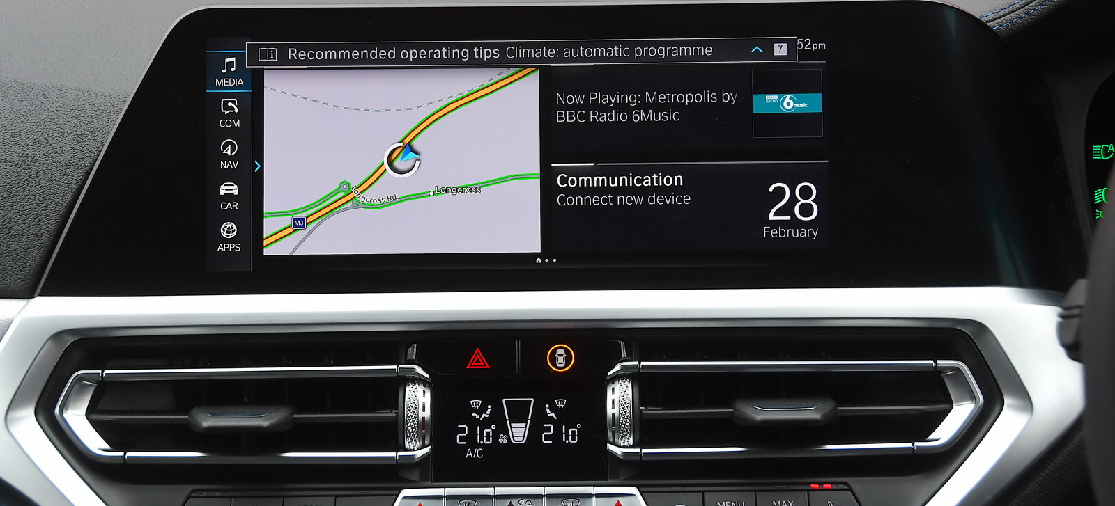
While you can have a more in-depth look at the results by clicking here, we’ll just go ahead and run through the winners and losers, from least to most distracting (30 is the perfect score). And the winner is… BMW.
1. BMW 3-Series with Live Cockpit Professional (28/30)
2. Mercedes CLA with 10.25-inch touchscreen (27/30)
3. Porsche Panamera with Connect Plus and PCM (27/30)
4. Audi Q3 Sportback with Virtual Cockpit Plus (26/30)
5. Mazda 3 with 8.8-inch color display and Mazda Connect (25/30)
6. VW Passat with 8.0-inch Composition Media System (24/30)
7. Ford Fiesta with Sync 3 and FordPass Connect (23/30)
8. Hyundai Ioniq with 10.25-inch screen and Bluelink (22/30)
9. Vauxhall Corsa with 10-inch Multimedia Navi Pro (22/30)
10. Skoda Kamiq with 9.2-inch system (21/30)
11. Jaguar XE with 10-inch Touch Pro Duo system (21/30)
12. Volvo S60 with Sensus (20/30)
13. Toyota Corolla with Touch 2 media system (20/30)
14. Nissan Juke with Nissan Connect (19/30)
15. Honda CR-V with 7-inch touchscreen and Honda Connect (18/30)
16. Lexus RX with 12.3-inch multimedia display (18/30)
17. Peugeot 508 SW with 10.0-inch Connected 3D Navigation (17/30)
18. Skoda Citigo-e iV with color screen (16/30)
19. Fiat 500X with 7.0-inch touchscreen and Uconnect Live (14/30)
20. MG ZS with 8.0-inch touchscreen (12/30)
If you own one of these models, or a separate one that still features one of these infotainment systems, let us know how distracting you’ve found it to be while driving.


