In recent years, more and more cars have started to hit the market with tablet-like infotainment screens that oftentimes dominate the driving experience.
Tesla arguably kick-started the trend with the introduction of huge portrait displays in the Model S and Model X before shifting things up a new gear with the Model 3 whose cabin is dominated by a horizontal display and not much else.
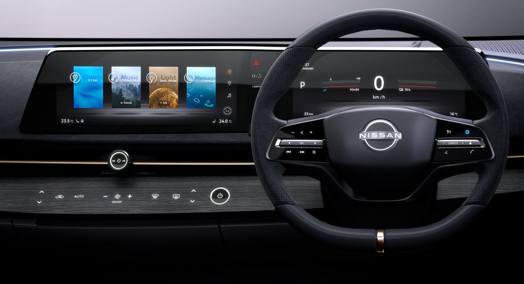
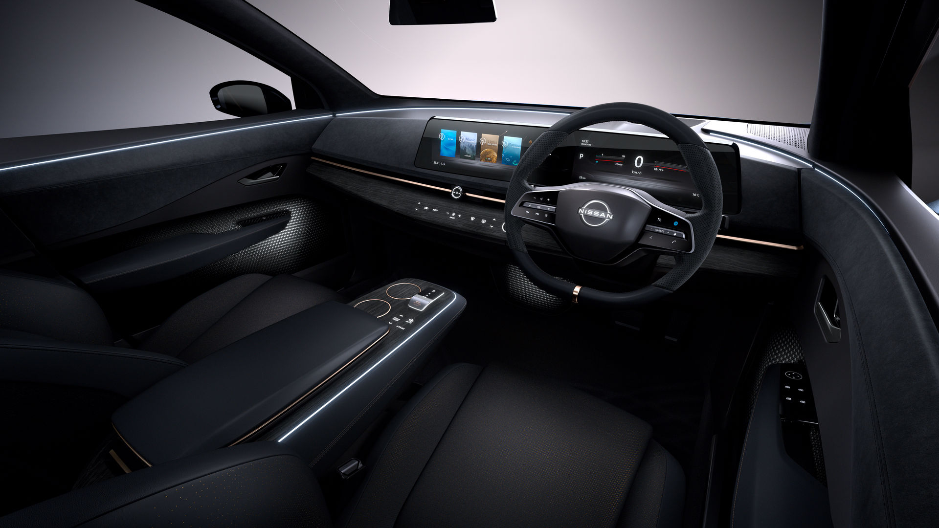
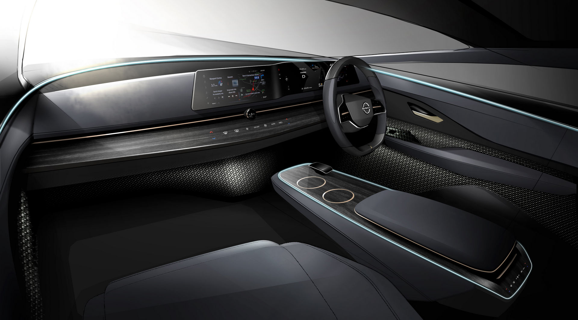
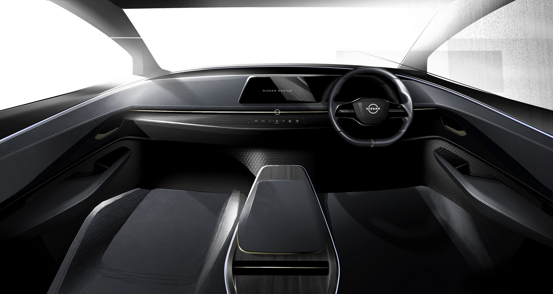
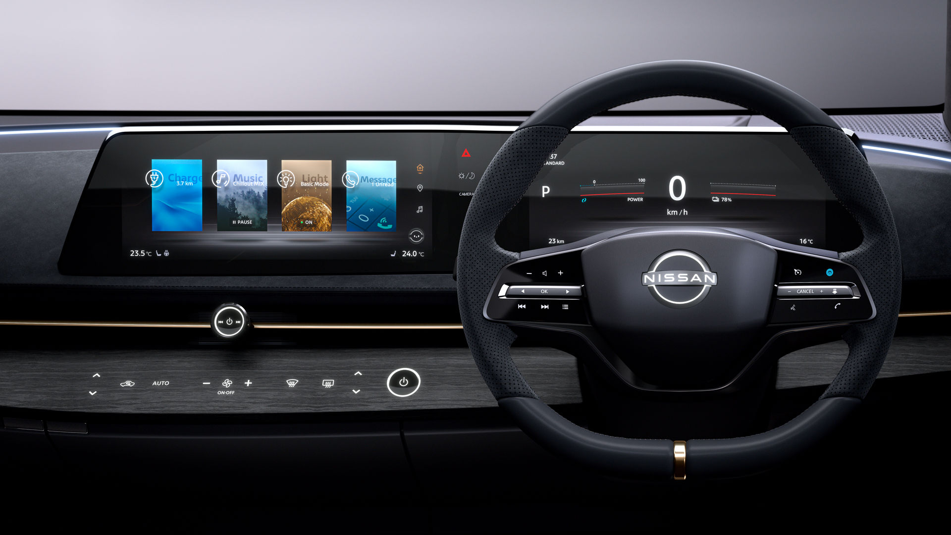
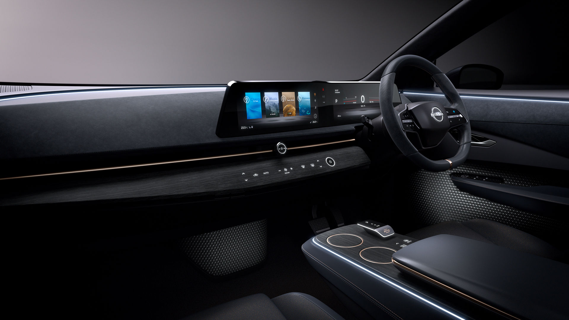
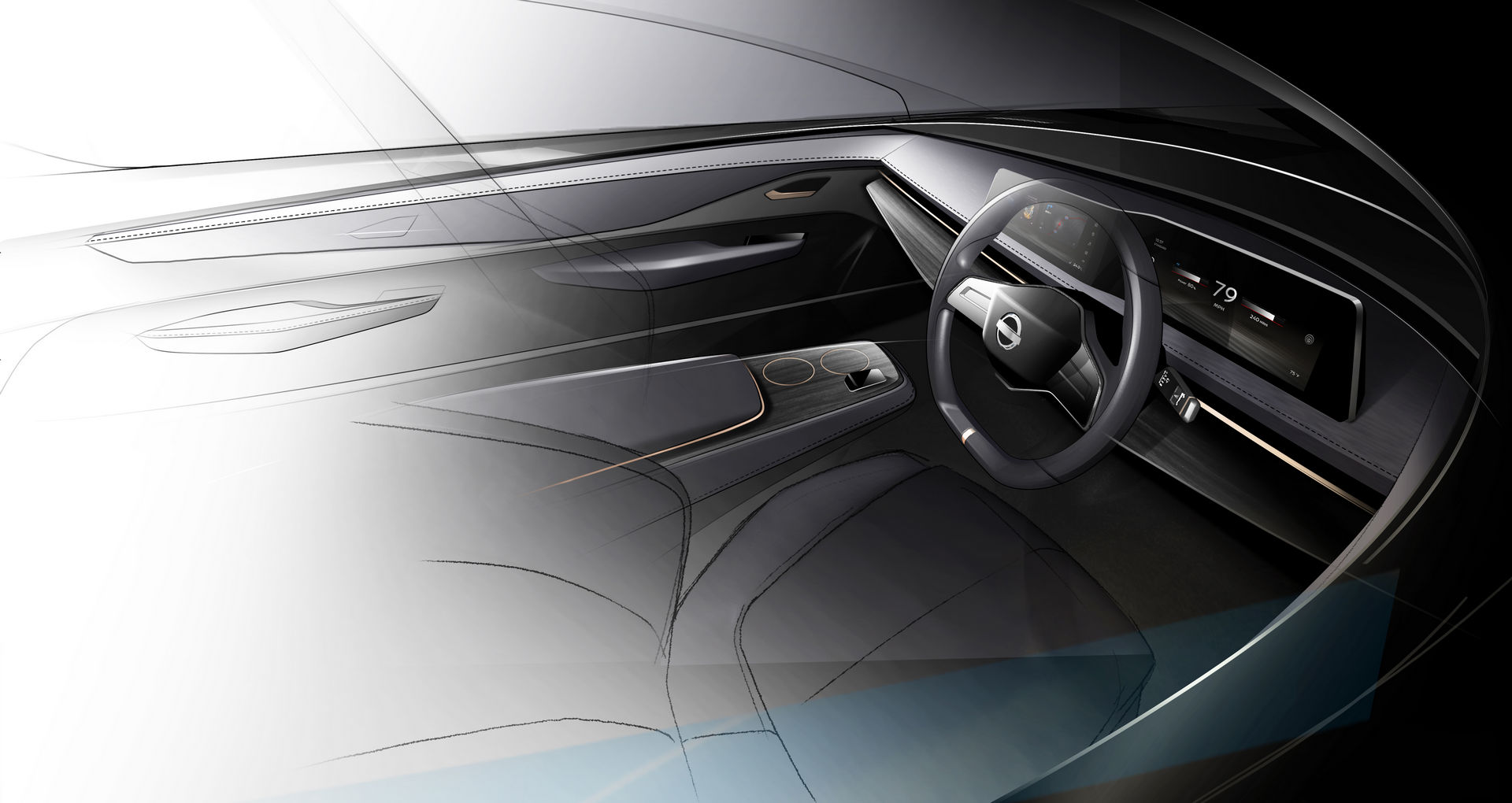
Nissan, however, says it is bucking this trend and is using the recent Ariya Concept as an example. Unveiled at last year’s Tokyo Motor Show, the study features a sleek horizontal infotainment screen sitting atop the dashboard, seamlessly joining an all-digital instrument cluster.
Read Also: Amazon’s Alexa Is Coming To More Cars And Might Be Joined By A Fire TV Entertainment System
It’s a philosophy adopted by many other automakers and it not only looks good but, according to Nissan, is also more intuitive than tablet-like screens. “The human eye naturally looks from side to side when driving,” said Tomomichi Uekuri, senior manager of Nissan’s HMI (Human Machine Interface) engineering team. “People can see and absorb more information if it’s laid out horizontally. Peripheral vision works this way as well.”
Nissan also says such a setup means the screen is in the line of sight to the driver and closer to the road. In designing the screen used by the Ariya Concept, Nissan developed software that allows information to be moved or swiped between the infotainment screen and instrument cluster in an easy and seamless fashion.
What about you, are you a fan of the tablet-style infotainment screens becoming commonplace or do you prefer more subtle designs?


