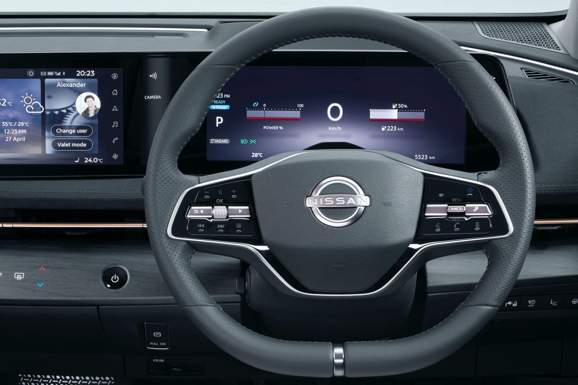
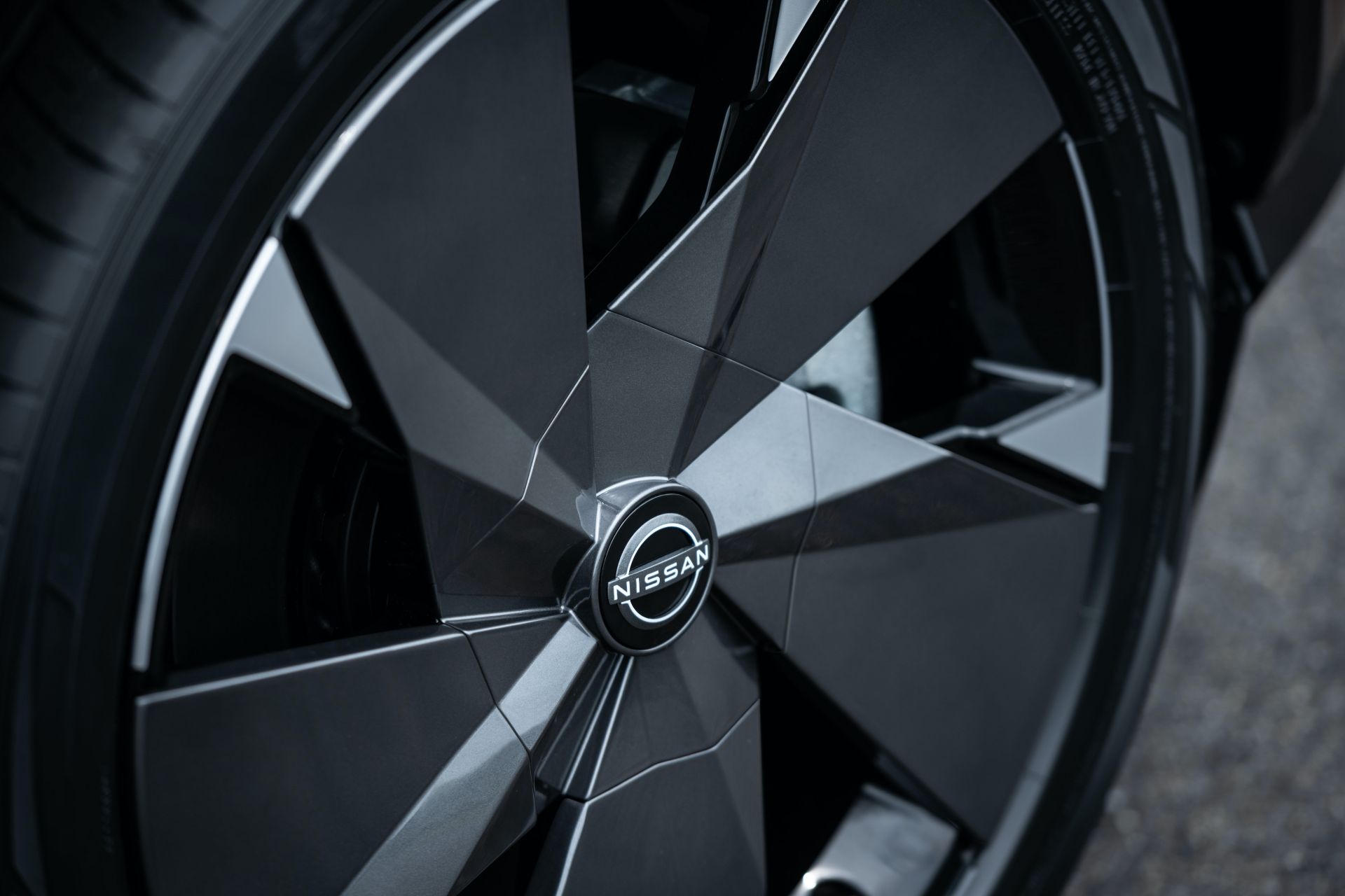
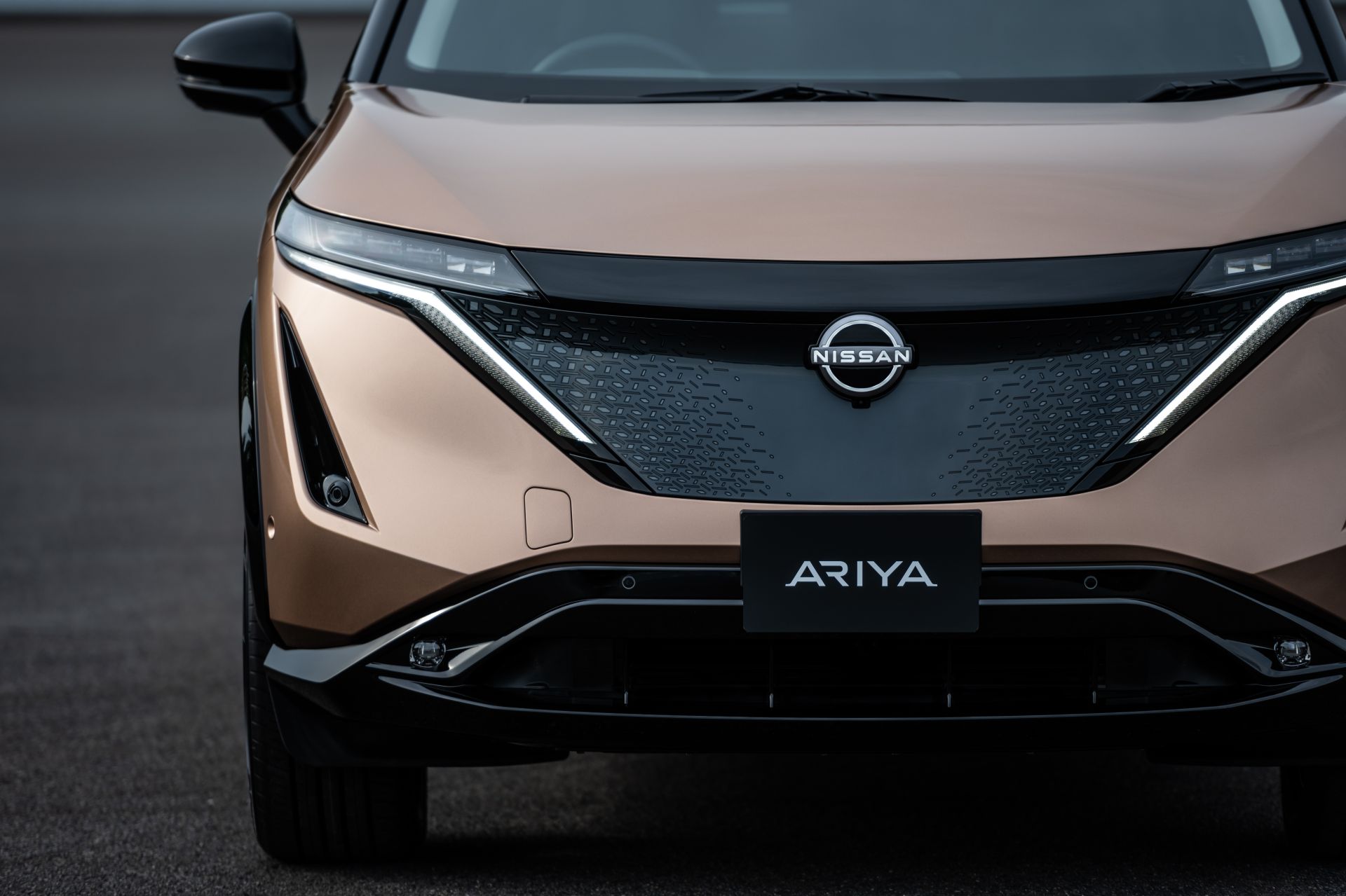
The Nissan Ariya global electric crossover is a very important vehicle for the Japanese automaker; in fact, it’s so important that it was chosen to debut the brand’s redesigned logo.
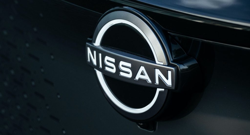
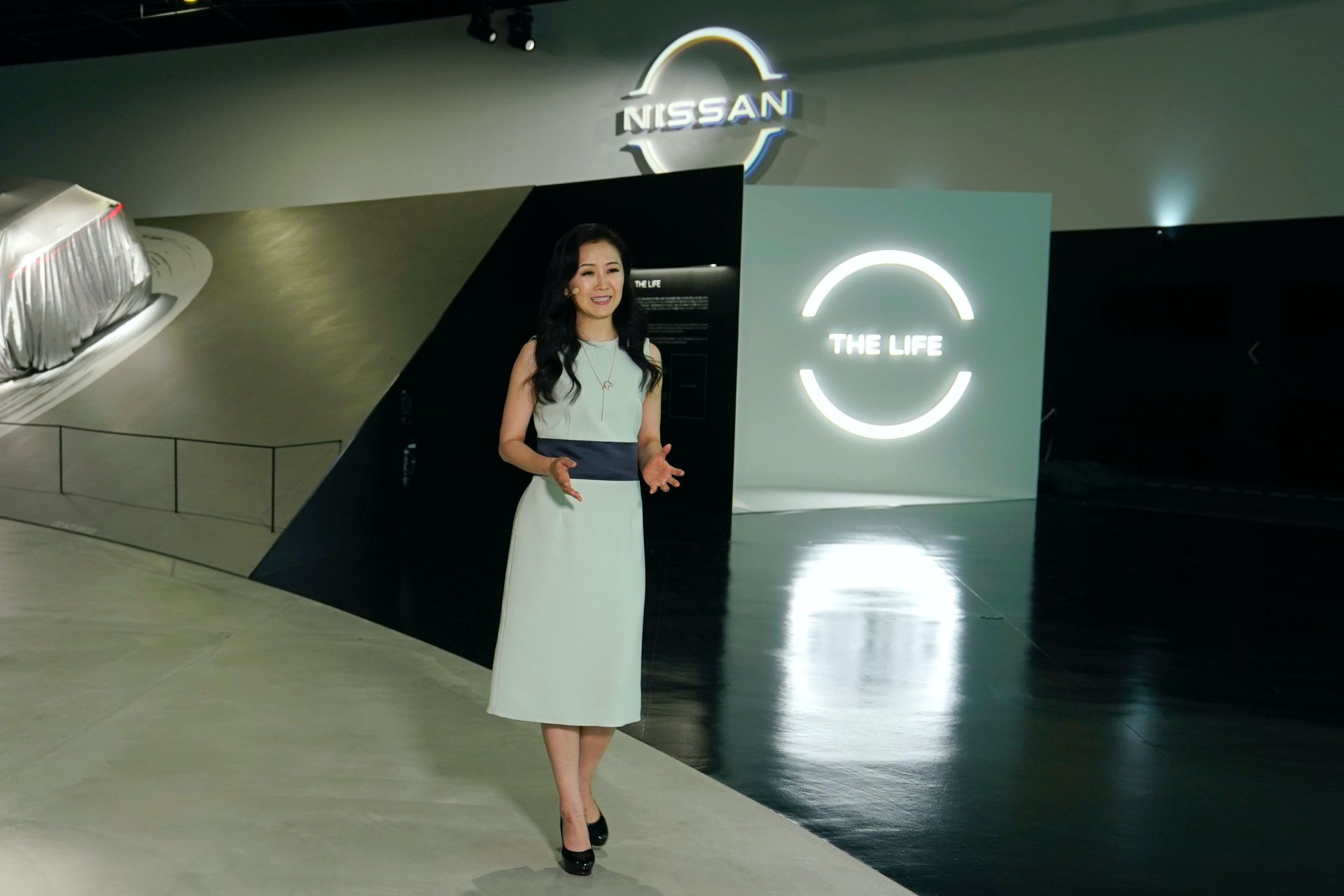
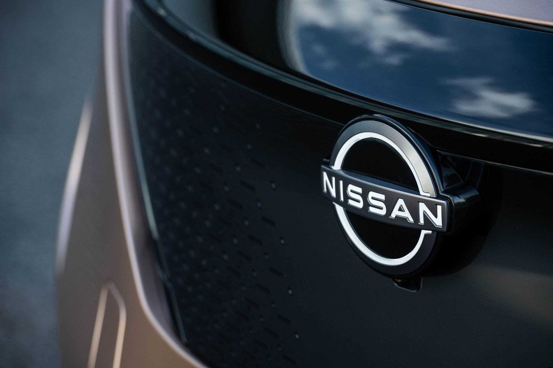
It’s the first time in 20 years that Nissan refreshes its logo, with the new one reflecting “the significant changes in society over the last two decades.” The automaker also describes it as “a reimagination of the iconic Nissan brand logo for a new chapter.”
As with Opel’s new logo, Nissan’s new emblem debuts on an electric vehicle at a time when the brand looks to the future while staying connected to its heritage. The company name remains at the center of the logo and from now on will be illuminated on all-electric models.
See Also: VW Unveils Their New Logo And First Ever “Sound Logo”
As a result, the thickness of the logo’s outline has been slightly increased to ensure a crisp impression when lit. Obviously, the logo also had to make a strong impression when not illuminated, which is why it has a two-dimensional impression that makes it look more designed than manufactured. According to Nissan, “the overall effect of the redesign is a transition from a hard-edged, industrial feel to a refined, familiar and digital-friendly look.”
The logo is also said to signal that Nissan is not only a traditional vehicle manufacturer, but also a provider of mobility and services. The new Nissan logo will begin appearing this month, both in digital and physical forms. All Nissan EVs, starting with the Ariya, will feature an exclusive illuminated logo lit by 20 LEDs.
The new logo will be incorporated across mediums, from letterhead and dealership signs to social media and digital advertising. Moreover, in certain digital and video applications the logo will shift and pulsate against a variety of backgrounds.


