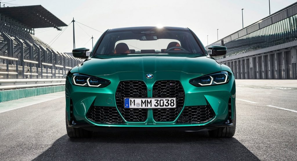
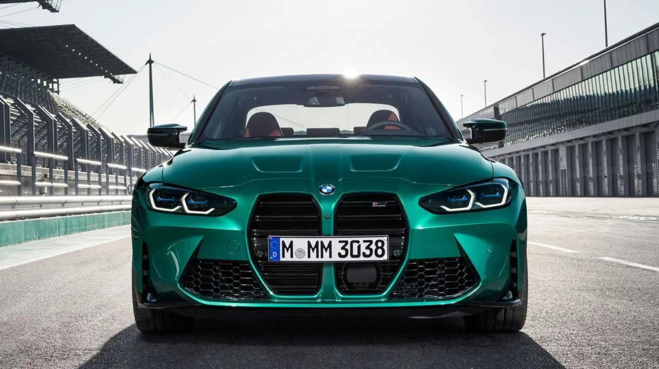
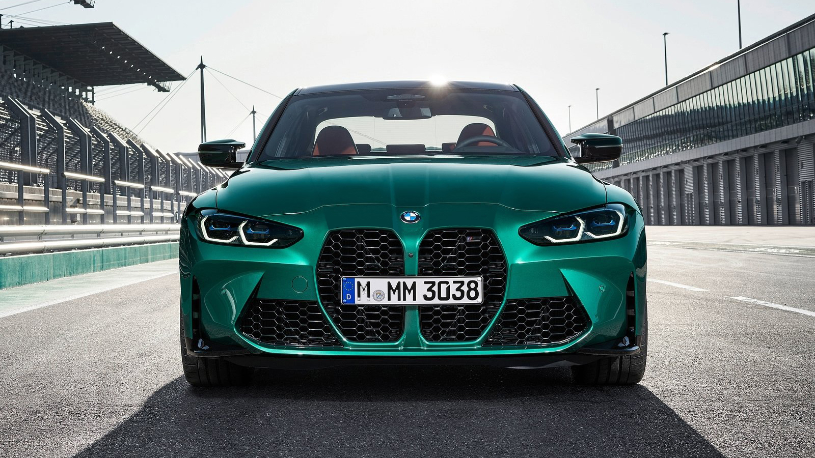
Ever since their reveal, the new BMW M3 and M4’s styling has been a point of contention due to their huge grille. With pricing having recently been announced, the cars have returned to the public eye.
Many people find the new grille, which now runs vertically, to be very unattractive compared to BMWs of the past. However, it might not be the actual grille that’s so unappealing, rather just the proportions and the the rest of the front end’s design elements. So, does this mean that it can it be fixed?
Read: BMW Doesn’t Mind If You Modify The 4-Series’ Massive Kidney Grille
Size not withstanding, some tweaks can be made without completely changing BMW‘s original vision, which is said to hearken back to the earliest cars in the company’s history.
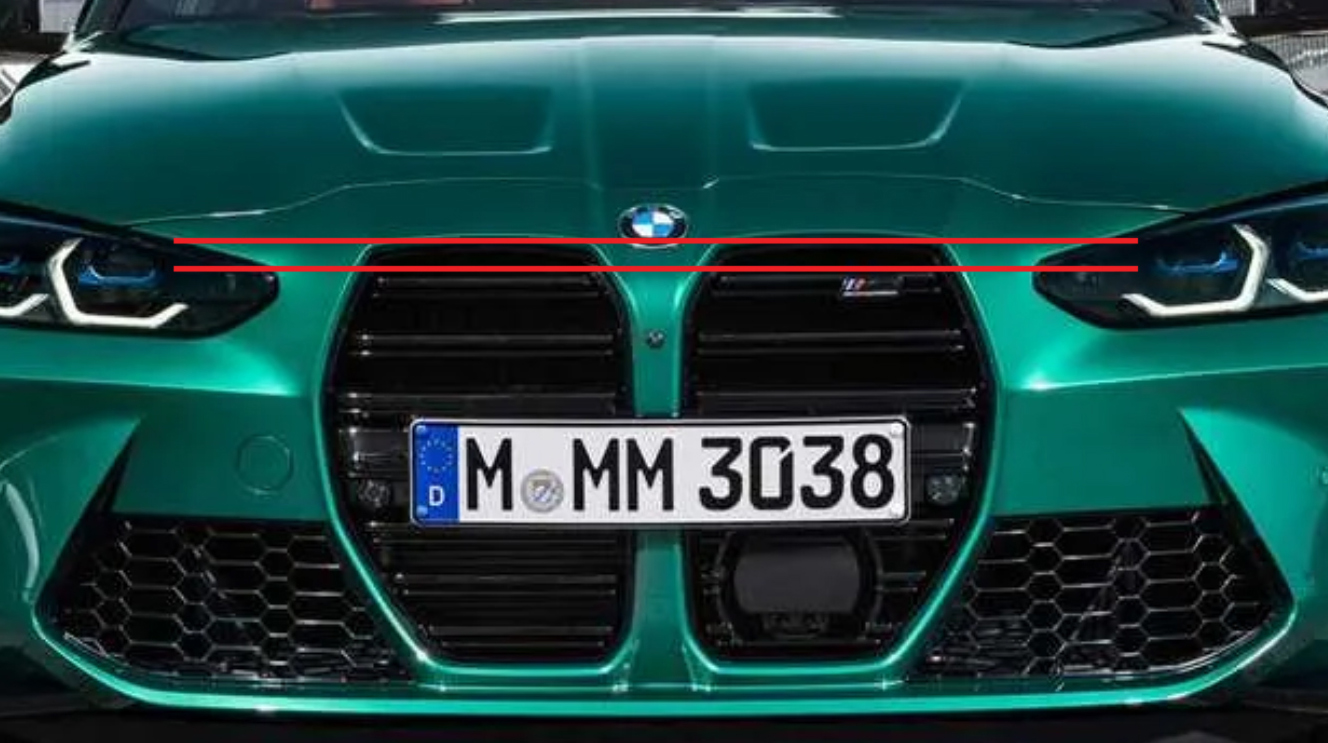
Looking at the front of the new M3, which shares its face with the M4, a few things stand out right away, one of which is the height of the grille. It extends well past the top of the headlights, making the proportions very awkward to say the least.
Take a look at any classically good-looking vehicle, and a common trait you’ll discover is that almost none of their grilles rise above the line of the headlights. If they do, it is usually only by very little.
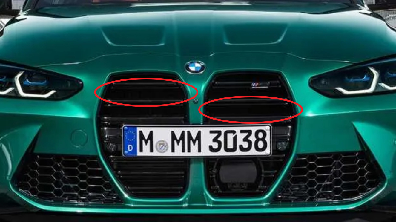
The other readily apparent issue with the grille is its pattern/graphical elements. As it currently stands, BMW has opted for horizontal bars instead of the usual vertical ones. That can be understood, however, as one could only imagine how much vertical bars would accentuate the grille’s height. Nevertheless, the bars leave a lot of empty space in between them, further adding to the gaping impression.
The following rendering fixes all of the issues mentioned above, and even addresses another minor one. It moves the top of the grille down to be in line with the headlights, replaces the bars with the mesh found in the side intakes, and removes the questionable double hood vents.
See also: Prior Design Is Working On A New Fascia To Fix The BMW M3 And M4
The changes are subtle, but they really help clean up the M3’s busy styling and reduce the emphasis on the two large kidney grilles. If not completely fixed, these small changes help the design a lot, and make a significant of difference without straying too far from the original vision.
Do you think this design looks better than the one on the stock cars? Share your thoughts on the comments below.


