Lately, the motoring press seems to agree on one thing: panning the designs of BMW. I can’t recall the last time any car company has come under heavy fire for their design blueprint. And I’ll gladly admit to being one of the many critics lambasting the ever-increasing grille size and buck-toothed form factor.
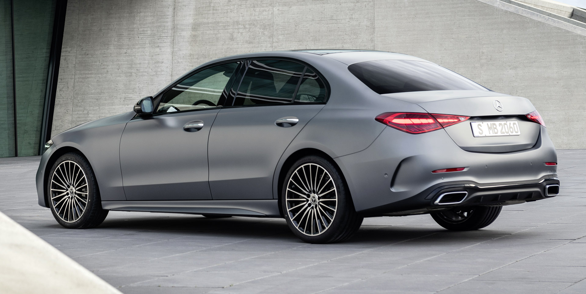
But since this week’s launch of the new C-Class, there’s yet another German stylistic query that I just can’t seem to get my head around: Is Mercedes’ cookie-cutter design policy a good thing or a bad? I’m leaning towards the latter.
Related: $10,000 Budget, What Used Fun To Drive Car Would You Get?
Don’t get me wrong; I understand the need to have an overarching brand identity. When done properly, it can solidify the connection people have with your cars in real terms, whether they see them on a screen or on the road.
![]()
![]()
![]()
![]()
![]()
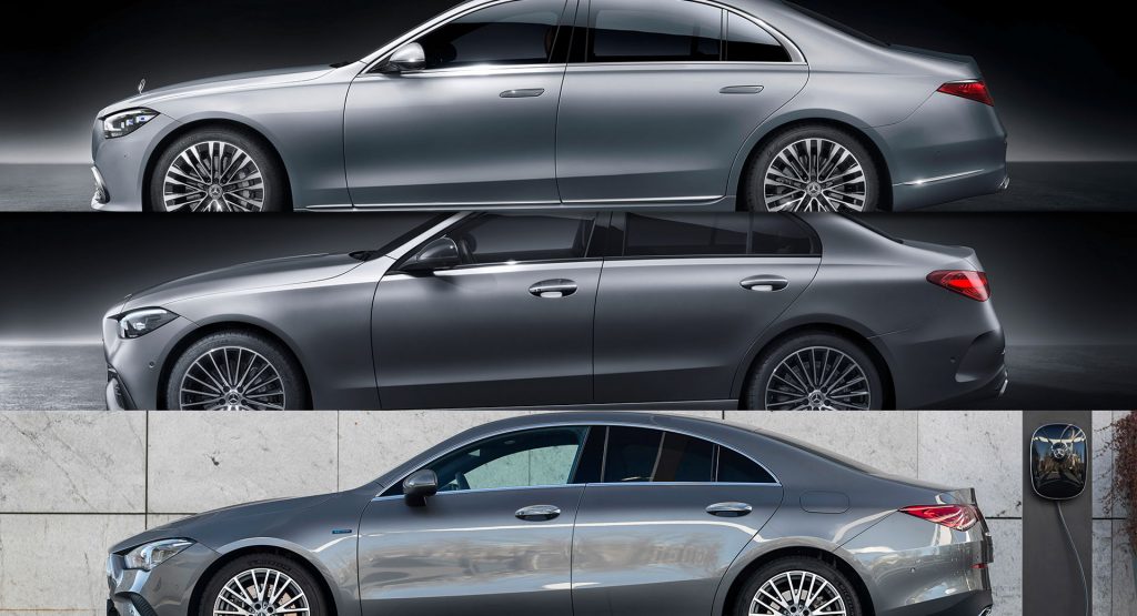
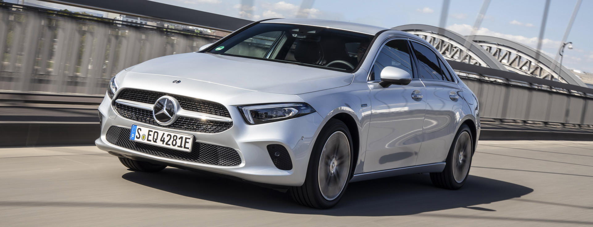
From top to bottom, the latest Mercedes-Benz A-Class, CLA, C-Class, E-Class and S-Class sedans
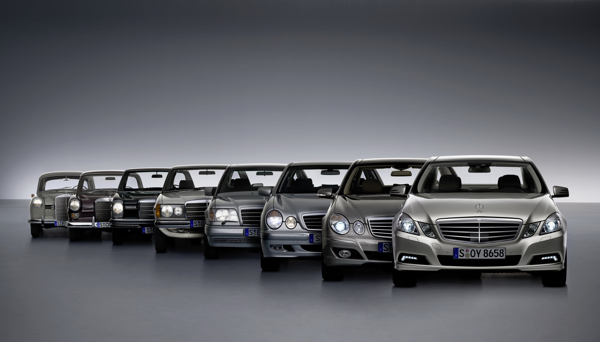
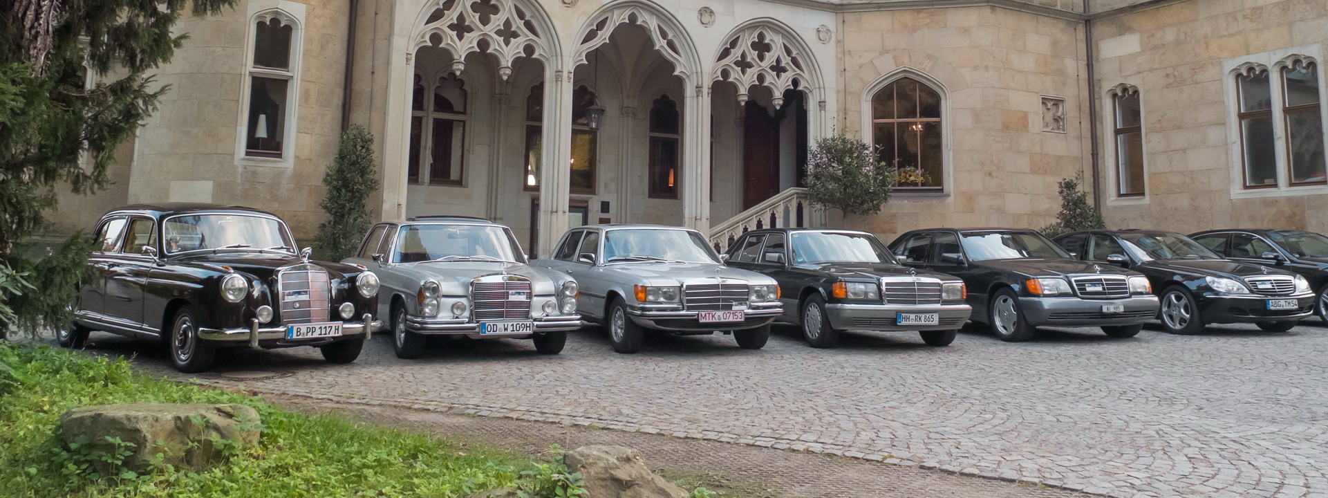
Mercedes-Benz were pretty much the masters of that approach. Take the designs of just a few generations ago. The pillars of the brand, the C, E, and S, were all designed in a way that not only instantly screamed “Mercedes”, but enabled even the casual observer to identify the model from just a few key elements.
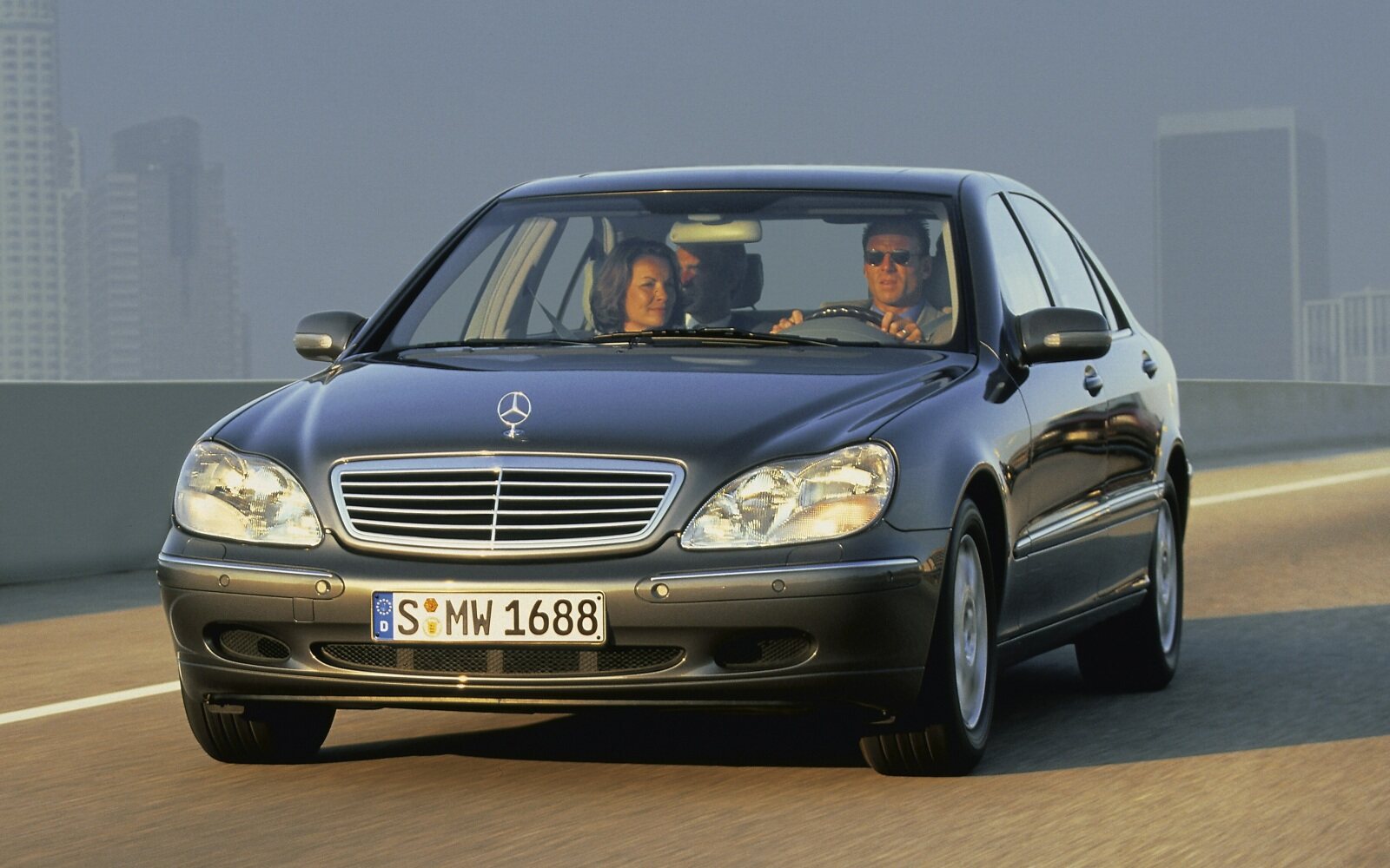
A W203 C-Class had a smaller rump, and styling didn’t try to compensate for a lack of physical size. It played to the “baby Benz” narrative and didn’t try to be something it wasn’t. The W211 E-Class, by virtue, was a more elegant shape. The trunk was pronounced, the bonnet longer, and the silhouette just a touch more squared off, lest those soft lines of a C-Class devalue your perceived purchasing power. At the top of the food chain, the W220 S-Class may not go down as the most loved Sonderklasse shape, but time has been kind to that generation S. Yet again, if you happened to see one on the road, you wouldn’t be in any doubt of its stature.
But today, Mercedes’ designs are less distinct from each other. The C-Class embodies the looks of the smaller A-Class Sedan (or is that the CLA – they too both far too similar), with the E and even the S. While the designers will probably have a field day pointing out the many small nuisances and individual changes, that’s the very problem: they have to be pointed out.
Let’s be clear: it’s not just about size. Because looking at one in real life is, granted, a very different experience. And yes, I — like most of you — haven’t yet seen the new C-Class in the metal. But in a world that bases impressions and judgment through a screen, having a model line whose products look distinct on a monitor and in-person are both equally important.
Perhaps I’m looking at it the wrong way. Maybe those who aspire to own an S-Class will be more than happy that their C-Class looks like an E- or an S-Class. But surely, with the dawn of electrification where platforms and drivetrains will be shared, the importance of car’s design will become one of its USPs?
Either way, even though I’m a staunch critic of them, at least with a buck-toothed M3, or a gaping-mouthed 2-Series Gran Tourer, I instantly know which one is racing towards my rear-view mirror, furiously flashing their lights.
But hey, by all means, tell me I’m wrong. Have at it in the comments below.


