Let me preface this with a brief disclaimer: I by no means am trying to downplay the countless safety innovations, both active and passive, that have been developed over the years. There’s no doubt that modern cars, at least those sold in the western world, are safer than ever, be it when presented with the possibility of an accident or surviving one. Nor am I too thrilled that the Sandero Stepway scored only two stars in its Euro NCAP test.
Active safety such as forward collision warning systems do a great job of preventing accidents or significantly mitigating the potential outcome. Similarly, modern-day safety cells, with their many airbags and energy dispersing designs, ensure you and your car’s occupants are kept as safe as possible during an impact.
But my grievance comes down to this: just how much has been spent on helping the nut behind the wheel remain undistracted? You see, I’m always a bit skeptical when a car manufacturer touts their latest round of innovations. Because while we all want to be cocooned in our own safe little invincible box on four wheels, just how much are modern cars helping us focus on actually driving?
Read: German Judge Didn’t Quite Say That Tesla Model 3’s Wiper Controls Are Illegal
It would seem every manufacturer boasts of new and intriguing ways to distract you from the driving experience, the chief offender being screens. Big, shiny, beautiful to look at, but ridiculously distracting, screens.
When Volvo announced the XC90 back in 2014, it quickly shot to the top of the wish list for any responsible and safety-conscious household head. Here was a seven-seater car that featured a high-strength steel safety cell to shield occupants from any accident. It had something called Run-off Road Protection, which cushions your spine if a crash exerts a vertical load on your body. And it had City Safety, which kept an eye out for errant pedestrians and motorists, automatically applying the brakes if needed. These were just a small selection of features that, combined, made the XC90 one of the safest cars on paper.
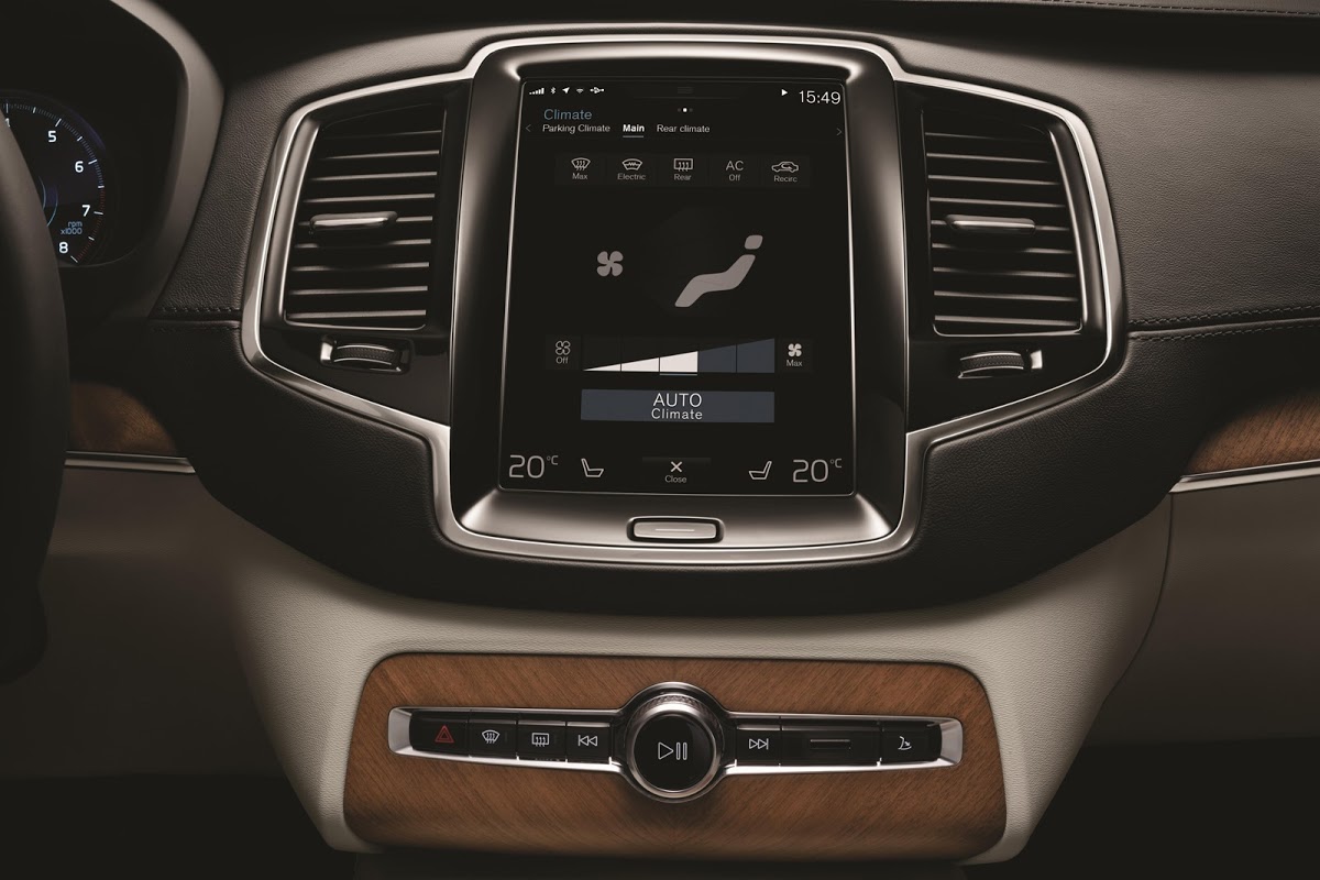
However, as I was taken through the new Swedish SUV’s myriads of features, one thing that the press liaison “handler” pointed out has stuck with me to this day. They boasted at how few buttons existed in the cabin, before taking me through the massive (for the time) touchscreen that housed control of virtually every function. It struck me that having all that collision prevention tech may just be necessary to offset the risks of a distracted driver, menu-deep in the massage settings.
See Also: Honda Reverts Back To Buttons And Dials As Customers Grow Weary Of Touchscreens
Because honestly, how is having a much bigger touchscreen, clearly designed to mimic your phone, any better than operating said mobile device behind the wheel?
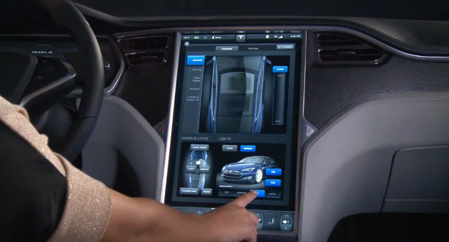
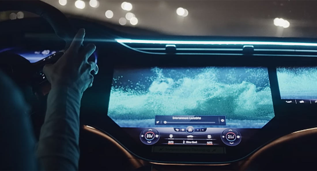
Now, I know that screens in cars have been around in some form or the other since the 80s. But, up until perhaps a decade ago, they were supplementary to the driving experience. The Volvo wasn’t the first to channel almost every feature into its portrait-style screen. Tesla has been one of the worst offenders, and they’ve already got into hot water about it, but now with “innovations” such as the Mercedes-Benz EQS’s screen, perhaps it’s about time we all take a time-out.
Read: Flagship Mercedes-Benz Electric Sedan, The EQS, Has A Bonkers 56″ Curved Screen Dash
Screens are half the issue. The way we interact with them causes ire too. If we erase the first iteration of BMW’s iDrive from our memories, the ensuing joysticks and touchpads were a great medium in which we could navigate through menus and settings. Although you still had to take your eyes off the road, you could at least control things with an intuitive way of harnessing hand-eye coordination. Not ideal, but better than swiping and scrolling across an expanse of screen, right? Obviously not, because they’re quickly and quietly being culled from most modern car interiors.
That’s why the new Dacia Sandero’s system is so great. You have the option to use your phone as the infotainment screen, but it’s no longer a necessity to the experience. You can pretty much operate everything without it, too. Have we’ve finally found a happy solution to our problems? Sadly, there’s a sneaky suspicion that the bean counters were more responsible for this brilliant safety feature (yes, I’m calling not having a screen a safety feature) than genuine interest in keeping drivers glued to the road.
But, surely, it’s this kind of rugged utilitarianism that breeds attentive and focused drivers. Now let me pull out my map and compass as I navigate my screen-less car to the next press event.


