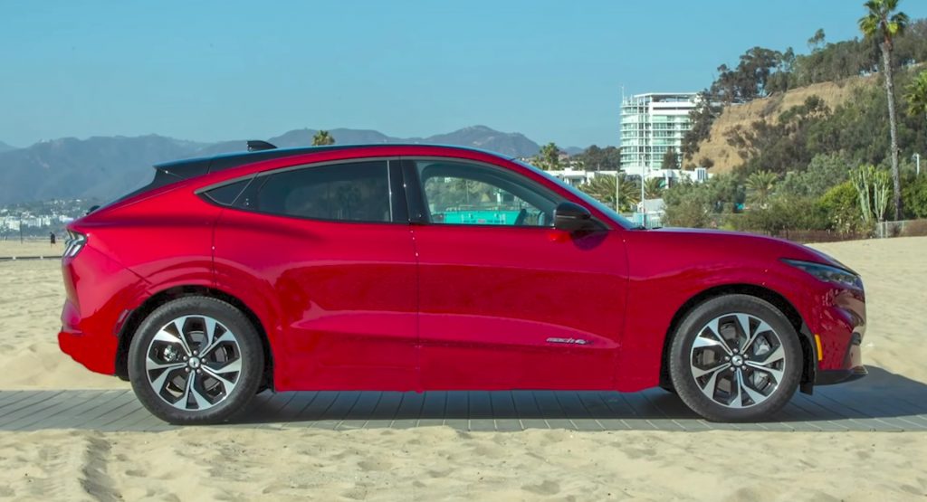
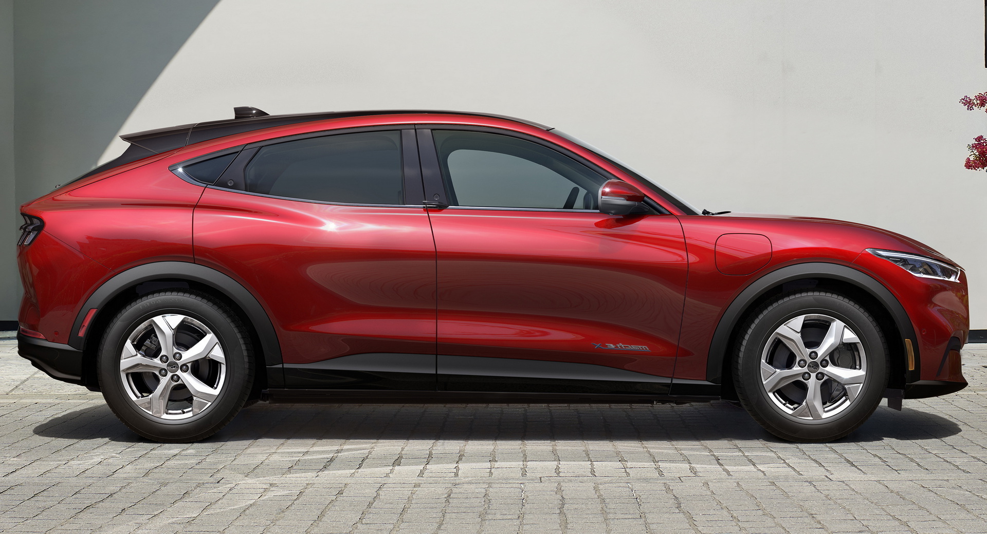
In creating the Mach-E, Ford’s designers had to put a lot of work into massaging the EV’s practical shape into something recognizably Mustang.
In his latest video, Frank Stephenson tracks the design cues and the “cheats” that the designers used to trick the eye into believing that the Mach-E has any claim to being a Mustang.
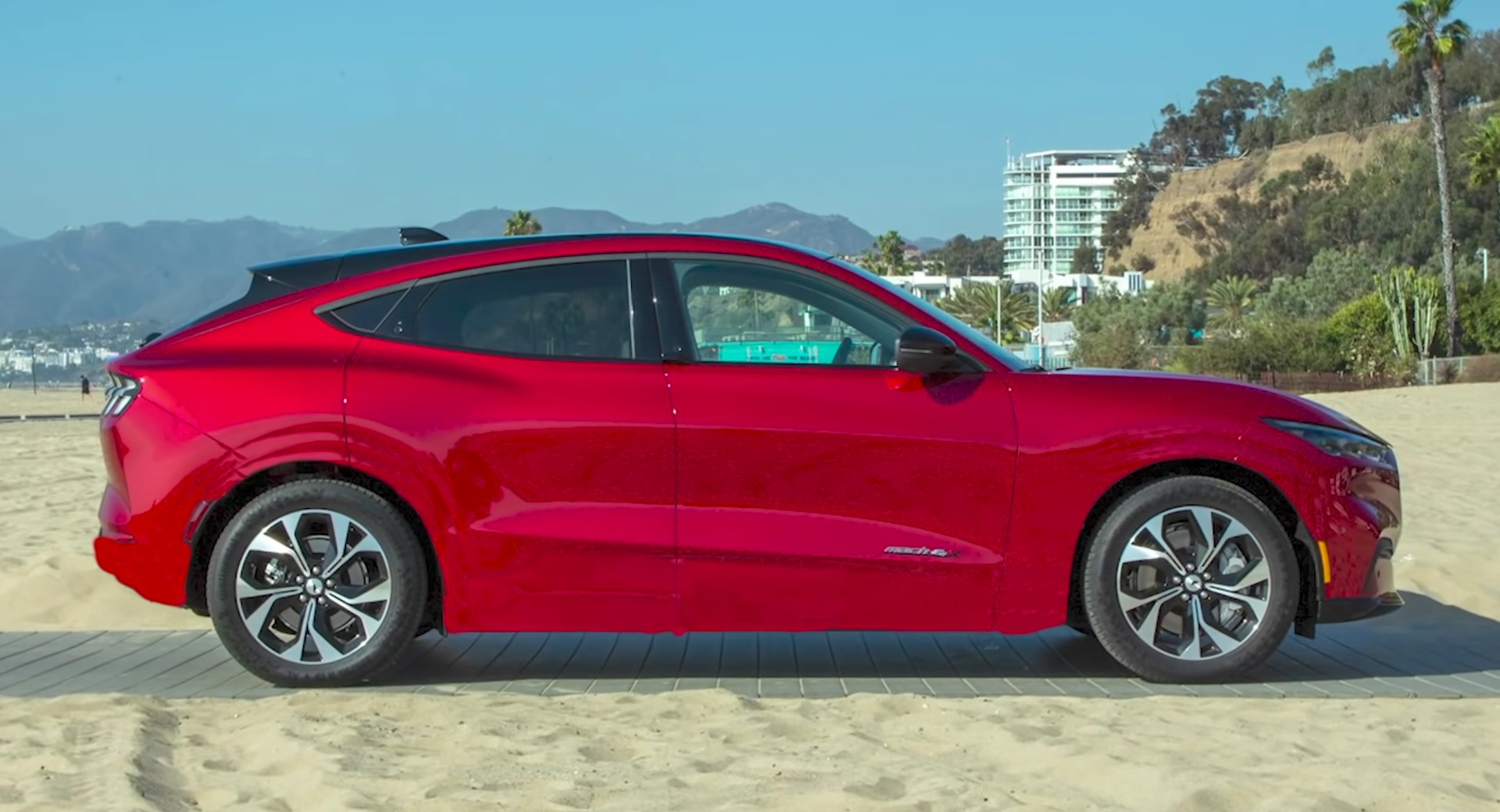
The visual trickery employed here is done largely with the use of black surfaces that are designed to fade into the background. Along with body lines intended to suggest a slimmer, coupe-like silhouette, they trick the eye into “missing” some of the body.
These tricks are used for a pretty simple reason: to hide the fact that the Mach-E has a big battery pack underneath it and that it needs to consider such practicalities as rear-seat headroom.
Although Frank Stephenson isn’t completely sold on the design of the new Mustang Mach-E, he has to admit that the Ford team did a good job managing all of the requirements placed on it.
Indeed, in a photo with the trickery crudely rendered out (above), the EV looks massive and artless from the side. With the tricks, the Mach-E looks a little lighter and a little more elegant. For something bearing the name of a pony car, that’s a good thing.
Ultimately, Stephenson objects to what he calls dishonest design but, personally, I’m less interested in “honest” design than I am in successful design. As far as I’m concerned the team did a great job of making a crossover that did just enough to suggest Mustang without going overboard and slipping into the uncanny valley.


