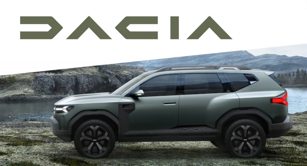
Dacia, the budget-friendly brand of the Renault Group, is launching a new and more modern badge design together with a fresh brand identity showcasing its focus “on the essentials”.
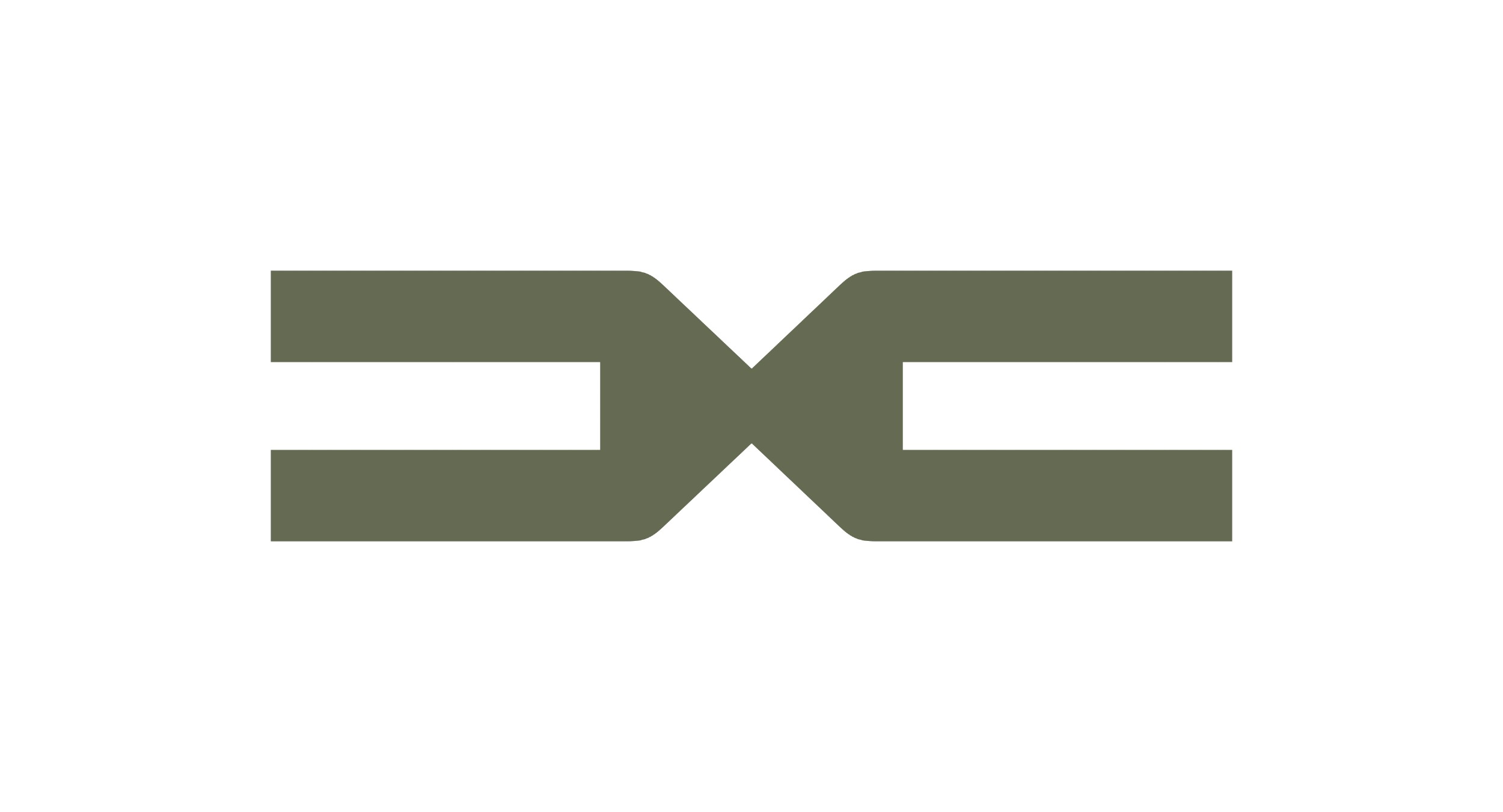
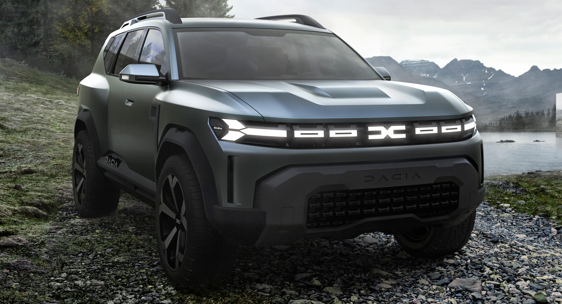
The new logo has Dacia in capital letters, and the new emblem simply reads DC in a weirdly satisfying symmetrical fashion – let’s hope people won’t confuse this with DC Comics. Strangely, this is not the first time we see them – the new emblem appeared on the illuminated grill of the Bigster concept car back in January 2021, while the reimagined logo was embedded on the side sills.
Also Read Dacia Becomes First Carmaker With Factory-Spec LPG Variants Across Entire Range
The custom font has a futuristic and almost sci-fi look to it with geometric lines and simplified letters. The green color is a nod to the brand’s closeness to nature – especially for all-terrain vehicles like the Duster. Secondary colors will be the “earthy” dark khaki, terracotta, and sand alongside the more “techy” bright orange and green.
Dacia wants the new logo to exude robustness and stability, with its simplistic nature communicating that this brand is focused on the essentials. While it kind of does that, we cannot help but visualize it on footwear, caps, and T-Shirts, as it wouldn’t look out of place as the logo of a sports fashion brand.
Back to the Romanian automaker, its core philosophy is to be a value-for-money brand. This is the case not only with the current range of Sandero, Sandero Stepway, Logan, and Duster but also with the new Dacia Spring supermini, one of the most affordable electric cars in the world.
The new brand identity will be rolled out starting from June 2021 with brand-specific sites, advertising and brochures, followed in early 2022 by dealerships, while vehicles will feature the new logo and emblem in the second half of 2022. According to the announcement, the first model carrying the new emblem will be unveiled in the second half of 2022. This could be Dacia’s upcoming C-SUV, previewed by the Bigster concept.


