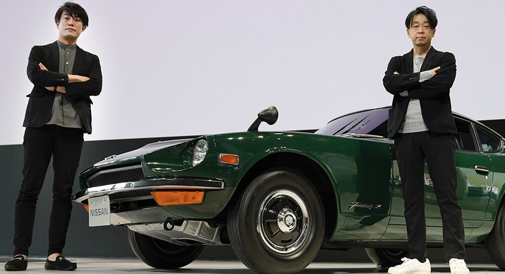
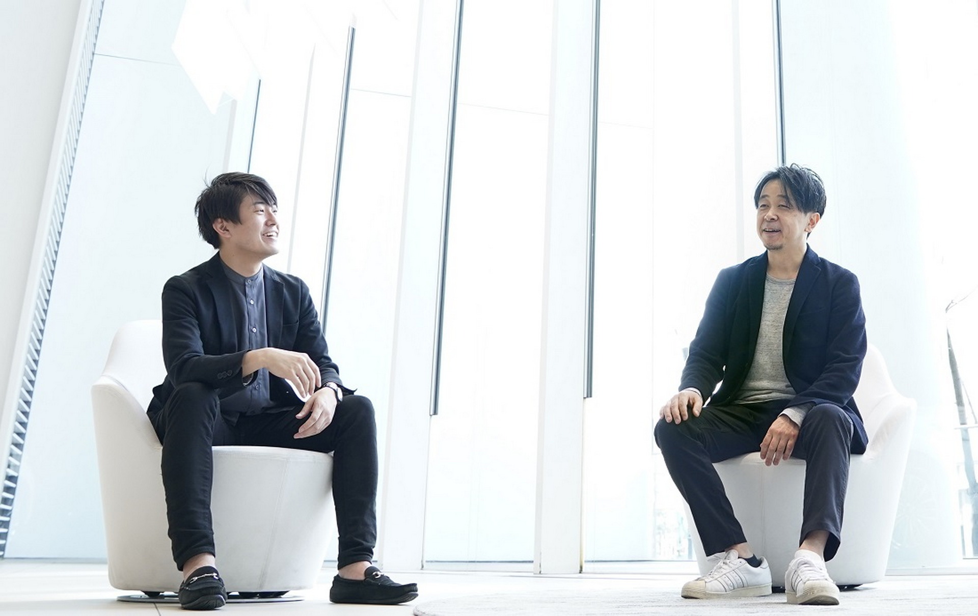
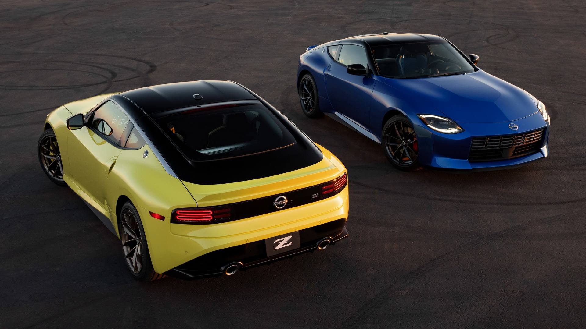
The Nissan Z is an important car for the Japanese manufacturer, so it comes as no surprise that a lot of work went into designing it. Now, a month after its release, Nissan has released an interview with the two designers primarily responsible for bringing it to life.
Exterior Designer Naoyuki Ohkoshi joined Nissan in 1997, and some of his most notable past projects include the 2009 and 2012 Infiniti QX80, as well as projects for Daimler and Magna. Interior Designer Takuya Yamashita is newer to the team, coming to Nissan just four years ago.
Read More: 2023 Nissan Z Coupe Is Coming For Toyota’s Supra With 400HP And A $40,000 Price Tag
Upon being chosen to design the Z, Ohkoshi and Yamashita were both optimistic despite the newfound weight on their shoulders. Ohkoshi felt quite a bit of pressure to get the design of such an iconic car right, but he also said he “didn’t feel worried or nervous because [he] was having so much fun.” Similarly, Yamashita said he felt “a high level of responsibility” seeing how influential the Z is, and he was honored to work on a car that he had admired since childhood.
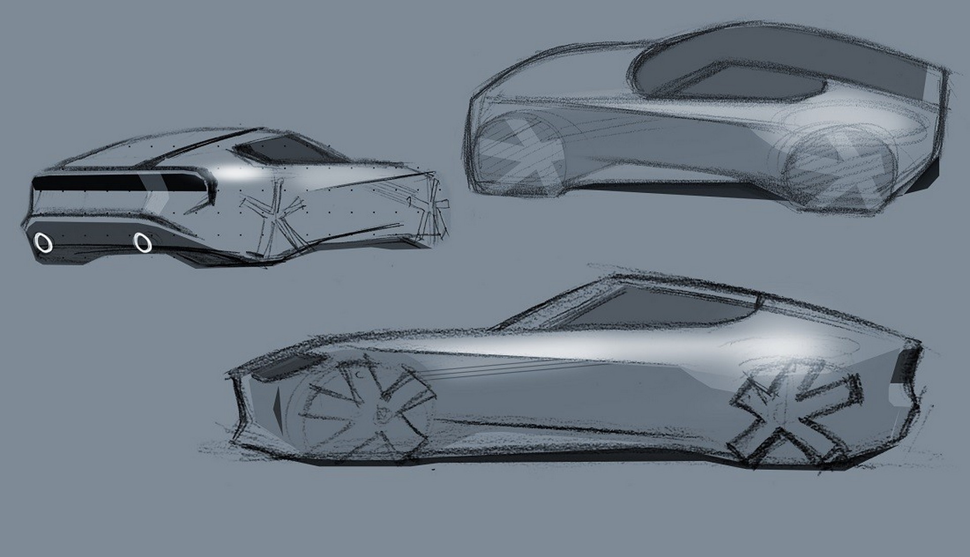
Even the selection process itself was quite intense. According to Ohkoshi, around 100 exterior sketches were submitted by numerous design teams from Japan, China, the United States, and the United Kingdom, which were subsequently rendered as 3D models. From those 100 sketches, just three finalists were chosen to become full-scale clay models, and the winner ended up being the Japan team after careful scrutiny by the brand’s executives. After the key exterior shapes and proportions were established, Yamashita’s interior work came into play. The original idea for the interior was to just evolve off the outgoing 370Z, but Yamashita was pleased to hear that they eventually decided to go in a different, more historic direction.
See Also: How Nissan’s Z Screws Toyota’s GR Supra By Offering More Power Than The 3.0 For Less Than The 2.0
When asked if there were any particular parts of the car that were difficult to design, Ohkoshi responded: “Absolutely! The placement of the side character line that Irie-san alluded to in a previous interview was something that looks clean and simple, but dictated the whole flow of the car. If we adjusted it a bit, it meant we had to re-think other areas as well. There were so many sketches made, drawing the Z is like muscle memory for me now.”
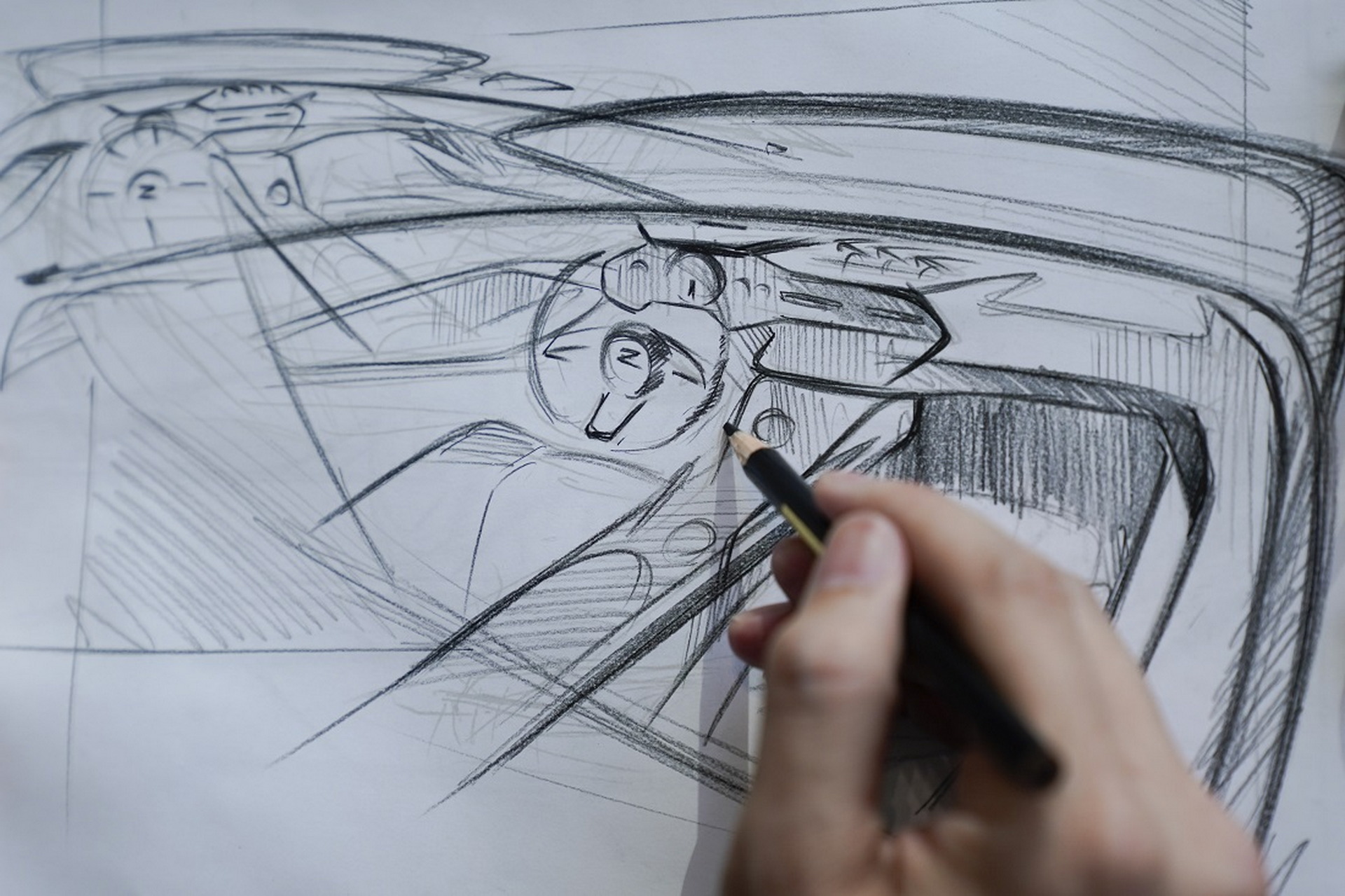
Yamashita seemed to have encountered a bit more difficulty, particularly with the center console. “I would have to say that getting the center console dialed in was the most difficult part of designing the interior. In the current 370Z model, the center console bends, rising as it moves toward the driver. With the Z, we wanted to make it straight and level, acting like a strong beam or support that enhances the Z’s rear-wheel-drive sports car spirit.
“The console shape appears very simple, but in fact, it’s surrounded by several interior elements, including the seats and a number of moving parts such as the shifter and parking brake, so trying to implement a more level design here proved extremely difficult. In fact, it took six months alone to get the design from 95 percent complete to 100 percent complete.”
Related: The Nissan Z Would Look Great As A Modern Reincarnation Of The 300ZX
When it comes to specific parts of the design that took inspiration from the older Z cars, Ohkoshi was quick to mention the side windows and overall silhouette, while Yamashita brought up the “reverse slant” of the dash that reduces the visual noise of the interior. As for each designer’s favorite element, Ohkoshi went with the rear end, while Yamashita chose the dashboard and instrument cluster.


