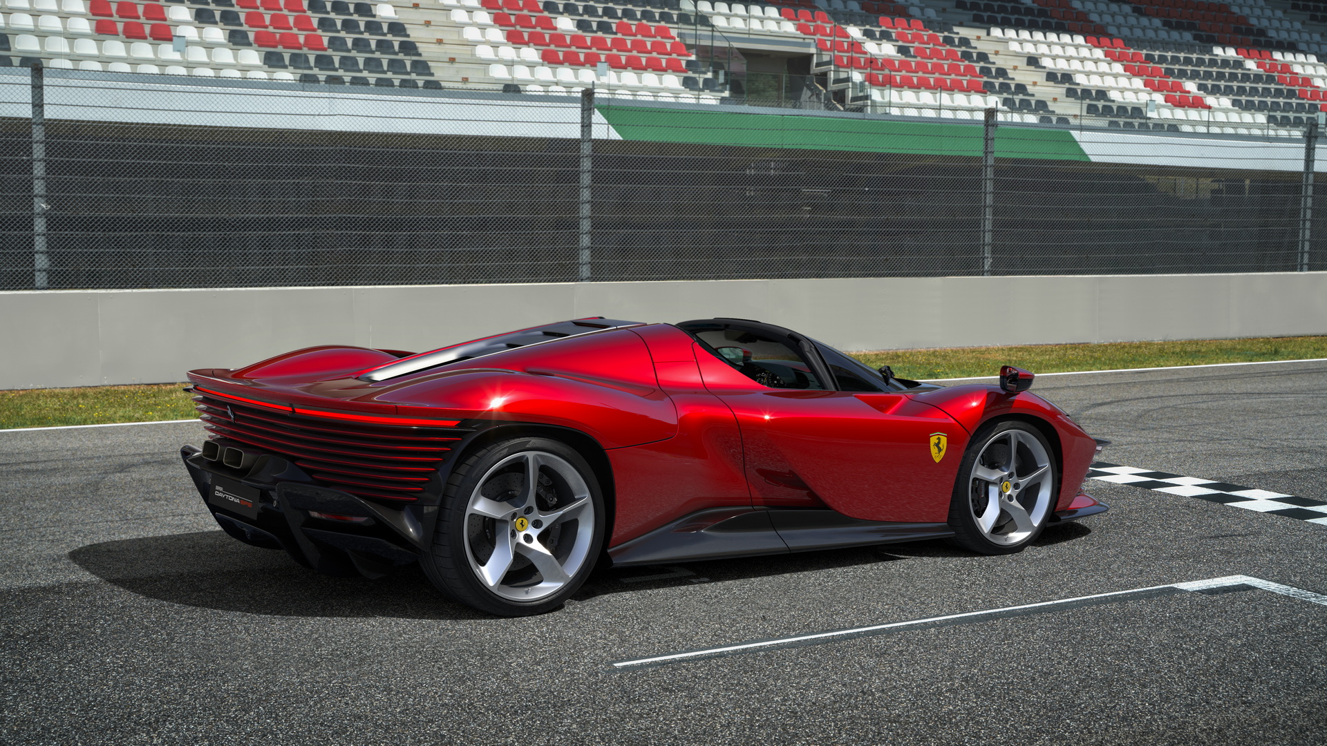
Since Ferrari unveiled the latest member of its Icona line, the Daytona SP3, much has been said about it. Now, designer Frank Stephenson is weighing in on the appearance of the new limited edition model.
While he admits that the car is stunning, bold, and even brave, the former Ferrari design boss is not sure if he would call it beautiful.
“There are a few elements on this car that seem to detract from that element of simple, beautiful design,” says Stephenson. “It’s almost a cacophony of different things happening all over the car.”
Read Also: Ferrari Daytona SP3 Is A Limited Run Hypercar With “Pop-Up” Headlights And An 829-HP V12
He points to the extreme design of the car in general and how it juggles numerous styles, design references, and elements. While he finds the grille dull and indistinct, he thinks the strakes leading into the vents at either side of it are a little over the top. He also thinks that the DRLs are dull and the headlights, though interesting, could have been executed better.
“I would have much preferred for that headlight cover to extend all the way down, cutting off the headlamp completely,” says Stephenson. “So, basically, you couldn’t look at half-open, half-closed eyes. Basically, they’re falling asleep.”
Throughout, the car has highs and lows. The fender-mounted mirrors are “absolutely monsters of mirrors,” he complains, but the air intakes drawing air in from the front fenders and into the door are lovely. All in all, Stephenson finds it’s a mixed bag; neither wholly successful, nor unsuccessful.
“In general, again, if you stand back and look at this car, the first time I saw it, this morning when I looked at it, I went ‘Wow!’ But does it hold itself together completely? Not 100% in my book,” he notes. “It’s still a stunning Ferrari […] but I don’t see it as being the ultimate, beautiful Ferrari as we know Ferraris.”


