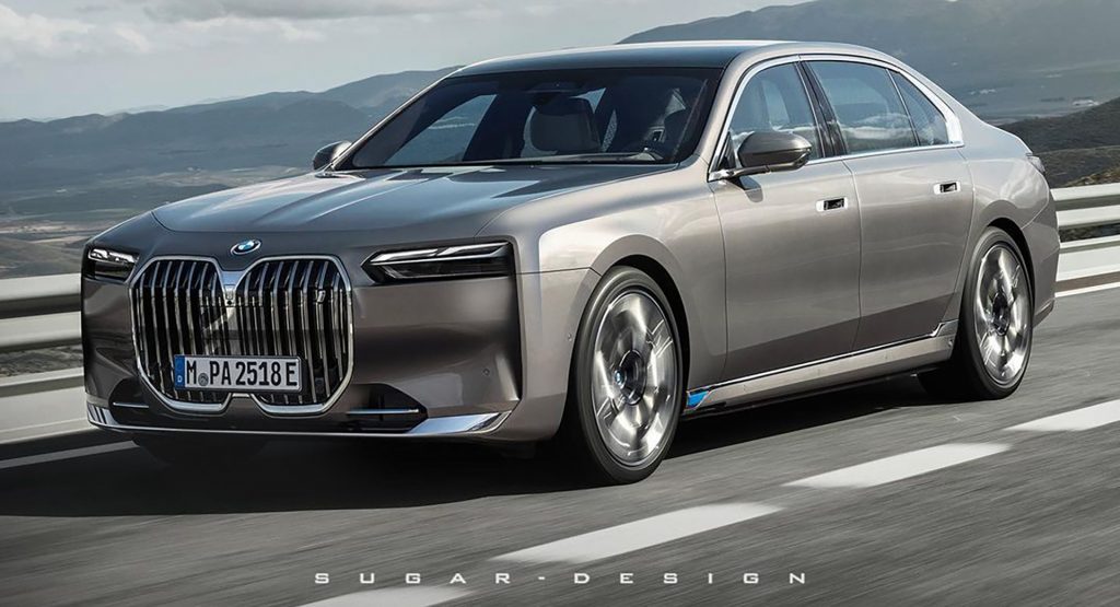
This is a rendering by Sugar Chow and is not related to nor endorsed by BMW.
At this point most people are aware that BMW owns Rolls-Royce. But now that the German automaker has just debuted their latest 7-Series flagship sedan, it begs the question if they could bring it upmarket enough to compete on the same level as Rolls if they wanted to. Digital artist Sugar Chow tried to imagine that as they injected some of the British luxury brand’s DNA into the latest 7er.
The overarching trend of the redesign seems to be squaring it off more to put it in line with Rolls-Royce‘s imposing, almost architectural design language. This is very evident up front, where the hood and bumper now join at with a same type of 90-degree character line found on all three of Rolls-Royce’s current models.
Read More: You Can Already Pre-Order And Configure The 2023 BMW i7, Show Us Your Build
https://www.instagram.com/p/CcmHYQTJGF2/
Chow also leaned into BMW‘s large grille theme by making it nearly as tall as the bumper, but it’s surprisingly quite tolerable. On the opposite front, the controversial quad headlights were toned down by combining them into a single unit at the top. The crease connected to the headlight now extends from top to bottom on the bumper, and it pairs with the aforementioned 90-segree character line that extends across the side of the car. The bumper and grille also feature a new horizontal kink to accommodate the newly empty space created by joining the headlights.
See Also: New BMW M760e And i7 M70 xDrive Performance Models Coming In 2023 With Up To 600 HP
https://www.instagram.com/p/CcoqXZdptEK/
Out back, the changes were minimal but impactful. The crease on the bottom of the bumper changed directions to point towards the rear of the car, and it was extended upward to join the character line through the lower part of the trunk. The reflectors were also moved to the bottom of the bumper and the license plate area was revised slightly. Additionally, the taillights were also squared off and lengthened, and the lighting design changed to something more similar to the all-red ones found on the 5-Series. The final touch involved moving the i7 badge from the top left corner of the rear end to dead center on the trunk for more impact.
We’d argue that Sugar Chow’s design may even be better than the one BMW put out given how much more solidity and presence it has to it, but what do you think? Let us know in the comments.


