It should come as no surprise that designing a new car isn’t easy, which is why automotive designers go to great lengths to properly connect themes and ideas in a singular, cohesive package.
Most of the times it’s not just one automotive designer that has complete control of the entire project, but a team of designers who all lend their expertise to create a beautiful product.
However, sometimes it looks like the folks that designed the front of the car had never even spoken to those that designed the rear, leading to a disaster of a design that completely lacks a cohesive theme.
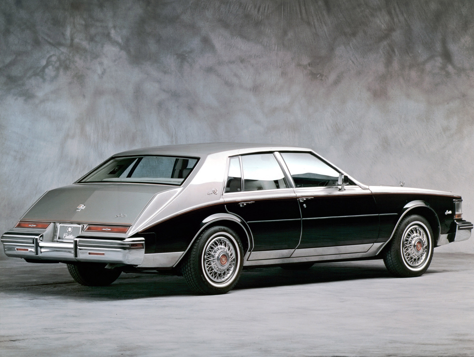
One of the best examples of this lack of design cohesion is the 1981 Cadillac Seville “Bustleback”. The car was penned by one of GM’s greatest designers, Bill Mitchell. Mitchell was responsible for countless vehicles in the brand’s porfolio, including the 1963 Buick Riviera and the C2 Corvette race car.
Read More: So You Hate BMW’s Current Grilles, What’s The Best Looking One Ever?
The Bustleback was Cadillac’s attempt to bring back the styling that some Rolls-Royces has had in the 1930s, but it appears that they started drawing it at the rear, and by about a third of the way through they thought this is a terrible idea, and then stopped and made it look like a regular Cadillac.
As it turns out, not all car buyers of the 1980s were interested in Rolls-Royce designs from before the Second World War, and the car was extremely polarizing, almost as polarizing as the difference in styles between the front and the back.
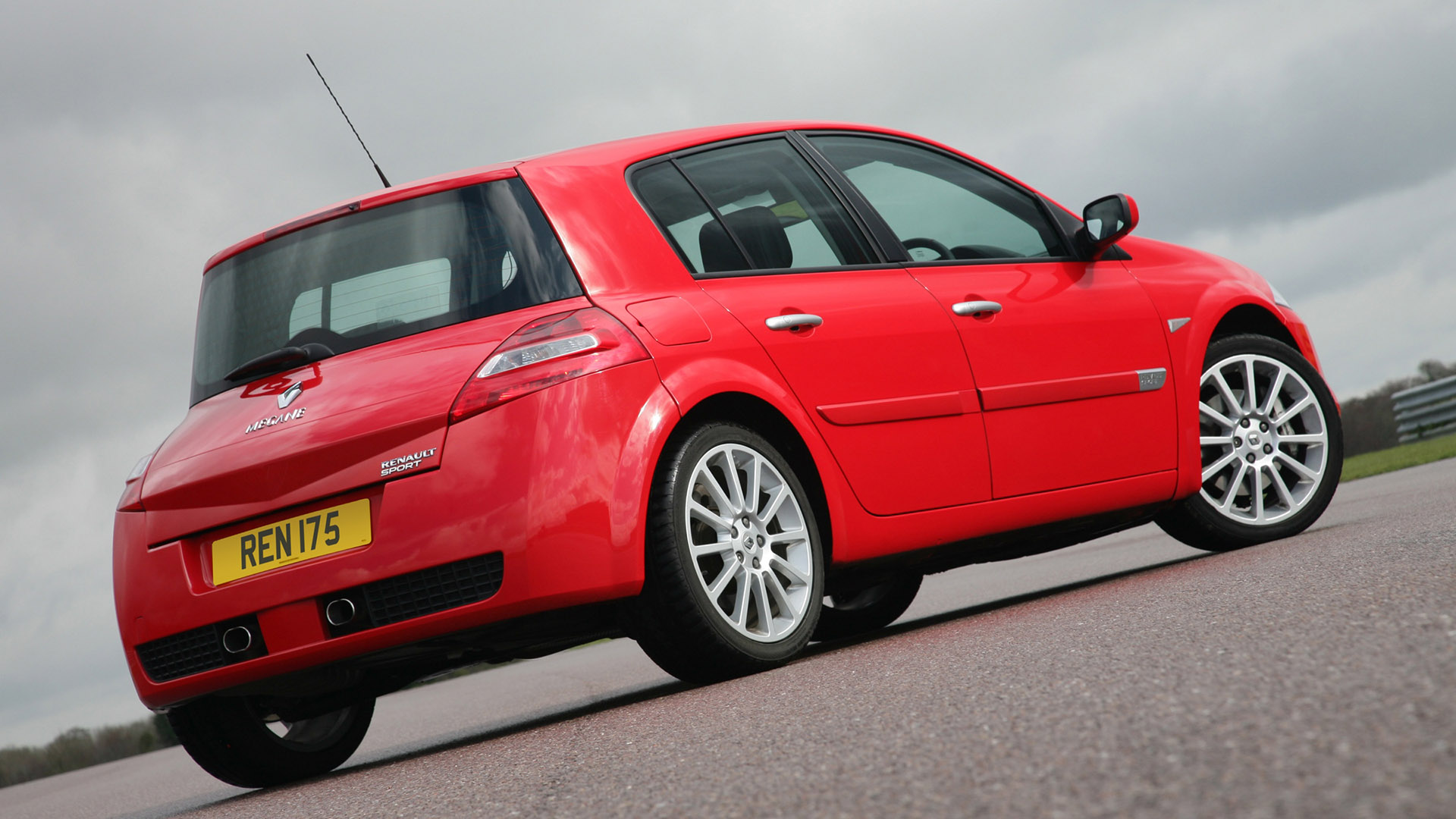
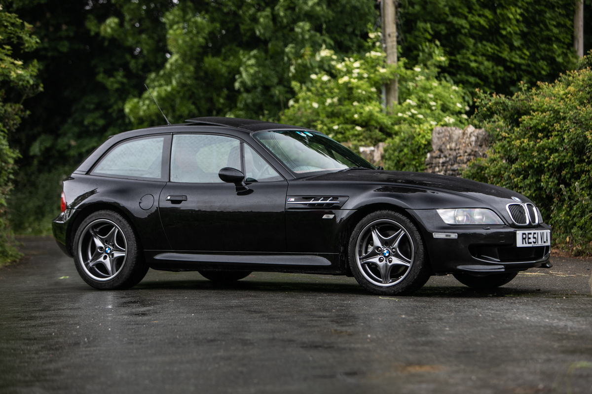
Other top contenders for two-faced automotive designs include the second-generation Renault Megane and the BMW “clown shoe” Z3.
So, what do you think? Which are, in your opinion,some cars that look normal in the front but weird in the back?


