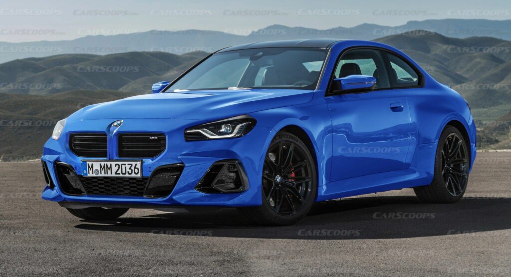
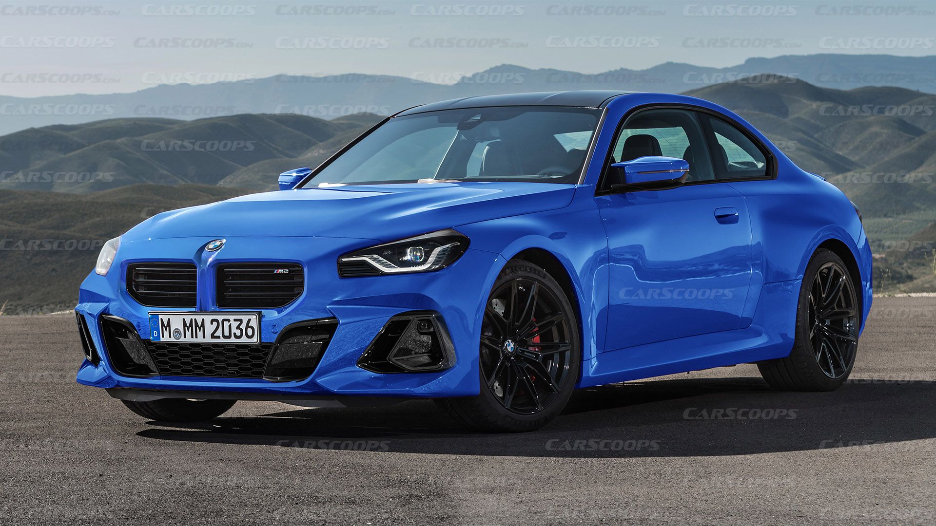
This story includes renderings of alternative BMW M2 bumper designs created by Thanos Pappas for CarScoops that are neither related to nor endorsed by BMW.
The all-new BMW M2 debuted earlier this week and as with most modern designs from the Bavarian automaker, it caused a bit of a controversy in our comments section. Our reader’s criticism was focused on the front bumper, so we decided to try and fix it while staying true to the BMW design language.
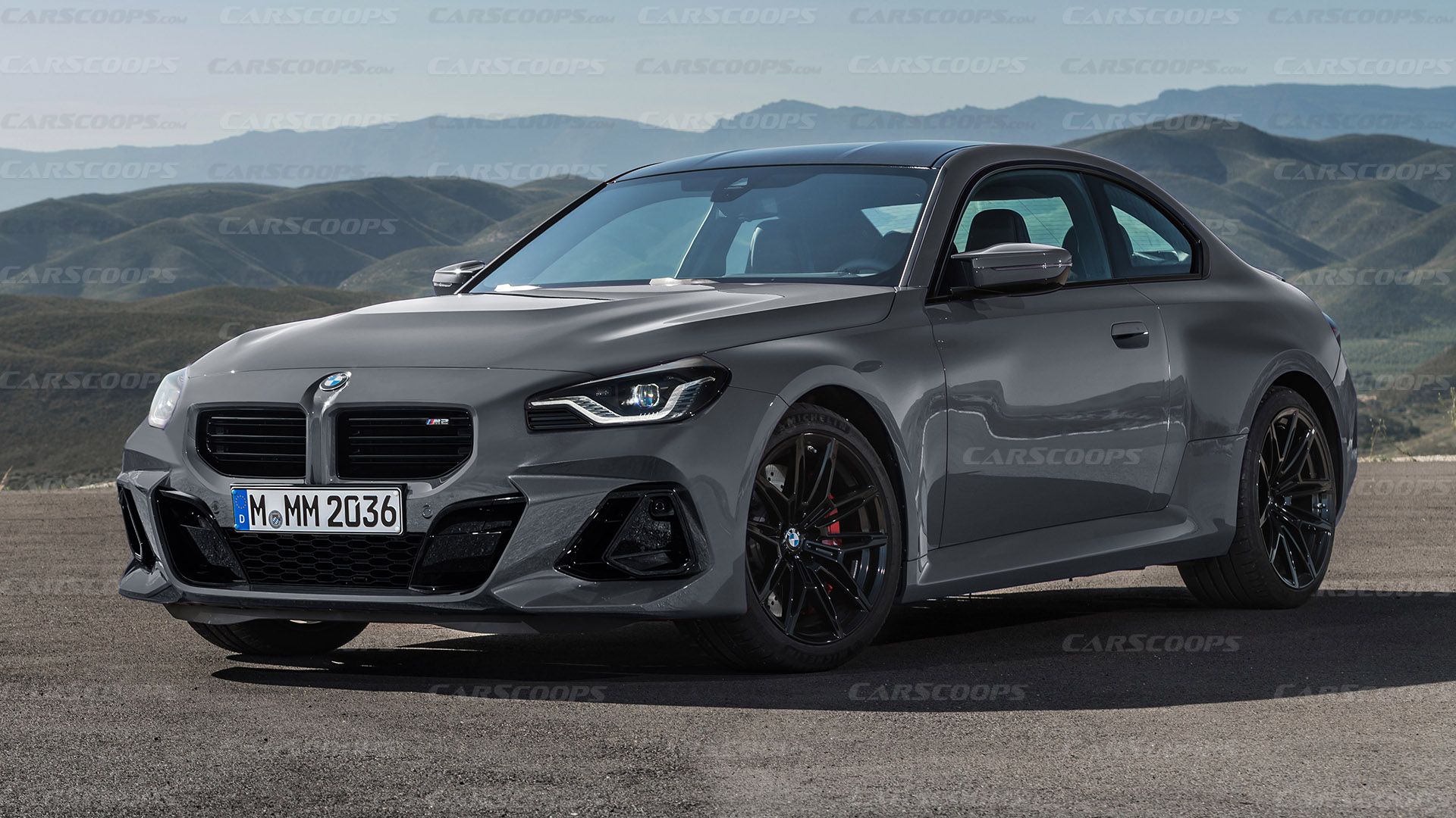
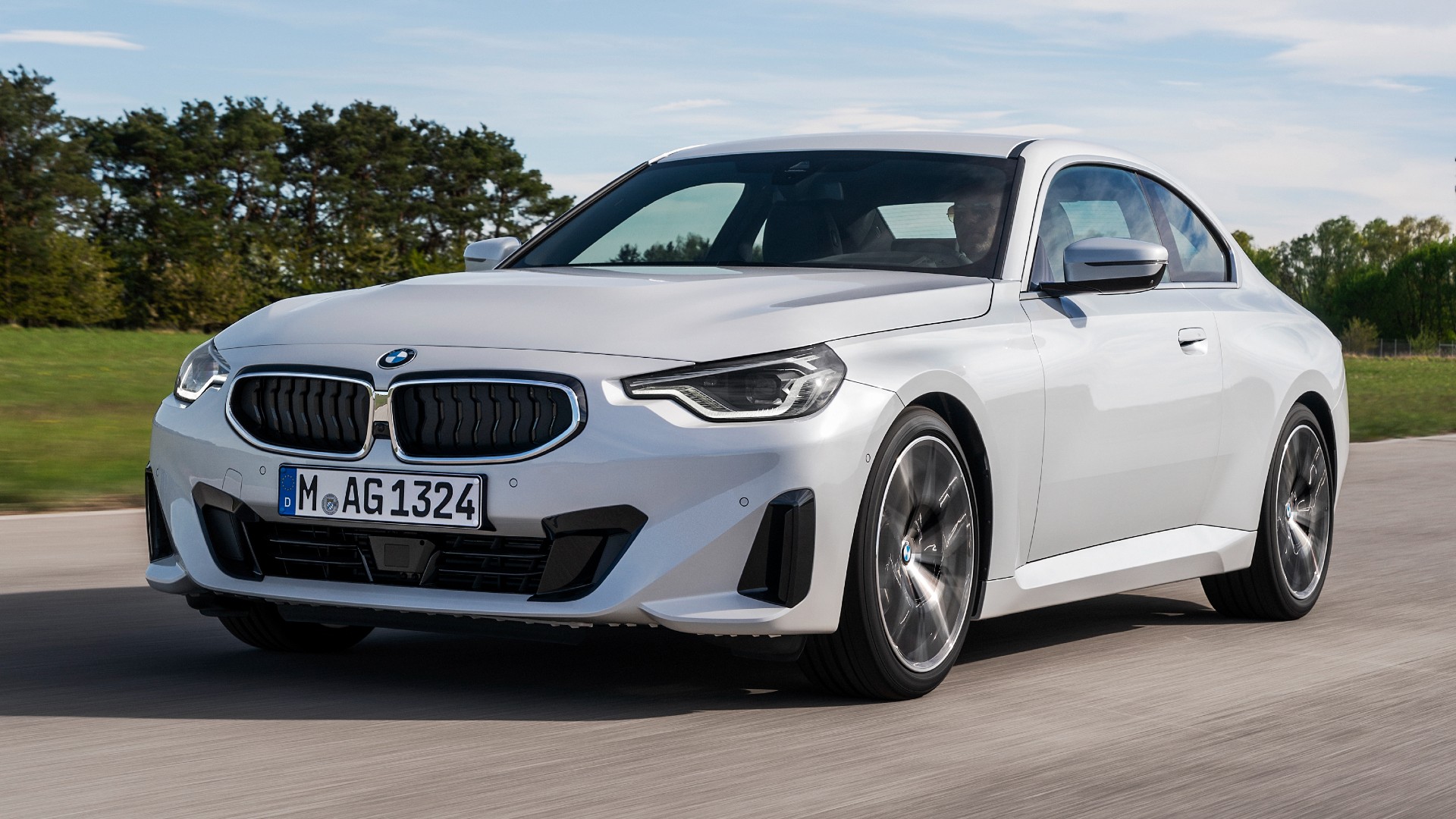
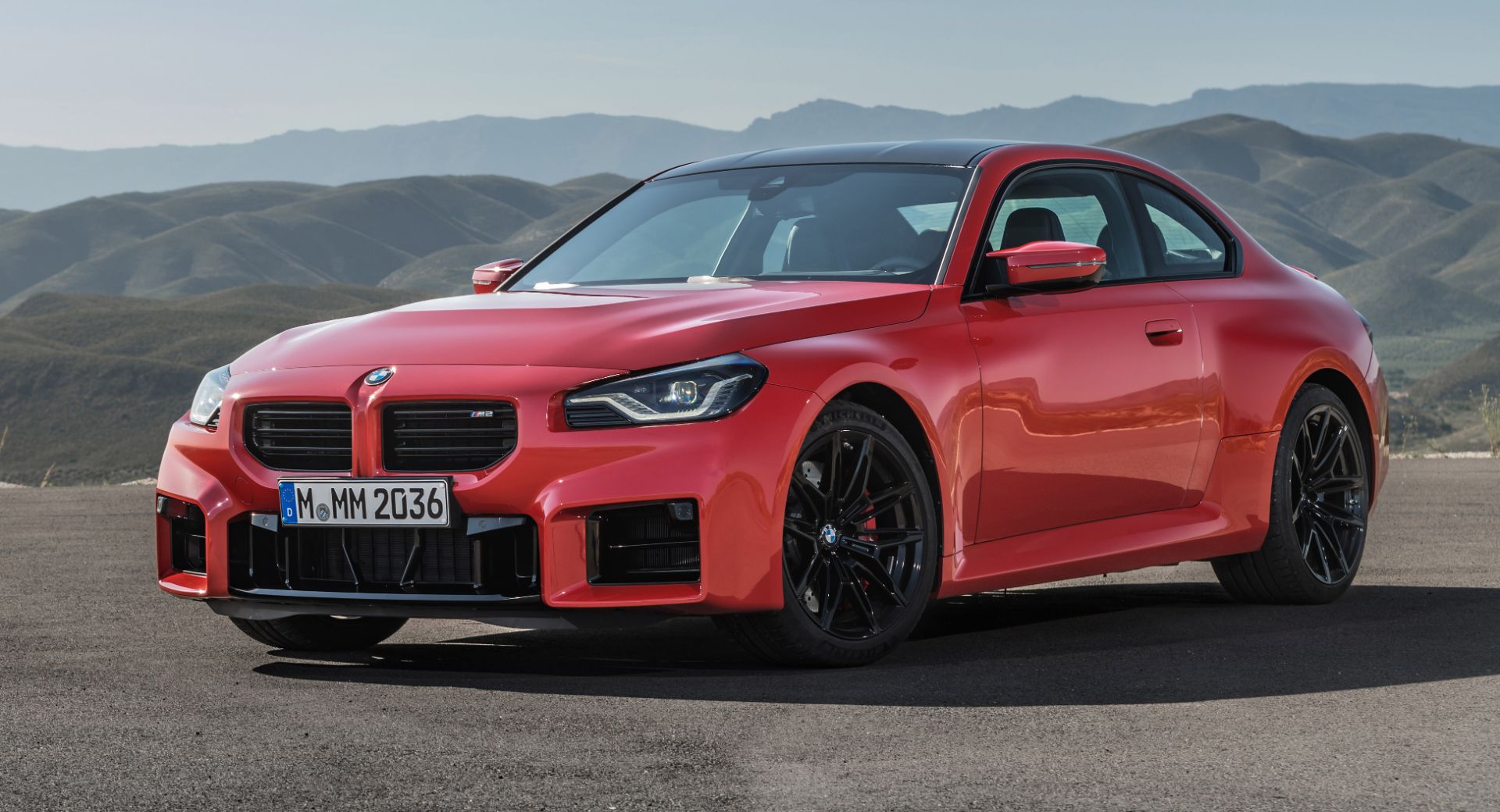
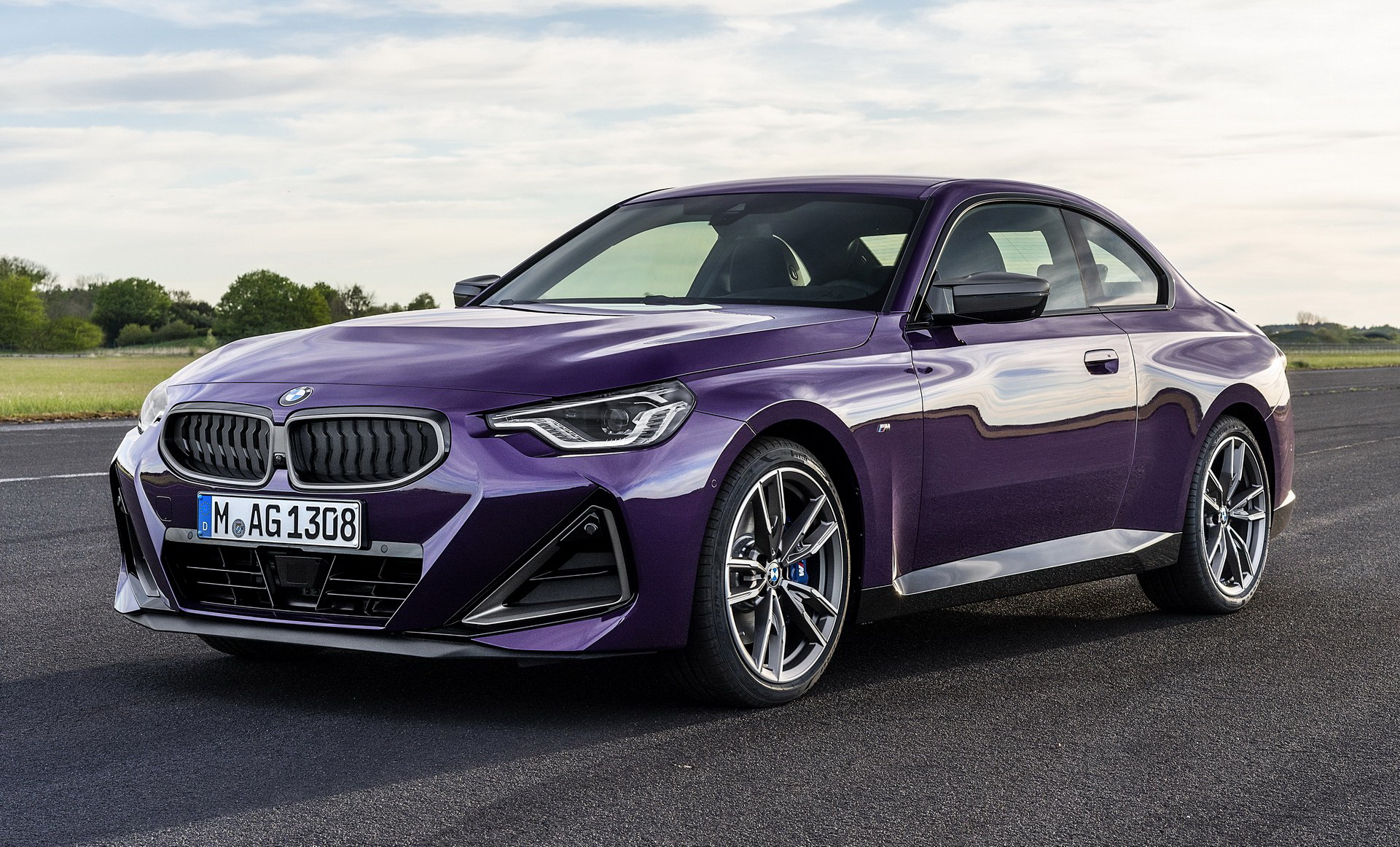
Let’s start by saying that the BMW 2-Series Coupe is offered with three different faces – the entry-level 220i with the less aggressive bumper, the M240i with the triangular intakes, and the full-blown M2 with the boxy intakes. The latter also boasts a version-specific grille and unique headlights, further differentiating its face from lesser models.
See Also: Would You Fancy A 2023 BMW M2 Convertible Like Our Render?
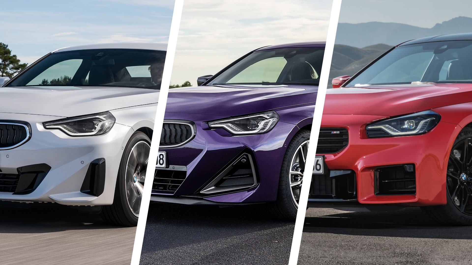
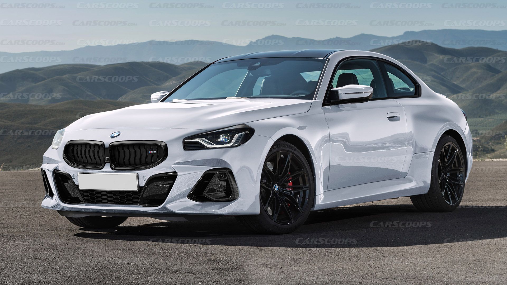
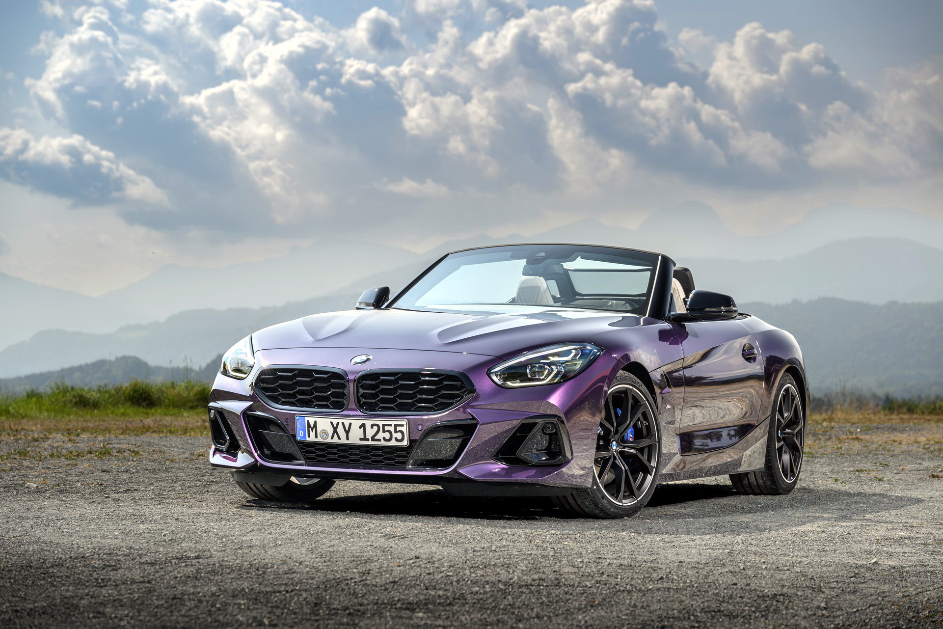
The three different bumper designs on the 2-Series Coupe family – the 220i (left), the M240i (center), and the M2 (right), compared to our alternative take on the M2 (below) using elements from the Z4’s bumper.
For our redesign, we sourced the front bumper from the BMW Z4. The recently facelifted two-seater roadster felt like the most fitting choice as its face is quite sculpted and sporty enough, while not being as controversial as in the M2 or in the M3/M4 duo. Illuminated grilles like the one on the XM are not our cup of tea, so we kept ours without any LEDs.
As you can see, we opted for the M2-specific headlights as they look better in our eyes compared to the more complex lighting units of the standard 2-Series. We also kept the original M2 grille, after trying on different options, including the more subtle-looking kidneys from the 2-Series and the wider kidneys of the Z4 (you can check them out in the gallery below). The rest of the bodywork remains unchanged, including the wide fenders, the bulged bonnet, and the M-style mirrors simply because they look cool.
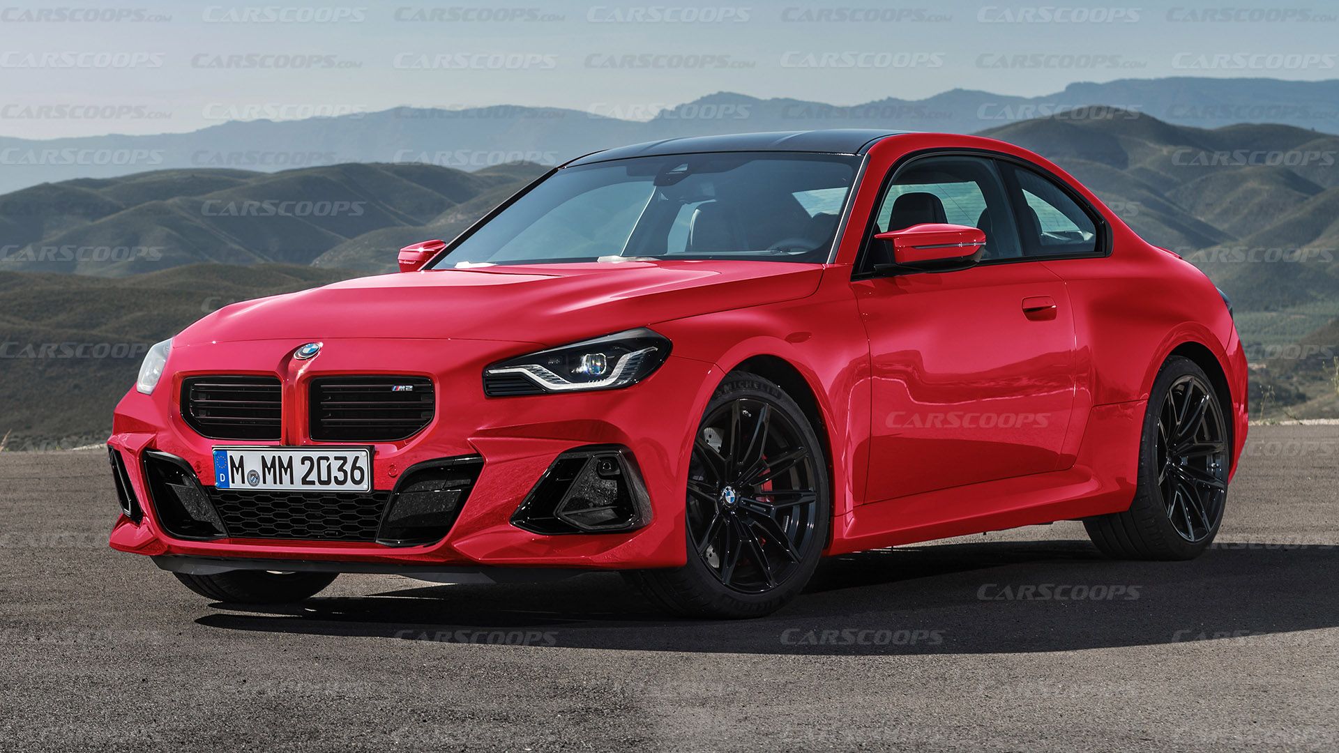
Our imaginary BMW M2 from an alternate universe retains the version-specific headlights, grille, and wide fenders, but combines them with less controversial bumper intakes.
The final result looks more subtle in terms of sportiness than the brutal face of the stock M2 which s full of horizontal and vertical lines. While some would say that our render looks more like a M240i xDrive than a full-blown M2, we shouldn’t forget that a few years back it would probably be as wild as it gets. BMW once was famous for its clean and elegant front-end designs, with M models looking slightly sportier thanks to subtle changes before the design center went nuts.
We don’t know if we succeed in making the new BMW M2 easier to digest, or if our mashup turned out to be less interesting than the original. Let us know in the comments section below how would you like your M2 in an ideal world – was the previous-gen M2 CS the peak in terms of sex-appeal?
Photos by BMW, Renderings by Thanos Pappas


