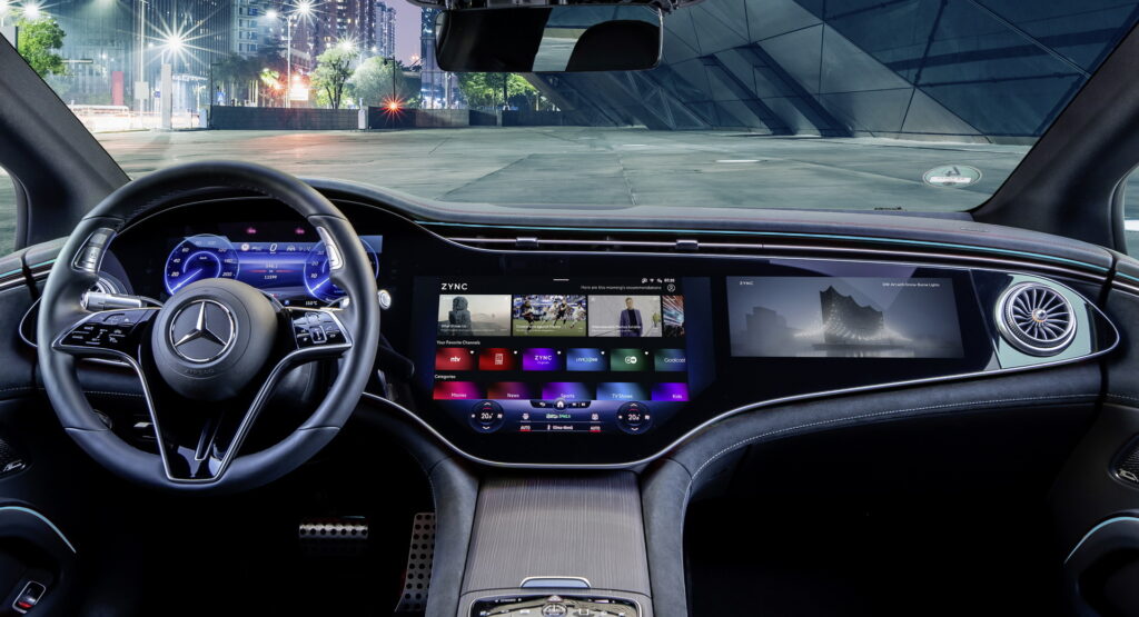
As touchscreens take over more and more of the interior of modern vehicles, a pushback among designers has started. Mercedes’s director of user experience (UX) design, Klaus Frenzel, still think that big screens are the right move for the industry, though.
It may not come as a surprise that Mercedes, the makers of the dash-wide Hyperscreen, are supporters of touchscreens. Indeed, Frenzel recently explained to Car Design News how good screens offer a world of opportunities.
“The screen is a like a playing field, the bigger the screen, the more you can do. The visual part is not all of it, the rest is beyond the screen,” said Frenzel. “It’s the combination that makes the difference.”
Read Also: DS Design Chief Thinks Covering The Dash With Screens “Is A Little Bit Stupid”
He explains, however, that size isn’t the only thing that matters. Instead, automakers must consider the soundscape, voice interactions, and more and they must all cohere to deliver a good product to the consumer.
“Just a big screen delivers no experience,” said Frenzel. “If you watch a movie without the sound, suddenly the film is kind of dead, even though the screen is the same. Everything together delivers the holistic experience.”
Doing that can be quite difficult. The UX team must be in constant contact with the UI team to ensure that the screen works perfectly. They must also be in conversation with designers, since the hyperscreen, in particular, reflects the design of the grille on Mercedes EQ cars.
Then, UX designers have to consider the usability of their systems. According to Frenzel, it’s easy for a team that has been working on a system for a long time to assume that their system is intuitive when, in fact, they’re just used to it.
“It can be dangerous within a company when developing these things, as staff might think all their customers will be able to understand, because they’ve worked on it for years. They cannot imagine anyone not understanding,” he said. “But if you fly to another city and jump into a rental car, you should be able to start the car in 20 seconds and know how to interact with its most important use cases.”
He admits, though, that to a designer, the thought of going too far with touchscreen infotainment is not possible. From a safety point of view, that’s less true, so getting the right balance is crucial.


