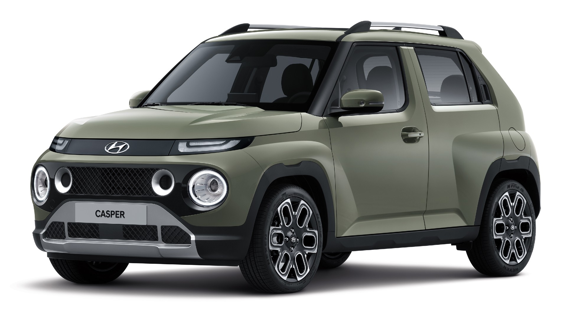
Close your eyes and picture a BMW. Easy, isn’t it? Whatever model you’re imagining, and from whatever era, you can probably see the crisp lines, taught surfaces and though the size of the kidney grille has varied over the years, it’s always been there. There’s no mistaking a BMW for anything else, and even when the company makes its next seismic design shift with the launch of the 2026 Neue Klasse (due to be previewed with a second concept this fall), we’ll see echoes of cars like the 1972 5-Series and know who’s behind it.
But for years Korean automakers like Hyundai struggled to create that kind of identity for their cars, most obviously in terms of a recognizable face, but also the sheetmetal behind it. Partly this came from their early cars being rebadged versions of other companies’ cast-offs, but also, a design boss at a Korean car company once told me, because Asian buyers have traditionally had bland car tastes, and the local designers weren’t exposed to the richer mix of cultural influences that western-based designers are. That’s why most automakers now have multiple design centers dotted around the world.
Related: Hyundai’s Design Boss Embraces Analog Controls Including Physical Buttons In Tech-Forward Interior
Struggling for an identity
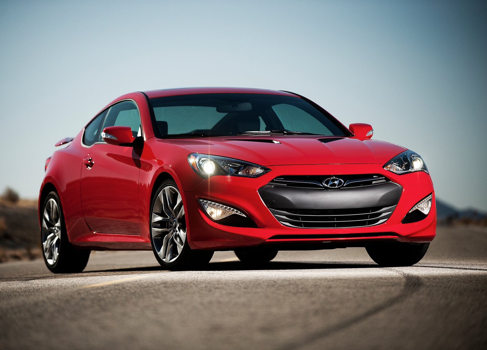
It’s not like Hyundai has never made a decent looking car. It’s had its moments. The original Pony wasn’t bad, and the stillborn Pony Coupe – both notably designed by Giorgetto Giugiaro rather than local boys – would really have helped put Hyundai on the map if it had ever made production. The 1996 Coupe/Tiburon (pre-horrific facelift) proved that opening a California design center in 1990 was the right move, and its 2001 successor also managed to turn a few heads. And a decade later the Veloster, with its asymmetric door layout and weird hunchback was certainly distinctive – more so than the Genesis Coupe.
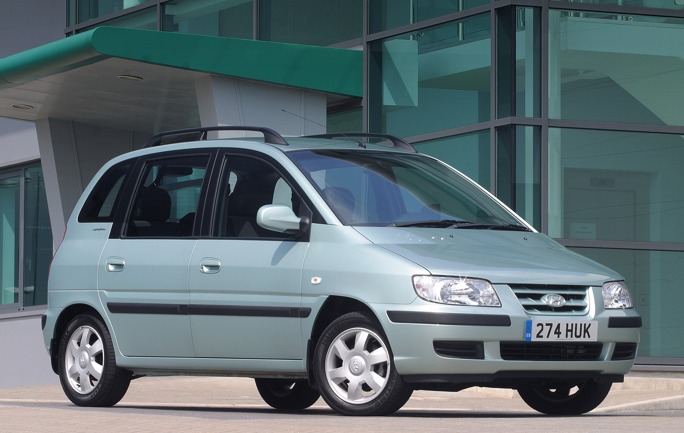
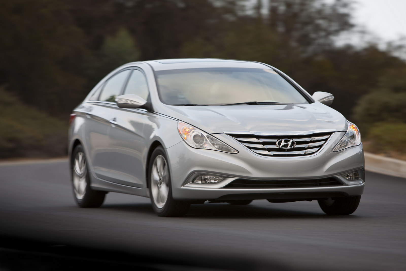
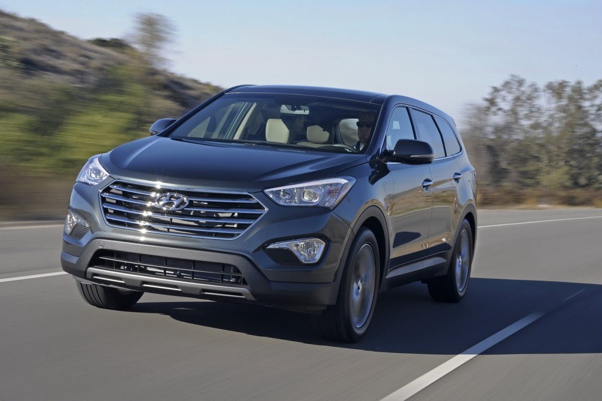
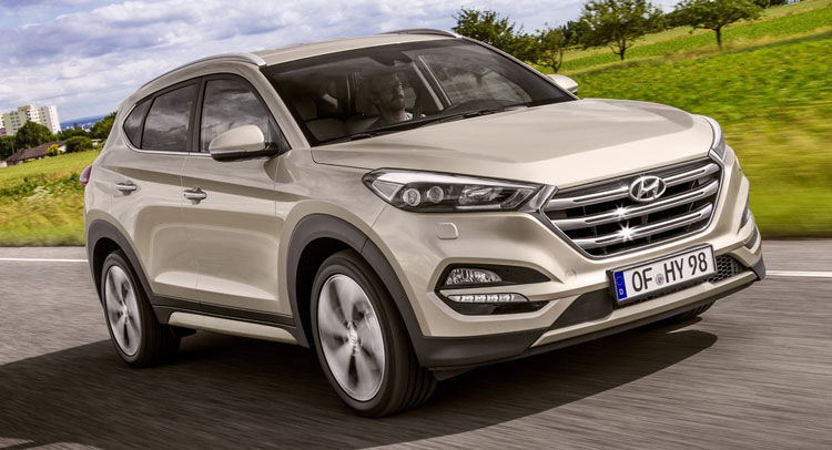
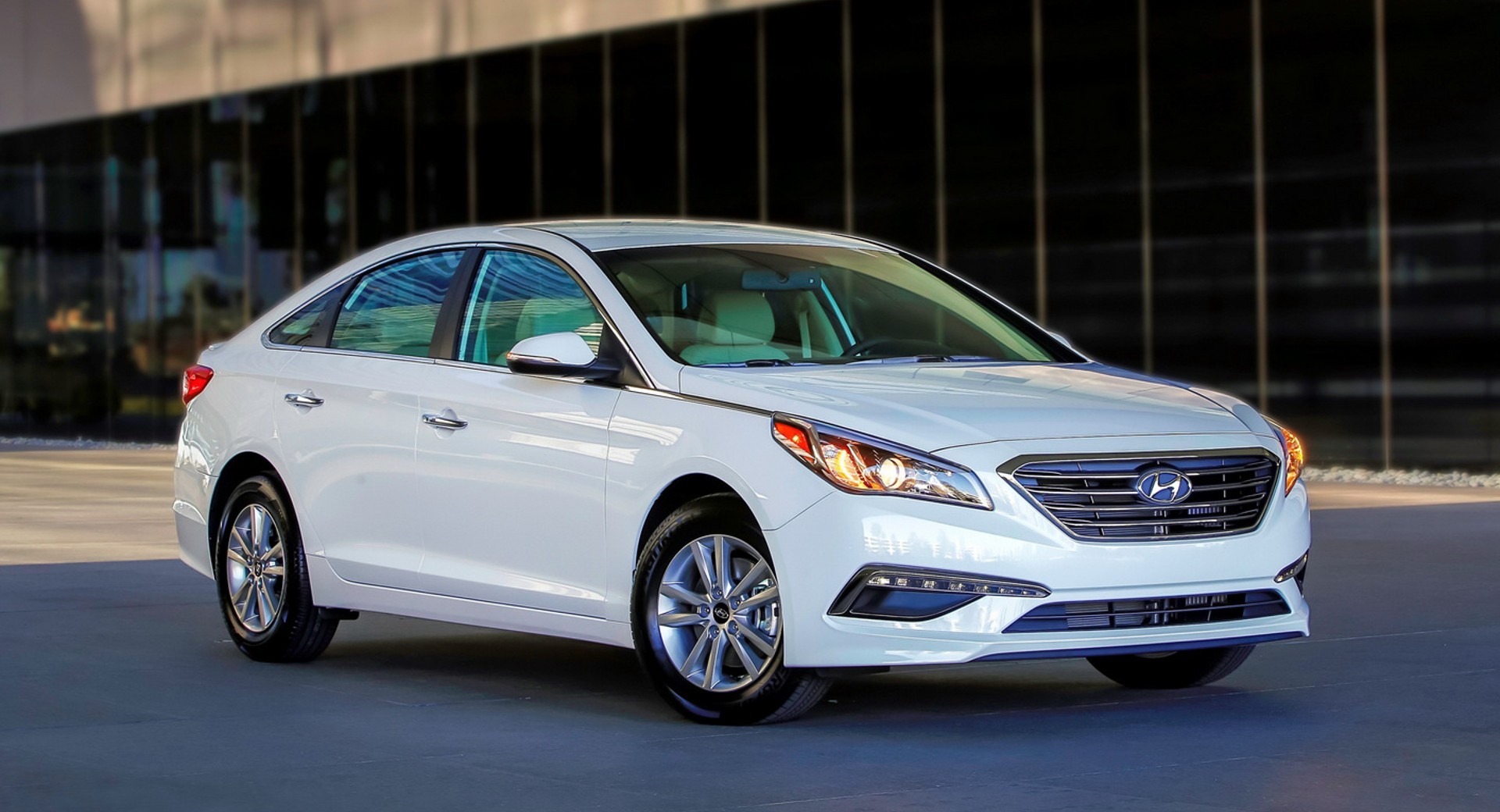
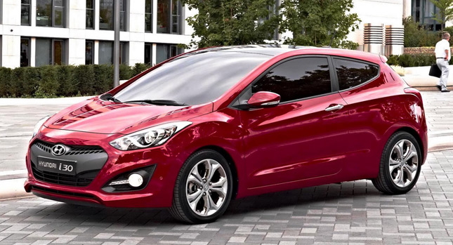
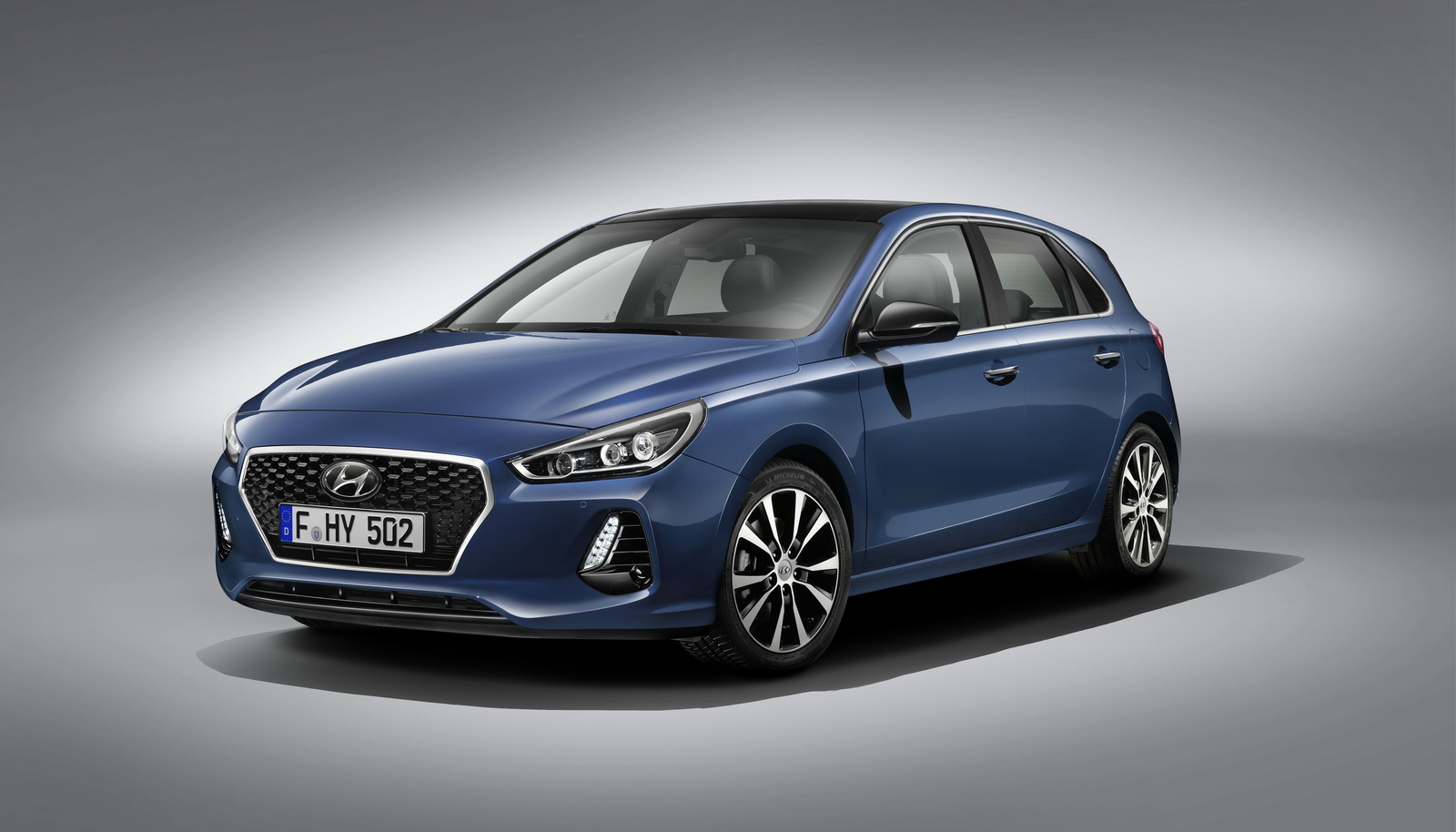
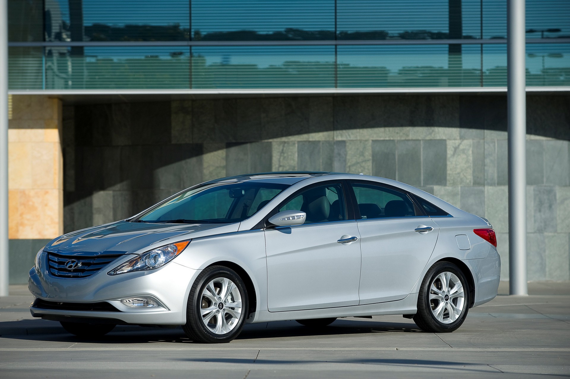
But it’s easy to be bold with sporty cars. Hyundai’s bread and butter hatches, sedans, minivans and SUVs of the period though, were a different story. Just take a look at the gallery above showing the firm’s early 2000s snooze-mobiles to remind yourself where Hyundai was just after the turn of the millenium.
If anything, though the quality was improving, some of the cars were even less distinctive in the first years of the new century as Hyundai tried desperately hard to be taken seriously not just by bargain hunters, and ending up trying to replicate existing successful cars in the market. Hyundai’s cars of this period weren’t terrible to look at, but they were terminally dull, which is arguably even worse.
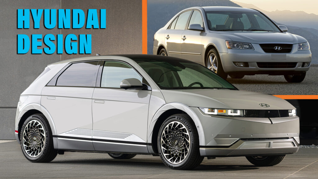
We’ll admit that things did get more interesting at the tail end of the 2000s as cars like the Elantra and Sonata took on fastback silhouettes and the SUVs looked more desirable too. But the design teams still seemed to be trying to mash together cues from Audi, Mercedes and Lexus and Honda rather than focus on creating a clear Hyundai identity for the brand’s cars.
The design switch flipped
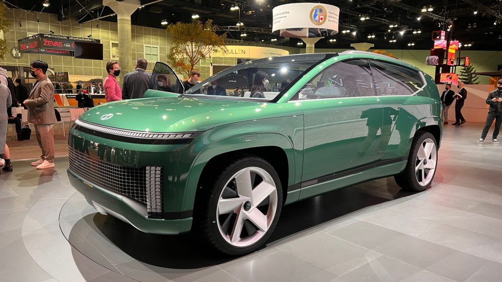
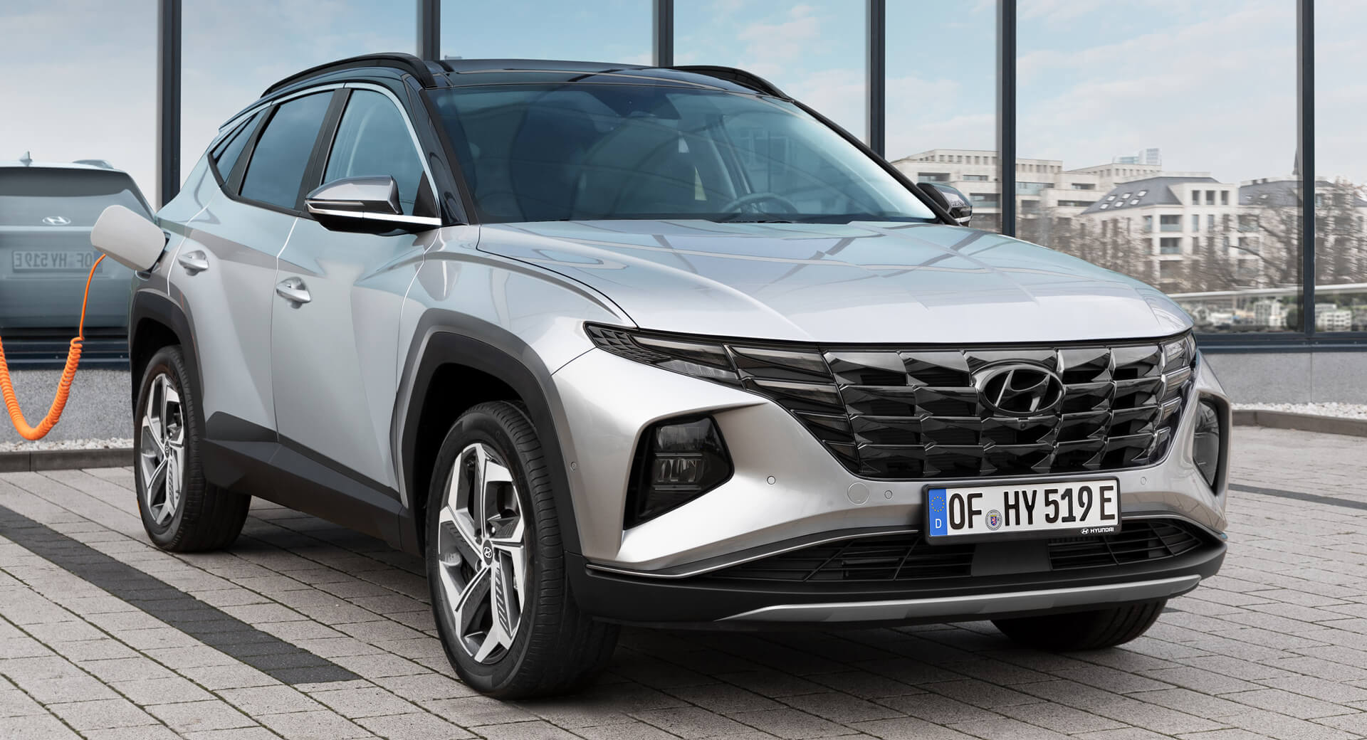
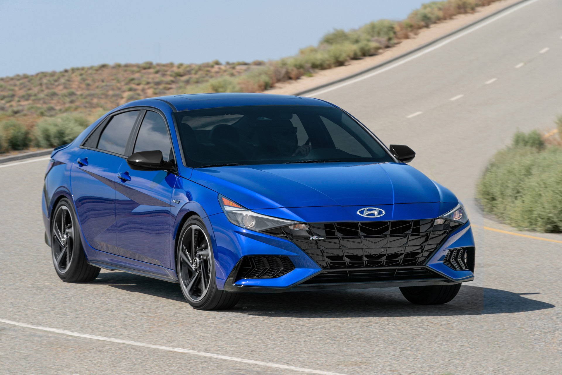
But around 2018, everything changed. Hyundai got brave. There was a polarizing split-lamp setup and fry-cutter grille for the new Santa Fe, and 2020 brought a reinvented Tucson complete with a cyborg grille and arches that bulged like a fitness model’s abs, plus a seventh-generation Elantra whose geometric door panel shapes played cool tricks with the light, and whose grille bled into the headlights to make a devil’s horns.
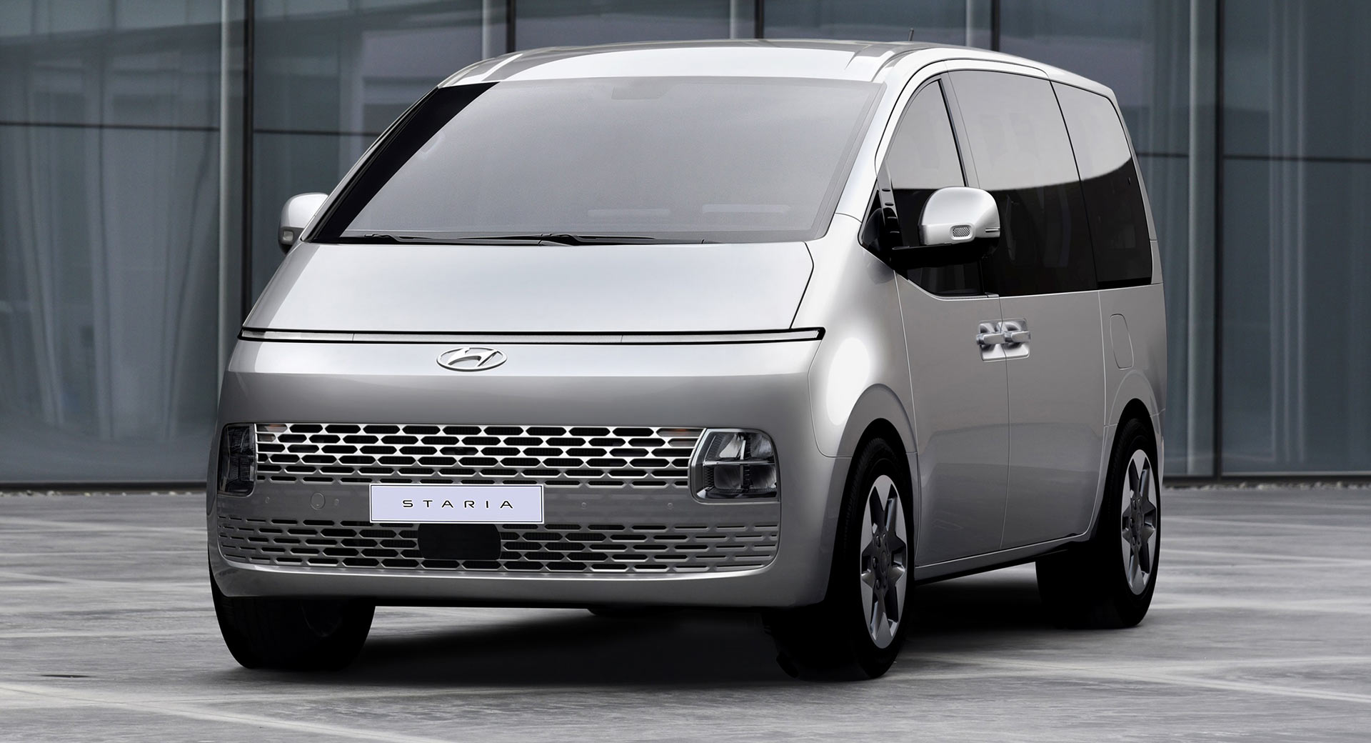
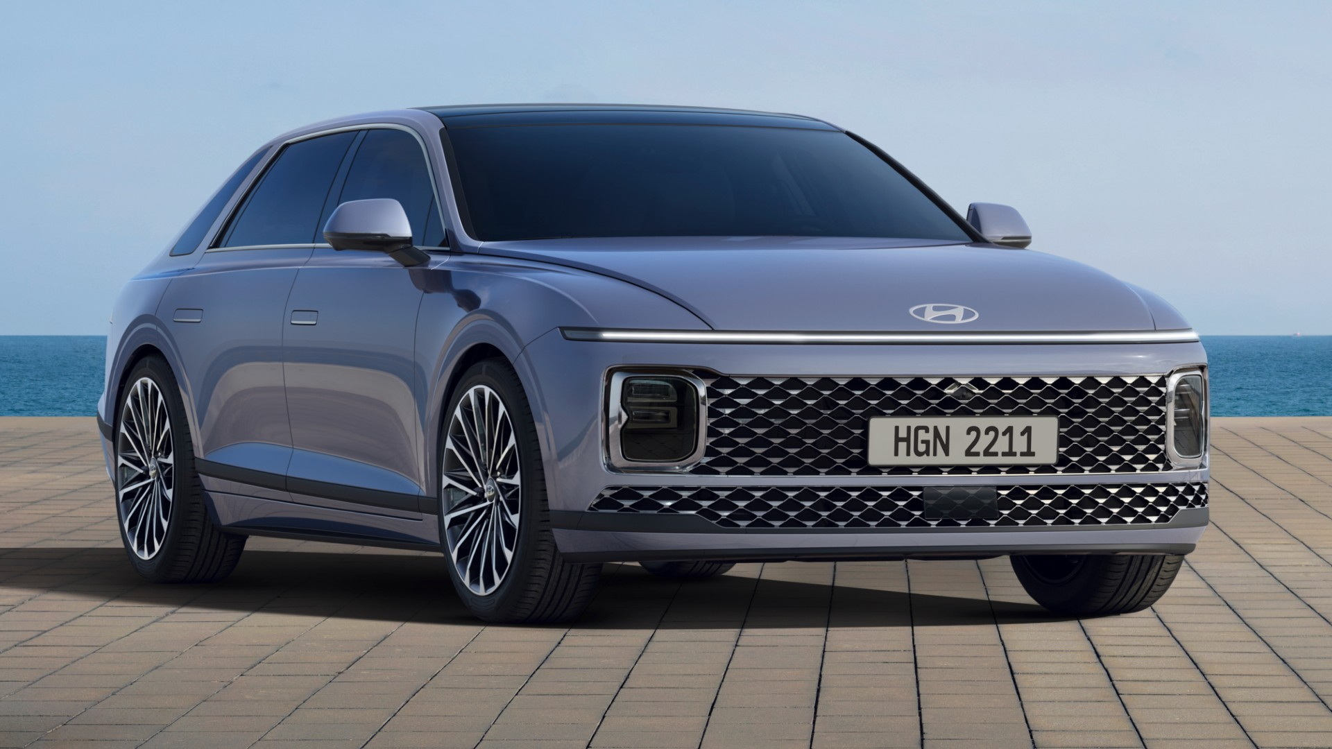
More recently we’ve seen a common theme – a slim horizontal light bar – being rolled out across multiple lines from the facelifted Kona crossover and Sonata sedan to the Staria minivan and Grandeur executive sedan, the last two of those also showcasing a grille that takes up the entire width of the car. It’s a radical look, and it finally gives Hyundai an instantly recognizable family look that’s all its own.
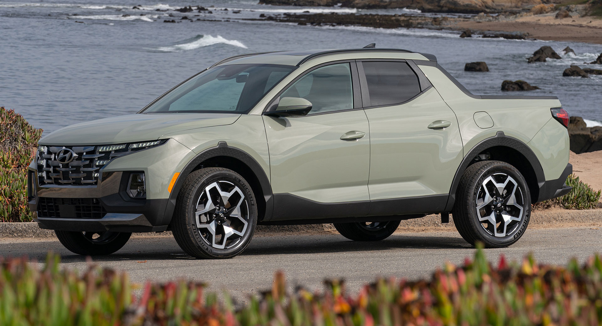
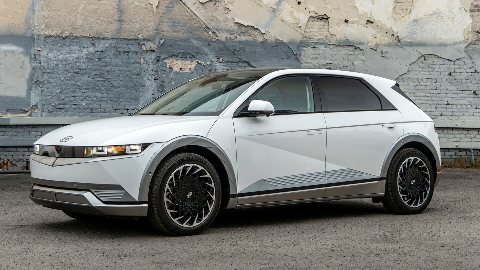
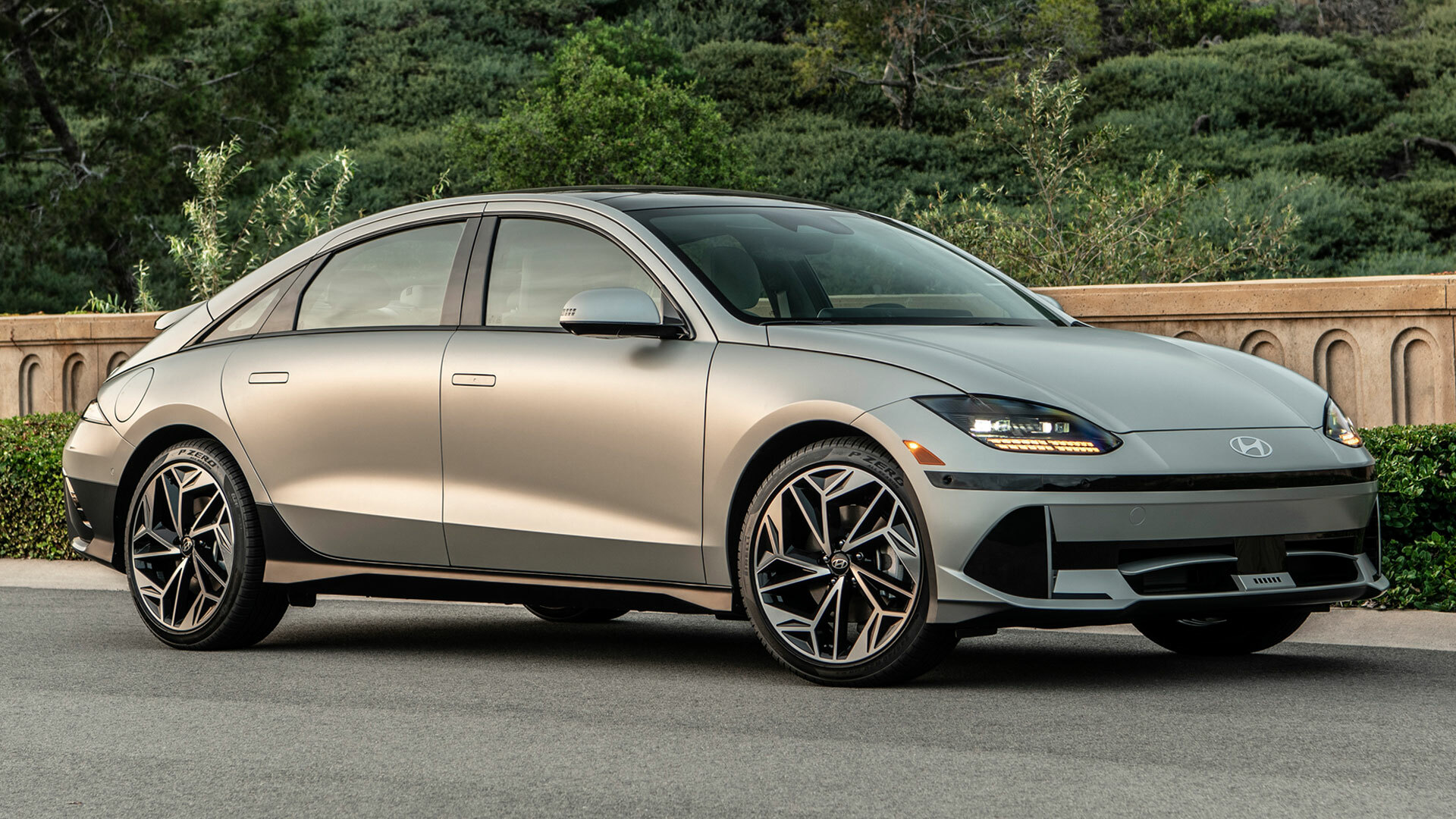
But wait, because it’s not as simple as that. What’s interesting is that Hyundai’s designs aren’t just resized versions of the same car. The new Santa Fe looks like nothing else in Hyundai’s range, and even the Ioniq 5, Hyundai’s most acclaimed bit of design work yet, looks nothing like the Ioniq 6, and neither have the full-width light bar.
“We already announced our chess-design strategy. Lots of makers use a family-look strategy, which have a cookie-cutter, Russian-doll consistency,” SangYup Lee, design boss at Hyundai and Genesis, explained to Autocar when he talked the magazine through the 2024 Santa Fe.
“There’s nothing wrong with that, but for us, Hyundai is a customer-centric brand, where lifestyle customers are very different. One Gen Z [person] in a single household is very different from mum and dad and three kids. So ‘chess’ is basically king, queen, bishop, knight – all very different and functionally different but working together as a team.”
Related: New Hyundai Patents Appear To Show Something Related To N Vision 74
But maybe, by virtue of looking so different to every other car on sale, and thereby creating their own identities, vehicles like the Santa Fe and Ioniq 5 and 6 don’t need to look like other Hyundais. Time will tell. All we know at this point is that Hyundai has gone from boring to bold in less than 15 years (five if we’re honest), and appears to bursting with the kind of self confidence that means there’ll be no return to dull design.
