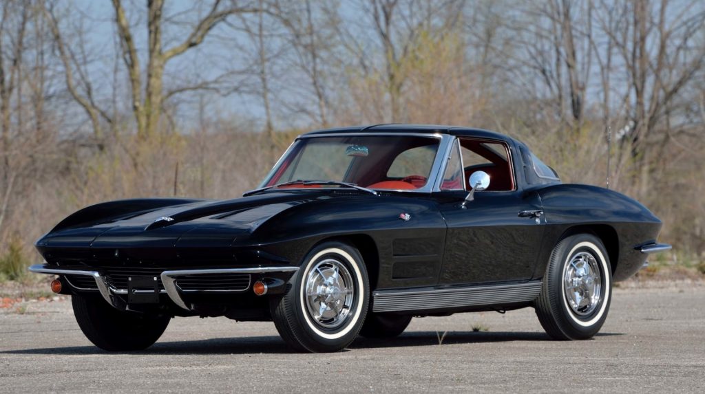
Car enthusiasts are a finicky bunch and whenever a new generation of an iconic car is released, there are bound to be detractors, no matter how exceptional that new car may be. The C8 generation Chevy Corvette is a prime example of this. By almost every metric, it is the greatest Corvette ever, yet there remain some that have not been won over by its design. That’s where this retro-inspired Corvette comes into the equation.
The following creation has been brought to life by Jason Battersby, a Canadian who up until last week, served as a senior exterior designer at Audi for the past 12 years, contributing to numerous projects, including the recent Grandsphere project. The 37 year old Toronto native has long had a passion for the Corvette. In sketching out his dream Corvette, he took inspiration from the C2 and C3 generations while making it look a little more modern.
Were the C8 model to look like this, we suspect that even the most enthusiastic of Corvette traditionalists would have been won over.
Read: Think The C8 Corvette Is Overstyled? Coachbuilder Has A $135,000 Solution
Renderings Jason Battersby
“With my Stingray I really aimed to strike the perfect balance between muscularity and elegance,” says Battersby/ ” The C2 Corvette was not purposely aggressive, it embodied an elegance that looked fitting when parked outside of high end hotels. Aside from the Ferrari Roma and some some Aston’s, most sports cars lean into the aggressive approach and can be a bit overwhelming. The Corvette was always sporty, but never angry.”
Like the first generations of the Corvette, the car depicted is front-engined meaning it has a very long hood and a familiar shape to the C2 and C3 models. A pair of large air intakes are visible, as are cutouts in the front bumper that channel air over the hood. We’re particularly fond of all the intricate lines and creases of the hood that help to give it some extra panache.
“I wanted to be sure to retain the iconic long bonnet proportions and emphasize them as much as possible,” explains Battersby. “Long feature lines stretch from the nose all the way to the base of the windscreen. The low functional air channels pay homage to the chrome outlets found on the C2’s bonnet.”

Battersby’s dream Corvette also sits on a set of large and sporty wheels and has a relatively small cabin with occupants sitting just in front of the rear axle. The doors are rather small and while this could impact ingress and egress, they do look rather lovely, as do the thin wing mirrors.
As for the rear, Battersby explains that his vision for the Stingray concept aimed at a modern interpretation of the classic C2 split-window design. However, instead of the wrap-around glass, the rear windows are tucked under two air channels.
Check out the new emblem
There are plenty of intricate details, including the new logos. “For my Stingray I didn’t want to use any existing Corvette logos, so I opted to design my own,” he said in an Instagram posting. “Instead of the classic beveled edges with color inlay, I simplified the shape and went for a matte/glossy treatment for the graphics. No chrome, no fuss, just a elegant black logo that carries on the Corvette flag tradition.”
Perhaps it’s high time the creative minds over at GM give Battersby’s work a keen once-over for a dash or two of inspiration next time.


