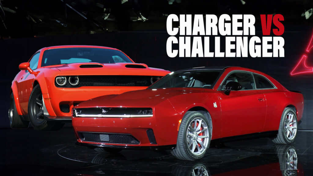
The Dodge Charger is making a bold return to its two-door bodystyle territory, effectively taking the reins from the long-standing Challenger, which has dutifully served for no less than 15 model years. With the debut of the all-new 2024 Dodge Charger Daytona, we’ve taken the opportunity to conduct a visual comparison with the Challenger to gauge how the replacement stacks up in terms of muscle car allure.
Before we move to the design battle, here’s a quick introduction to the newcomer. The 2024 Dodge Charger Daytona is the first model to introduce Stellantis’ new STLA Large architecture, following the retirement of the ancient Chrysler LX platform that underpinned the outgoing Challenger and Charger.
More: 2024 Dodge Charger Daytona EV Has Up To 670 HP, Straight-Six And Sedan Here Next Year
Actually, the new Charger serves as a replacement for both, offering both two-door and four-door bodystyles for the first time. It also marks Dodge’s inaugural fully electric vehicle, though starting next year, it will also be offered with a twin-turbo 3.0-liter six-cylinder Hurricane engine, ensuring the brand’s legacy of ICE-powered vehicles for the foreseeable future.
Now that we’ve covered the basics, let’s delve into a comparison of dimensions. As you can see from our table below, the 2024 Dodge Charger surpasses the Challenger in every aspect, with the most significant disparity being the additional 8.9 inches (226 mm) in length.
Dimensions
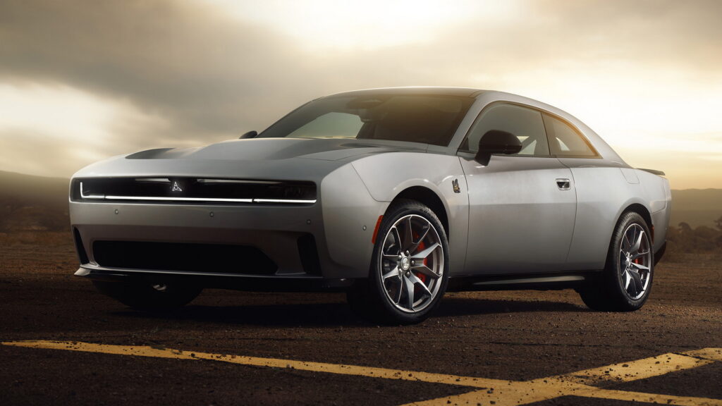
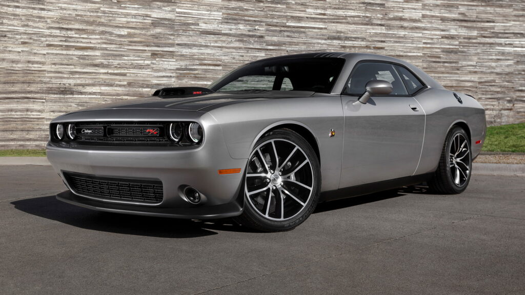
In terms of design, the new Charger stays true to the concept that previewed it back in 2022, drawing inspiration from the iconic second-gen 1968-1970 Charger, which stands as its most celebrated predecessor. On the other hand, the Challenger was a revival of its more brutal 1970-1974 namesake, coexisting with the Charger sedan as a slightly smaller muscle car rivaling the Ford Mustang and Chevrolet Camaro.
Both designs seamlessly blend retro shapes with modern styling cues, drawing inspiration from the same era. The Charger follows the minimalist approach of the Challenger which proved to be a hit, keeping it relevant for 15 years. Unlike the Challenger’s quad round headlights, the Charger opts for discreet lighting units and slim full-width LEDs accentuating its elongated grille. With no need to cool a combustion engine, the “R-Wing pass through” grille of the electric Charger doubles as an aerodynamic feature, directing air flow to the deep hood vent. Characteristic of Dodge, the simple bumper intakes and integrated splitter complete the distinctive look.
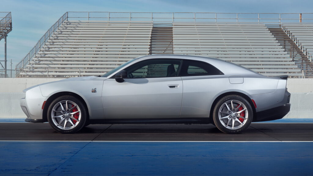
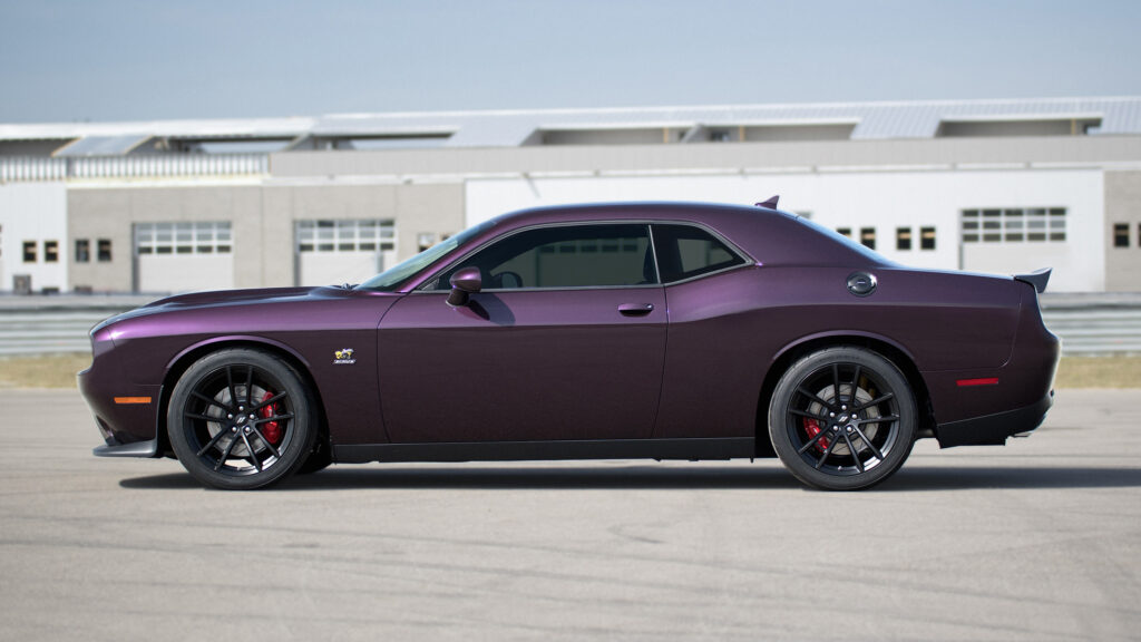
The profile is where the magic unfolds, showcasing the unique personality and style of each model. Despite its age, the Challenger’s signature character line still captivates, elegantly dividing the vehicle in half. In contrast, the Charger boasts sweeping lines above the fenders and a straight line underneath, creating a striking 3D effect.
More: We Face-Swapped The Dodge Charger Daytona SRT EV Concept With Its ICE Ancestors
Both muscle cars have long hoods and oversized front overhangs, with the Charger featuring a sharper nose. The Charger’s cabin occupies a lot more space compared to the Challenger, something that will most likely translate to increased room for the rear passengers. Moving towards the back, the Challenger wins the butt-beauty contest hands-down, thanks to its clearly defined rear volume as opposed to the Charger’s fastback tail.
More: New Dodge Charger Fuels V8 Demon 170 Fantasies
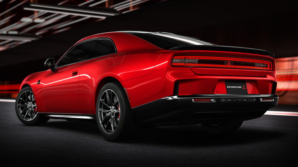
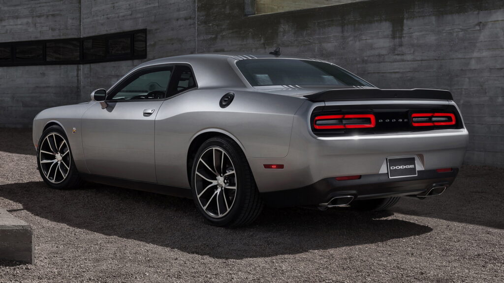
And that leads us to the rear three-quarters view where the timeless design of the immortal Challenger gets our vote. The full-width LED taillights of the Charger might look more futuristic, but its rear bumper is a lot busier compared to the simple lines of the Challenger, in a quest to make up for the lack of tailpipes. The vertical outlets would look more fitting in a coupe-SUV while the the protruding glossy black trim piece above the diffuser looks weird from certain angles.
Another missed opportunity lies in the Charger’s rather conventional rear glass, that can’t match the sculpted buttresses of the original 1969 Dodge Charger, or the sexy narrow windscreen of the modern-day Challenger.
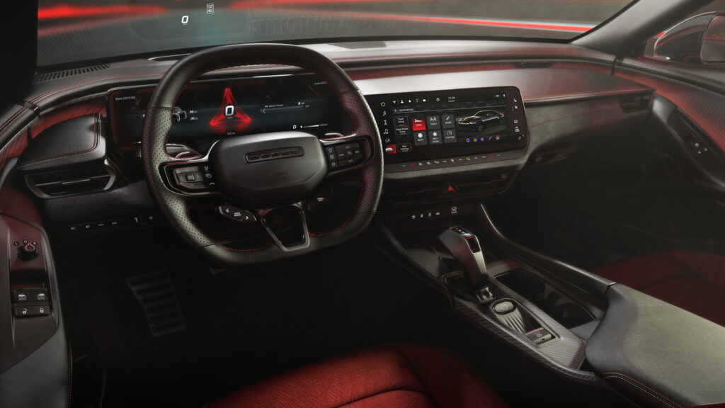
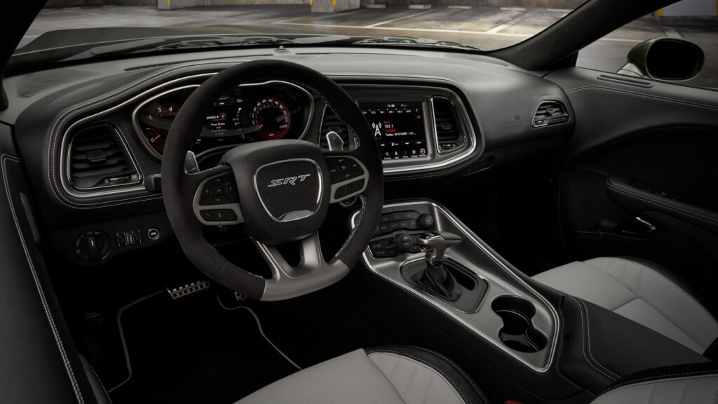
Moving inside, the differences between the Charger and the Challenger in terms of design and technology are chaotic, although in both cases the cockpit is centered around the driver – as it should in a proper sportscar.
The Challenger had long begun to show its age, even after the extensive makeover in 2015 that blessed it with an overhauled dashboard. Keeping up with the trends of our time, the new Charger embraces a dual-screen layout, featuring a prominent 16-inch digital instrument cluster and a 12.3-inch infotainment touchscreen positioned lower to avoid obstructing the driver’s view of the road. This setup can be complemented with a head-up display and other optional features, such as an advanced 18-speaker Alpine audio system and a drive experience recorder.
The Charger’s dashboard and center console feature slimmer climate vents, fewer physical controls with a modernized design, a flat-bottom steering wheel, a new gearbox selector, and sharper volumes. This design evolution looks significantly more modern compared to the older Challenger, which feels like it’s stuck in the previous decade. Additionally, the materials used in the Charger’s interior appear to be of higher quality, although we’ll need to inspect the final production model up close to confirm the expected improvements in perceived quality.
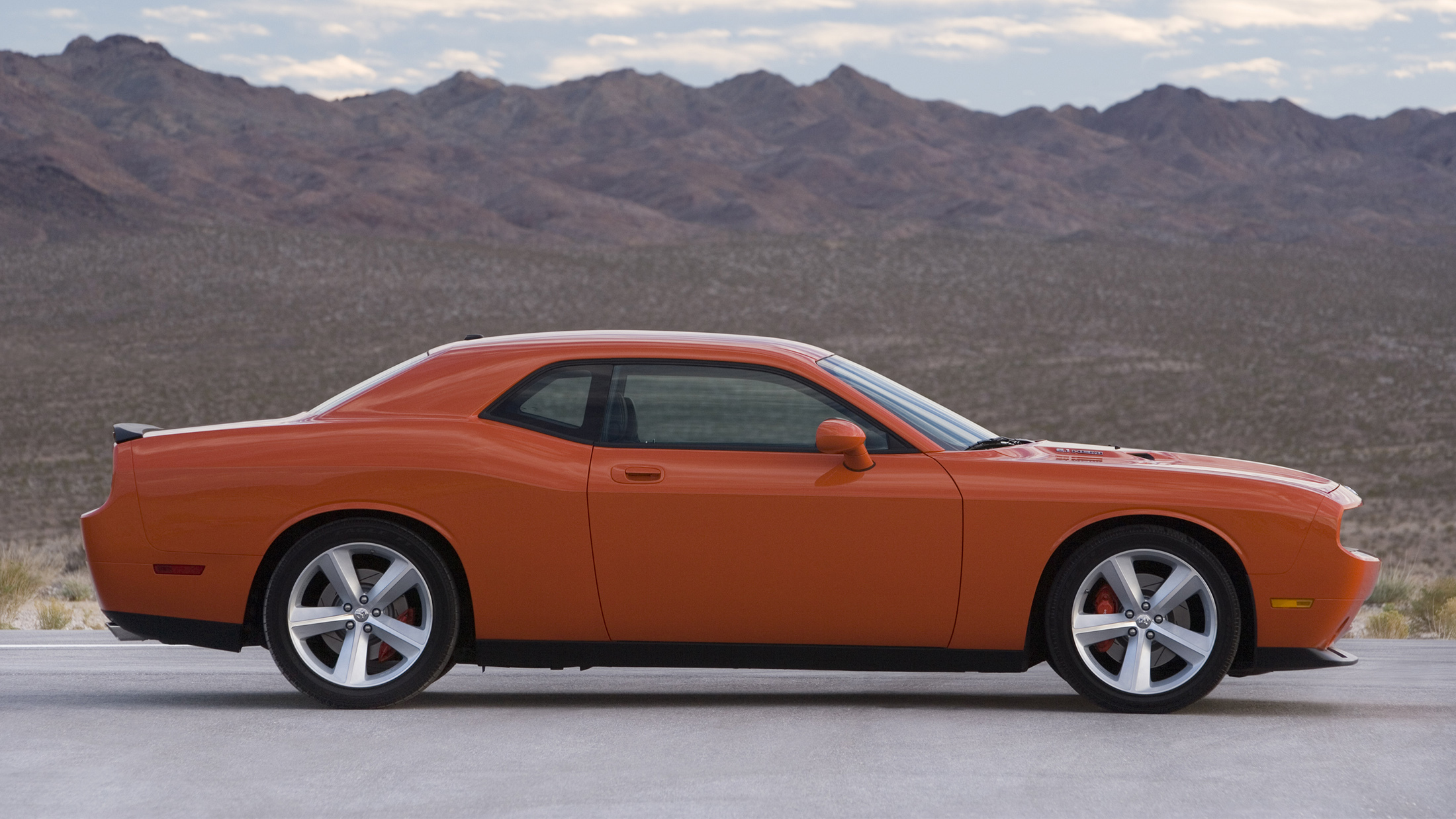
And that wraps up our visual comparison of the two muscle cars. Do you think that the 2024 Dodge Charger Daytona lives up to the name of the classic muscle car? More importantly, does it make your heart beat as fast as with the outgoing Challenger when it first came out? For a trip down memory lane, we’ve added a gallery of the 2008 Dodge Challenger SRT8, showing how much the old geezer had progressed during its prolonged lifecycle – especially when it comes to interior design.


